Typography | Task 3 Type Design & Communication
13/11/2023 - Ending Date / Week 7 - Week 14
Wong Jia Yi Carmen 0357198
Bachelor Of Design (Honours) In Creative Media
Task 3: Type Design & Communication
Table Of Contents
LECTURES
Week 7: Briefing Of Task 3
PHYSICAL CLASS
We started our final task today, Mr Vinod showed us some examples. We were to deconstruct letters: h, o, g, and b using our preferred font from the 10 fonts that we like. After that, we were to sketch out the letters: odhng using 3 different pens and explore 3 different writing styles for each of the pens.
ONLINE LECTURES
All lectures from 1 to 6 were completed in Task 1
INSTRUCTIONS
fig 1.0 Typography Module Information PDF Week 7 (13/11/2023)
Task 3: Type Design & Communication
Timeframe: Week 08 - Week 09
Deadline: Week 10
Before we started the task, Mr Vinod told us that we should dissect a letter first in order to understand how each letterform works and to analyze the structure of each letter. We were given letters: h, o, g, and b to dissect. We are also free to choose whatever font we wish to use out of the 10 fonts that are given to us.
Initially, I wanted to use Bembo Std to dissect the letters but I found it challenging and I was on the urge to have a mental breakdown so I've decided to use Serifa Std instead.

fig 1.1 Failure Attempt Of Dissection Of Bembo Std JPEG Week 8 (17/11/2023)
This is my re-attempt at the dissection of letters in Serifa Std.

fig 1.2 Dissection Of The Letter 'H' in Serifa Std JPEG Week 8 (17/11/2023)
I realized the letter 'H' is mostly straight lines, so I have no struggle with destructing the words.

fig 1.3 Dissection Of The Letter 'O' in Serifa Std JPEG Week 8 (17/11/2023)

fig 1.4 Dissection Of The Letter 'G ' in Serifa Std JPEG Week 8 (17/11/2023)
There's a mixture of both circles and straight lines.
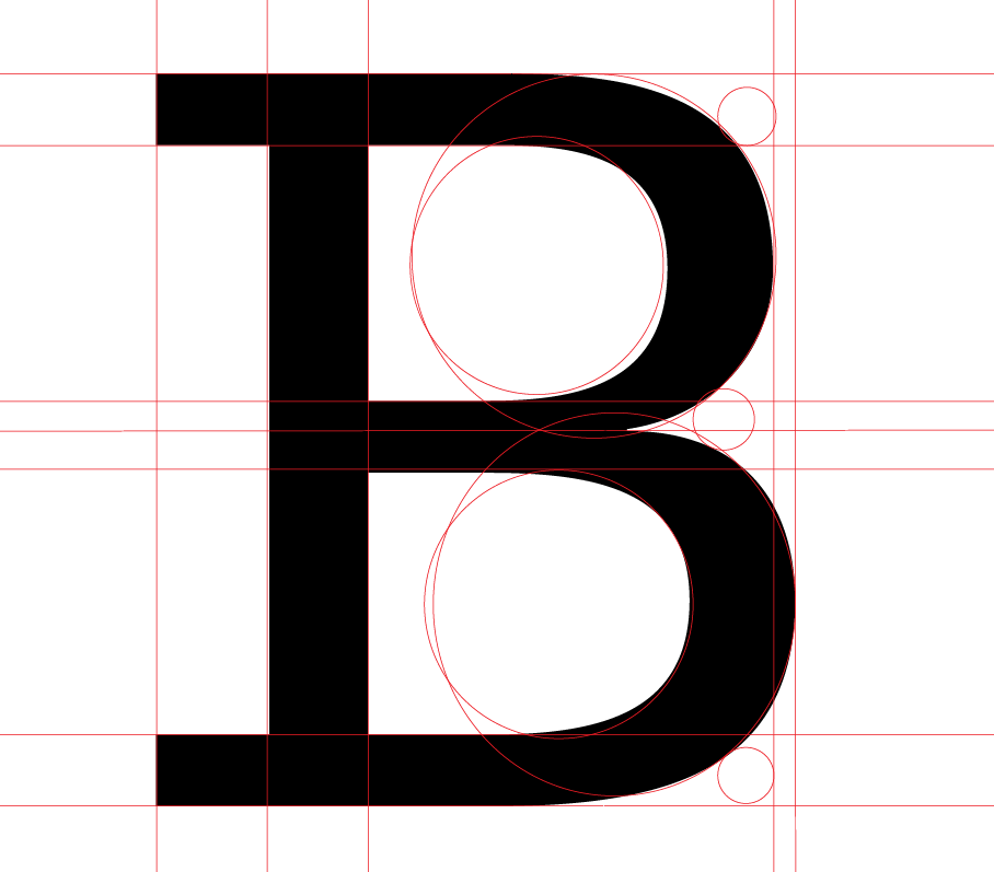
fig 1.5 Dissection Of The Letter 'B ' in Serifa Std JPEG Week 8 (17/11/2023)
The letter 'B' is also very unique.
For this task, before we start to digitalise the letter o l e d s n c h t i g, . ! #
We need to do some exercise first which is we need to prepare 3 different markers with different pen tip shapes and some graph paper.
These are my sketches.

fig 1.1 First Sketch JPEG Week 8 (17/11/2023)

fig 1.2 Second Sketch JPEG Week 8 (17/11/2023)

fig 1.3 Third Sketch JPEG Week 8 (17/11/2023)
Since week 8 is an Independent Learning Week, we don't have physical class on campus, hence we communicated online through teams and we were told to upload our sketches in the Facebook group. After receiving feedback from Mr Vinod, I was told that my Uncial Hand was too messy and I needed more practice before I started to sketch out o l e d s n c h t i g , . ! # and begin to digitalise it.
Since I'm not familiar with using pens to draw out the fonts, I did some research to understand better how to grip and use the pens correctly.
1. Breaks Between Strokes

fig 1.4 Understanding Upstroke, Transition and Downstroke JPEG Week 8 (17/11/2023)
I've found out that inserting breaks between strokes aids in achieving consistent spacing between letters and enhances focus on letterforms, facilitating the development of muscle memory.
We should take brief pauses or lift our pen between each stroke during practice.
Modern calligraphy deviates from cursive writing, where the tendency is to write swiftly and continuously. In calligraphy, a slower pace is essential. Introducing pauses between strokes contributes to achieving well-defined thick and thin strokes, distinguishing calligraphy from cursive writing.
2. Hold The Pen Correctly

fig 1.5 How To Hold Pen Correctly JPEG Week 8 (17/11/2023)
Make sure the brush pen is positioned at approximately a 45-degree angle to the paper. This angle facilitates the mastery of thick and thin strokes, ensuring smooth transitions between them. Furthermore, maintain a loose grip on the pen to prevent hand fatigue and enable free pen movement. Hold the pen slightly away from the tip for optimal control.
3. Be Mindful Of The Pen Pressure

fig 1.6 Pen Pressure JPEG Week 8 (17/11/2023)
Applying gentle pressure during upstrokes facilitates achieving delicate, hair-like strokes while employing heavy pressure on downstrokes contributes to thicker lines. The thickness of downstrokes can be adjusted based on the desired outcome, and there's no need to worry about applying excessive pressure, as brush pens are designed to withstand it without breaking.
~ Use Light Pressure for the Upstrokes (when you're moving the pen upwards)
~ Use Heavy Pressure for the Downstrokes (when you're moving the pen upwards)
After some research and understanding, I began my practice.

fig 1.7 Sketches JPEG Week 9 (20/11/2023)
I found the 'o' a bit challenging so I focused more practice on that.
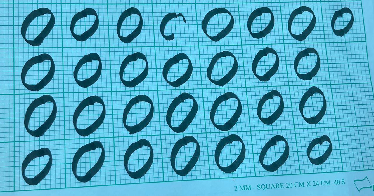
fig 1.8 Sketches JPEG Week 9 (20/11/2023)

fig 1.9 Draft Sketches JPEG Week 9 (20/11/2023)
After getting it checked by Mr Vinod, I found out that the anatomy for my sketches was incorrect, after some explaining, I finally understood and immediately started sketching again.

fig 1.10 Corrected Anatomy Sketches JPEG Week 9 (21/11/2023)
After practicing, I started to write each font one by one to see which one was better. From there, I chose the one I feel nicer from the rest.

fig 2.0 Each Font One by One Sketches JPEG Week 9 (21/11/2023)

fig 2.1 Best Written Of oledsnchtig,.!# JPEG Week 9 (21/11/2023)


fig 2.3 Process Digitalizing 's' using The Smooth Tool Screengrab Week 9 (21/11/2023)

fig 2.4 Process Digitalizing 's' using The Curvature Tool Screengrab Week 9 (21/11/2023)

fig 2.3 Process Of Digitalizing Screengrab Week 9 (21/11/2023)

fig 2.4 Digitalized oledsnchtig,.!# JPEG Week 9 (21/11/2023)
I mostly used the pen tool to create my alphabet as I found more easier compared to other tools in Adobe Illustrator, if I had any imperfections in the alphabet, I then used the smooth tool to smooth out some edges and strokes.
After receiving feedback from Mr Vinod, I need to use the brush tool to make the strokes and don't rely on the pen tool. And so I made some changes.

fig 2.5 Using The Brush Tool On The Letter 'o' Sreengrab Week 10 (27/11/2023)

fig 2.5 Adjustment With The Anchor Point On The Letter 'o' Screengrab Week 10 (27/11/2023)

fig 2.7 The Brush Tool On The Letter 'd' Screengrab Week 10 (27/11/2023)
Final Work

fig 2.8 Final Digitalized oledsnchtig,.!# JPEG Week 11 (05/12/2023)
After finalizing everything, I started to convert all the fonts into FontLab.

fig 2.9 Process Of Putting oledsnchtig,.!# in Fontlab7 Screengrab Week 11 (05/12/2023)
Download Fonts Here:

fig 2.10 oledsnchtig,.!# in Fontlab7 Screengrab Week 12 (11/12/2023)

fig 3.0 Final Task 3A: Type Design and Communication "Glazier" JPEG Week 12 (11/12/2023)
fig 3.1 Final Task 3A: Type Design and Communication "Glazier" PDF Week 12 (11/12/2023)

fig 3.2 Final Poster JPEG Week 12 (11/12/2023)
fig 3.3 Final Poster PDF Week 12 (11/12/2023)
FEEDBACK
Week 8 (Independent Learning Week)
General Feedback: Practice more on holding your pen before starting sketching, make sure to only write once when you're writing the alphabet, do not lift up the pen.
Personal Feedback: I need a little more practice with my Uncial hand. Practice more and begin writing the instructed letters: o l e d s n c h t i g , . ! # in the chosen hand then digitise.
Week 9
General Feedback: Since we established the deadline on our own, it is our responsibility to turn in our work on time. Understand your fonts before you start your work. If we make changes to the feedback put 'updated' in black beside the comments.
Personal Feedback: Understand your anatomy before you sketch, and practice more
Week 10
General Feedback: E-portfolio is very important in our course as it carries 30% of our grades. If you have alot of images, try to combine them into one so that our blog won't be long. If you have progress for your work, make sure to include it in the blog as well as it counts as marks. Make sure the pdf is visible. Try to add jump links in the blog so that we won't have to scroll down and up.
Personal Feedback: Use the brush tool to create the strokes and don't rely on the pen tool, after creating the strokes one by one, combine them together and then make final changes to the shapes. Make the letter 'o' has overshoot and the rest as well.
Week 11
General Feedback: Make sure the shapes of the letterform are tidy, use 'pathfinder' and 'unite' the shapes accordingly. Also adjust the anchor points of the shapes, the lesser the anchor point the easier to shape the letterforms.
Personal Feedback: Adjust the letterform more, progress still remains the same as last week. The letter 't' is a little to the left.
Week 12
General Feedback: The purpose of the poster is to present your fonts. Try to type out the letterforms in FontLab, in this way, you'll know which letter needs to be improved and adjusted. Make sure the fonts are the same size when designing the poster.
Personal Feedback: Bring the letter 'g' closer, too complex, and needs to be simplified, the dot for the exclamation mark and the period needs to be above the baseline. The hashtag needs to be until the ascender. Adjust the angle for the stroke, especially the spine of the letter 's'.
REFLECTION
Experience
In week 8 of my typography exploration, the focus shifted towards a hands-on and detailed examination of letterforms, involving the process of dissecting letters and mastering the art of writing with different pen tips. This week was dedicated to a meticulous study of letterforms. I engaged in dissecting and analyzing the anatomy of letters—exploring the intricacies of strokes, terminals, serifs, and counters. Understanding the structural components of letters became instrumental in creating well-crafted and harmonious typography.
I delved into the art of calligraphy, practising the fluid and expressive strokes characteristic of this traditional form of writing. This hands-on exercise allowed me to appreciate the relationship between pen pressure and line variation, crucial elements in achieving beautiful and dynamic letterforms.
The exploration extended beyond the mere shapes of letters to consider texture and line quality. I practised creating textures within letters and manipulating line weight to add depth and visual interest to my typographic compositions.
Observation
Mastery of pen angles was a key focus. I learned how the angle at which a pen is held can dramatically impact the style and character of the letters, gaining a nuanced understanding of how to achieve consistency in different writing situations. The week of dissecting letters and experimenting with different pen tips heightened my sensitivity to the intricate details of letterforms. I became more aware of the nuances in strokes, serifs, and counters, fostering a deeper appreciation for the subtleties that contribute to well-designed typography.
The exploration of various pen tips revealed the profound impact that different tools can have on the style and character of letters. Each pen tip brought its own set of characteristics, influencing the weight, width, and expressiveness of the strokes.
Findings
The detailed dissection of letterforms, combined with the exploration of various pen tips, emphasized the importance of precision in letterform design. Each stroke, serif, and counter became a deliberate and calculated choice in crafting visually appealing and well-balanced letters. Findings revealed that the choice of pen tip significantly influences the aesthetics of the lettering. Different pens offer unique characteristics, impacting the overall style and mood of the typography. This understanding enables a designer to make intentional choices based on the desired outcome.
The exploration of different writing styles underscored the adaptability needed in typography. Findings indicated that being able to modify one's writing style to suit different contexts and convey diverse messages is a valuable skill for a typographer. The study of pen angles underscored their critical role in achieving consistency and precision in lettering. Findings demonstrated that mastering pen angles is fundamental for maintaining uniformity and coherence in typographic designs.
FUTHER READING

fig 1.0 Typography Basics JPEG Week 9 (22/11/2023)

fig 1.0 Typography Basics JPEG Week 9 (22/11/2023)
Display fonts are crafted with distinctive and attention-grabbing features, making them ideal for headlines, titles, or other prominent elements in a design. Their primary purpose is to attract attention and set the tone for the overall visual impact.
Decorative fonts, on the other hand, often include ornamental or stylized elements, They are designed to convey a particular theme or mood and are well-suited for creative and artistic applications. Decorative fonts add a unique flair to design but can be challenging to read in extended passages.
Display and decorative fonts are best suited for headlines rather than body copy. Headlines demand attention and benefit from the distinctiveness of these fonts, whereas body copy requires readability and should generally use more straightforward, legible typefaces.
Script fonts are crafted to replicate the fluidity and elegance of handwriting. They often feature cursive or calligraphy styles, providing a personal and expressive touch to the text. One characteristic of script fonts is that the letters are designed to touch or connect with each other, mimicking the natural flow of cursive writing. This interconnectivity adds to the appeal of script fonts and contributes to their distinctive look. Script fonts have a long history of being associated with formal and elegant occasions. They are commonly used for invitations, especially those for weddings, galas, or other sophisticated events. The script's graceful appearance enhances the formality and charm of the text.
Text fonts draw inspiration from the hand-drawn letters crafted by early monks for religious books. This historical connection gives them an "Old-World" feel, evoking a sense of tradition, craftsmanship, and heritage. The design of text fonts is often purposefully chosen to reflect a certain historical tradition. They are particularly popular for certificates, diplomas, and invitations, where the goals is to convey a sense of significance and importance.
The design of text fonts is often purposefully chosen to reflect a certain historical or classical aesthetic. This makes them well-suited for projects where an elegant and timeless appearance is desired. It is frequently used in contexts that demand a touch of formality and tradition. They are particularly popular for certificates, diplomas, and invitations, where the goal is to convey a sense of significance and importance.


Comments
Post a Comment