Packaging Design

24/04/2025 - 23/07/2025 | Week 01 - Week 14

Wong Jia Yi Carmen | 0357198 | Section 01 

Packaging Design | Bachelor of Design (Hons) In Creative Media


TABLE OF CONTENTS

1. Lectures

2. Instructions

3. Feedback

4. Reflection


LECTURES

Week 3


What is Packaging? Introduction to Packaging
  • Packaging is a very important aspect in our daily lives and has a great impact on how we operate in the contemporary world.
  • Since people’s lifestyles, working schedules, and leisure time change, so does packaging to reflect new consumption patterns, different settings, and circumstances. In its simplest definition, packaging can be described as the outer layer or the protective shield that encloses a product.
  • Packaging design is the process of making the package look attractive and appealing to the consumer, while also considering factors such as the target audience, brand identity, and practical considerations like ease of use and sustainability.
  • By creating an effective package design, brands can make their product stand out and connect with consumers on an emotional level.
fig 1.0 Packagings (08/05/2025)


The Evolution of Packaging

Ancient Times (Before Modern Civilisations)
  • Early humans used natural materials like:
  • Leaves, bark, coconut shells, bamboo, and animal skins to wrap or carry food and items.
  • Ancient Egyptians and Chinese used clay pots to store oils, grains and spices
fig 1.1 Ancient Time Packagings (08/05/2025)


Early Civilisations (Mesopotamia, Egypt, Rome)
  • Glass Bottles and Clay Amphorae were introduced for storing olive oil, wine and medicine.
  • Romans started labelling their containers using clay seals, kind of like early branding


fig 1.2 Early Civilisations Time Packagings (08/05/2025)


Industrial Revolution (1700s-1800s)
  • Major shift in packaging due to mass production and factories.
  • In 1810, Peter Durand invented the tin can for preserving food.
  • Paper packaging and cardboard boxes began being widely used for shipping.
fig 1.3 Industrial Revolution Packagings (08/05/2025)


20th Century (1900s-2000s)
  • Packaging became more commercial and visual, thanks to supermarkets and advertising.
  • 1950s: Plastic packaging became popular - cheap, lightweight, and versatile.
  • Brands like Coca-Cola and Kellogg's started using signature colours, logos and typography to stand out.
fig 1.4 20th Century Packagings (08/05/2025)


21st Century - Era of Sustainability & Digital 
  • The focus shifted towards eco-friendly packaging - biodegradable, recyclable, and less plastic.
  • Many brands now use paper, glass and reusable materials
  • Rise of smart packaging - like QR codes and NFC tags for interactive experiences.
fig 1.5 21th Century Packagings (08/05/2025)

In short, packaging has transitioned from a simple protective shield to a tool for advertising, identity, and sustainability. It has gone beyond the simple idea of putting a product in a box — it is about communicating something, sharing something, and producing an effect.


Packaging Design
  • The design of packaging must consider various factors, such as the target audience, product positioning, brand identity, and marketing strategy.
  • It involves creating a visual and sensory experience that resonates with the consumer and communities, the product's value and benefits.
  • Packaging design encompasses various elements, such as the shape, colour, typography, imagery and material choices.
  • These elements work together to create a cohesive and visually appealing package that stands out on the shelves and captures the consumer's attention.
  • Successful packaging design must also consider the practical aspects of the package, such as ease of use, sustainability, and cost-effectiveness. It must balance the need for functionality and aesthetics to create a package that is both effective and visually appealing.

fig 1.6 Purpose and Function of Packaging (08/05/2025)

  • Protection
  • Identification 
  • Transportation
  • Differentiation
  • Communication 
  • Marketing

Physical Protection

  • One of the primary functions of packaging is to protect the product inside.
  • Packaging must be designed to keep the product safe from damage during transport, storage and handling
  • For example, a fragile item like a glass bottle might require packaging that includes extra padding or reinforcement to prevent it from breaking.

fig 1.7 Packaging for Glass Bottle (08/05/2025)


Identification
  • Packaging is often used to help customers identify a product quickly and easily.
  • Effective packaging design included the product name, logo, and other important details that allow customers to easily recognize the product on store shelves or online.

fig 1.8 Identification on Packaging (08/05/2025)


To Transport
  • To easily and safely move the product from the manufacturer to the consumer.
  • Gain functional, the package serves to help transport, carry, ship and distribute the product.

fig 1.9 Packaging to Transport (08/05/2025)


Differentiation
  • Packaging can help a product stand out from its competition
  • Effective packaging design should be distinctiobe and memorable, with unique colour schemes, typography, and imagery that helps the pricct to stand out on crowded shelves.
fig 1.10 Packaging to Differentiate (08/05/2025)


Communication
  • Packaging can be used to communicate important information about the product, such as its features, benefits and usage instructions.
  • Effective packaging design should include clear and concise messaging that helps customers understand what the product is and how it can be used.
fig 2.0 Packaging to Communicate (08/05/2025)


Marketing
  • Packaging can also be used as a powerful marketing tool, helping to create a positive impression of the brand and product.
  • Effevtive packaging design should align with the brand's overall marketing strategy and messaging, creating a cohesive brand identify that resonates with cutsomer.
fig 2.1 Packaging to Marketing (08/05/2025)


Information on Packaging
  • Product name: The name of the product must be clearly displayed on the packaging so that customers can easily identify what they are purchasing.
  • Net quality: The amount or weight of the product contained in the packaging must be indicated, usually in both metric and imperial units.
  • Ingredients: If the product containers any allergens or other ingredients that may cause harm to consumers, these must be listed on the packaging.
  • Nutritional Information: For food products, nutritional information such as the calorie count, fat content, and sugar content must be included.
  • Country of Origin: The country where the product was made must be stated on the packaging.
  • Manufacturer information: The name and contact information of the manufacturer or distributor of the product must be included.
  • Warning Labels: Certain products may require warning labels to inform customers about potential hazards or risks associated with the product.


fig 2.2 Information on Packaging (08/05/2025)


Packaging Design as Communication
  • Visual problem solving is at the core of packaging design.
  • Whether it is introducing a new product or improving the appearance of an existing one, creative skills- from conceptualizing and rendering to the three-dimensional design, design analysis, and technical problem solving- are the ways a design problem is resolved into innovative solutions.
  • As a creative tool, packaging is a means of expression.
  • A product's expression, one that attracts a target consumer market, is achieved through a creative process in which physical and visual elements work together to communicate emotional, cultural, social, psychological, and informational cues to the target consumer.


fig 2.3 Packaging Design as Communication (08/05/2025)


Week 4


3 Common Types of Boxes in the World of Packaging

In the world of packaging, many people are confused about all the different types of boxes and the interchangeable terms used to describe them

  • Folding Cartons
  • Rigid Boxes
  • Set-up Boxes
  • Carboard Boxes
  • Corrugated Boxes
  • Paperboard Boxes

1. Folding Cartons

- Folding cartons (paperboard cartons, or paperboard boxes) are some of the most common types of boxes
- Eg: Cereal Box

fig 2.4 Folding Cartons (17/05/2025)


2. Rigid Boxes

- Rigid Boxes (set-up boxes) are sturdier and do not fold or collapse as folding cartons do 
- They are often, not always, used for higher-end products where perceived value is important 
- They are also used when the product within is heavy and in need of extra support.

fig 2.5 Rigid Boxes (17/05/2025)


3. Corrugated Boxes

- Also known as corrugated board, corrugated fibreboard or combined board
- Commonly referred to as brown cardboard boxes
- Typically has 3 layers
- A wavy or fluted layer sandwiched between 2 puter flat layers
- The fluted layer is where the strength of this paper product lies
- In packaging, corrugated boxes are often referred to as "shipper boxes" or "master packs"
- Mostly used to ship a company's retail-ready products to stores all over the country/world
- Corrugated is also commonly used as a primary retail packaging, the same way a folding carton is used
- Corrugated fibre is also commonly used in floor POP displays 


fig 2.6 Corrugated Boxes (17/05/2025)


Common Elements in Folded Cartons (Box Styles)
  • There are many varieties of different box styles for folding cartons or paperboard boxes
  • It is just not for style, but in dimensions as well
  • Most common box styles are TUCK TOP
  • There are basically 2 types of tuck top boxes:
                - Reverse Tuck Emd (RTE)
                - Straight Tuck End (STE)
  • These boxes are made of art card ranging from 190 gsm (light product) to 360 gsm (heavy product)

Reverse Tuck End (RTE)

The top closure trucks from the rear to the front, and the bottom closure tucks from the front to the rear

fig 2.7 Reverse Tuck End (RTE) (17/05/2025)


PROS of RTE box styles
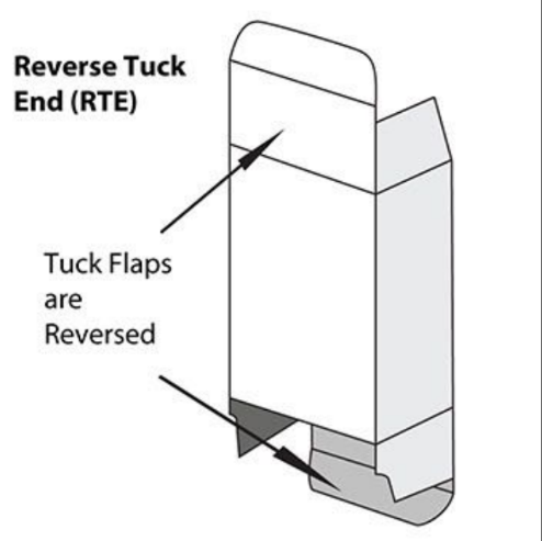
  • Cost-effective because you can run more boxes at one time on the same-sized paperboard as opposed to the Straight Tuck End
  • Easy assembly
  • Compact storing (stored flat) for excess packaging inventory
  • Relatively quick to load the product in this packaging
  • Works well for lighter-weight products
CONS to RTE box styles 
  • Not good for heavy products 
  • Not as aesthetically pleasing because of the visible raw edges in the front of the box 

Industries that most commonly use RTE:
  • Health and beauty 
  • Comestics
  • Pharmaceautical
  • Electronics
  • Nutraceutical

Straight Tuck End (STE)

Both the top and bottom closures tuck from the front to the rear

fig 2.8 Straight Tuck End (RTE) (17/05/2025)


PROS of STE box styles
  • More luxurious than RTE because there are no white raw edges visible on the front of the box
  • Avoids any blockade between the tuck flap and any front window film (see-through window to display the product)
  • Easy to assemble
  • Compact storing (store flat) for excess packaging inventory
  • Works well for lighter-weight products
  • Relatively quick to load a product in this packaging

CONS to STE box styles
  • More expensive, manufacturers produce fewer boxes at one time per paperboard sheet
  • Not good for heavy products

Industries that most commonly use STE:
  • Health and beauty
  • Cosmetics

Tuck Top Snap-Lock Bottom

This box, also known as a "1-2-3 bottom", has a bottom closure that closes in 3 simple steps 


fig 2.9 Tuck Top Snap Lock Bottom (17/05/2025)


PROS
  • Works well for heavier products (bottom closure can handle more weight)
  • Relatively quick loading (the 3 steps are easy)
  • Compact storing (stores flat) for excess packaging inventory 
  • Easy assembly 
  • Sits well on retail shelves because package bottom is nice and flat 

CONS
  • More expensive than a bottom-tuck box 
  • Takes slightly more time to "set up"

Industries that most commonly use TTSLB:
  • Health and beauty
  • Toys
  • Food
  • Phaarmaceutical

Tuck Top Auto Bottom

This box has a bottom closure that makes setting up the box a breeze

fig 2.10 Tuck Top Auto Bottom (17/05/2025)


PROS
  • Works well for heavier products (bottom closure can handle more weight)
  • Ultra-fast assembly
  • Super speedy loading
  • Compact storing (stores flat) for excess packaging inventory
  • Sits well on retail shelves because bottom is nice and flat

CONS
  • More expensive than a bottom tuck or snap-lock bottom (factory has to perform an extra step by gluing the bottom)

Industries that commonly use TTAB:
  • Health and beauty
  • Cosmestics 
  • Toys 
  • Food 
  • Pharmaceutical

Closure Types for the Tuck Top Box Styles


All of these Tuck Top Boxes can include "Slit-Lock" or "Friction Fit" lock features for an extra snug hold and to prevent the top from bowing

The choice of box styles for folding cartons can be vast. Many of the elements listed are applicable to most of the typical box styles in common usage in current retail marketplace


Week 5


Packaging and Branding

Packaging is the container for a product - Cover the physical appearance of the container and including the design, colour, shape, labelling and materials used.

Most marketing textbooks consider packaging to be an integral part of the 'product' component of the 4 P's of marketing: product, price, place and promotion

The main use for packaging can be considered to be protection of the goods inside, packaging also fufils a key role in that it provides us with a recognizable logo, so that we instantly know which product is inside the package.


fig 3.0 Example of Branding and Packaging (22/05/2025)


Packaging is an important part of the branding as it plays a role im communicating the image and identity of a company.

The role of packaging is changing from that of 'protector' to 'information provider' and 'persuader'

It is now being used as an important saled tool to attarct attention, describe the product and make the sale


The Importance of Packaging and Branding for Businesses

    1. Attracts Attention and Differentiates from Competitiors:

Packaging is often the first interaction that a consumer has with a product. A well-designed package can grab the consumer's attention and make a positive first impression. Effective packaging can also differentiate a product from its competitors and create a competitive advantage.

fig 3.1 Attraction in Packaging in Supermarket (22/05/2025)


   2. Builds Brand Identify and Recognition:

Branding and packaging go hand in hand, and company's package design can help build brand idenity and recognition. Consistent branding across all products and packaging reinforces the brand image and can create a srtong brand identity. This can lead to customer loyalty and trust.

 
fig 3.2 Brand Identity in Packaging (22/05/2025)


    3. Communicates Brand Message:

Packaging and branding can communicate a bran's message and values. A company can use its package design to convey information about the product, such as its quality, ingredients, and benefits. This can help build trust and loyalty with consumer who share the same vaues and beliefs

fig 3.3 Example of Communicates Brand Message in Packaging (22/05/2025)


    4. Influences Consumer Perception:

Packaginh can influence a consumer's perception of a product. A well-designed package can make a product appear more premium or high-quality, while a poorly designed package can make a product seem cheap or low quality. Packaging can be also influence a consumer's perception of the brand as a whole.

fig 3.4 Consumer Perception in Packaging (22/05/2025)


    5. Supports Marketing and Promotion

Packaging can support marketing an promotional efforts. For example, seasonal packaging can create excitement around a product and drive sales during specific times of the year. Packaging can also be used to promote special offers or discounts.

fig 3.4 Example of Marketing and Promotion in Packaging (22/05/2025)


Consistency in Packaging and Branding

Brand consistency in packaging design is imporatnt because it leads to brand recognition.

When customers recognize ypur brand (and have positive associations with it), they're more likely to make purchases and commit to your company for the long term.

Repetion makes customer more likely to choose you.


fig 3.5 Example of Consistency in Packaging and Branding (22/05/2025)


Differentiation Through Packaging and Branding

Differentiation through packaging and branding is important because it helps product and brands be easily recognizable in the marketplace, and it can help a company eastablisg a competive advantage.

When a product is similar to others on the market, effective pakcaging and branding can be the key factor in convincing a consumer to choose on brand over another.

Here are some ways that companies can differentiates through packaging and branding:
  • Unique Design Elements
  • Creative Mesaging
  • Customization and Personalization
  • Sustainability

Unique Design Elements:

Companies can use unique packaging design elements, such as shapes, colours, textures or materials to make their products stand out.

For example, Method, a cleaning products company, uses a distinctive, ergonomic bottle shape and bright, eye-catching colors to differentiate their products from competitors.


Creative Messaging:

Companies can use messaging on their packaging and branding to differentiate their products.

For example, Dove, a personal care brand, uses messaging on theor packaging that promotes a message of self-love and body positivity, which differentiates them from competitors who may use messaging that focuses solely on product features.


Customization and Personalization:

Companies can offer customized or personalized packaging to create a unique product identity. For example, Cola-Cola's "Share a Coke" campaign used personalized paclaging with individual names to differentiate their products and create a personal  connection with consumers.


Sustainability:

Companies can use sustainable packaging materials or highlight their sustainability efforts to differentiate their products.

For exmaple, Patagonia, an outdoor clothing company, uses recycled and sustainable materials in their packaging and highlights their commitment to sustainability on their branding to differnetiate their products.


Emotional Appeal through Packaging and Branding

Emotional appeal through packaging and branding refers to the strategy of using packaging and branding elements to evoke an emotional response from consumers. This emotional connection can help create a more meaningful and long-lasting relationship between a consumer and a brand.

According to a study, the appeal of product packaging can trigger different emotions, including impulsive buying, even for customers with no intention to make the purchase. Attractive packaging designs can instantly trigger positive and rewarding emotions in consumers, significantly contributing to their purchasing decisions

Here are some ways that companies can use emotional appeal through packaging and branding:

    Color Psychology: 

Color can have a powerful effect on our emotions and can be used to create an emotional connection with a brand. For example, red can evoke feelings of excitement and energy, while blue can create a sense of calmness and trust. Companies can use color in their branding and packaging to evoke specific emotions that align with their brand values and messaging.


    Imagery and Graphics: 

Imagery and graphics can also be used to evoke an emotional response. For example, a brand that focuses on outdoor adventure may use imagery of nature and outdoor activities to create a sense of freedom and adventure. A brand that focuses on family values may use imagery of families spending time together to create a sense of warmth and connection.


    Brand Storytelling: 

Brand storytelling is a powerful way to create an emotional connection with consumers. Companies can use their branding and packaging to tell a story that connects with consumers' values and beliefs. For example, a coffee company may use their packaging to tell the story of how their coffee beans are sourced from fair trade farms, creating an emotional connection with consumers who value ethical sourcing practices.


    Personalization: 

Personalization can also create an emotional connection with consumers. When a product or packaging is personalized with a consumer's name or other personal information, it can create a sense of connection and make the consumer feel valued by the brand.


Week 6

Introduction to Shelf Display
- A paramount objective in the field of retail package design is to get your package noticed.
- With the competitors fighting for eye time and shelf space, a package's life and death depend upon those few moments of a consumer's interest while walking down a store.
- The whole point of successful package design is to stand out from a crowd. 
- Often a difficult thing to do when packages are displayed side by side with other products.
- One of the most effective ways of grabbing the attention is through the point of purchase display.


The Sale begins with eye contact
  • A point of purchase display - referred to as P.O.P. - attracts the audience, draws them in close, and makes a sale
  • Point of Purchase marketing material includes a myriad of printed advertising display items that can help your product stand out from the crowd.
  • A well-designed point of purchase display can help separate a product from its competitors, focus customer attention, & serve as a directed advertisement, targeting the shopper at the exact moment of sale.

Designing for display
  • Much like packaging itself, the art of P.O.P. design is part of packaging, part of structural engineering, part of advertising & part of psychology
  • The creation of P.O.P. must take into account these additional factors:
                - The P.O.P. display should complement the current advertising campaign for the                      product.
                - It must be designed to show the package in its best light.


Sample of Point Of Purchase Display

1. Shelf Talker P.O.P
  • Shelf Talkers are small signs that attach to a retail shelf ledge. They are most commonly utilised with data strips, but can be implemented without them.
  • Shelf Talkers are an effective way to attraxt and communicate way to attract and communicate with customer's in store as they are wandering department aisles.


fig 3.6 Example of Shelf Talkers (31/05/2025)


Wobbler
  • Wobblers are tags that are stuck to shelves or other surfaces to stand out to grab customer attention.
  • Also called shelf talkers or product talkers, these branded tags literally talk for themselves - they point customers to your product, giving you an edge over competitors that sit on the same shelf.


fig 3.7 Example of Wobblers (31/05/2025)


High Back Countertop P.O.P


fig 3.8 Example of High Back Countertop P.O.P. (31/05/2025)


Tall Back Floor Standing P.O.P

Also known as "Floor Standee".


fig 3.9 Example of  Tall Back Floor Standing P.O.P. (31/05/2025)


Windows Displays 
  • Induces persons to enter into the shop, It arouses the interest of passers by and kindles a desire to buy the product on display.
  • Acts as a selling point.
  • Timeliness of displays of goods is important. Products which are bought more during a particular season should be kept in a window display.


fig 3.10 Example of Windows Displays (31/05/2025)


Floor Stickers 
  • The floor is an advertising space, which is rarely used. As a result, floor stickers are very effective.
  • Floor Stickers are perfect for reinforcing existing advertising as well as complementing as well as complimenting Point of Sale. They are also great space savers, ideal for supermarket aisles, shopping centres, retail stores, or staircases and landings.

fig 4.0 Example of Floor Stickers (31/05/2025)


go up

INSRUCTIONS

fig 1.0 Packaging Design's MIB (24/4/2025)


Exercise / Case Study

Timeframe: Week 1 - Week 4

Description: Exercise - Packaging Design Analysis (20 marks) (1 product a week)

  1. Overview: Choose 4 products in the market that you believe have poor packaging design. Ensure the product is readily available for purchase.
  2. Product Analysis: Conduct a thorough analysis of the existing packaging design. Identify the specific shortcomings and challenges in the current packaging. Consider factors such as functionality, aesthetics, sustainability, target audience and branding.
  3. Market Research: Investigate the target market for each product and assess how the current packaging aligns with the expectations and preferences of the target audience.
  4. Competitor Analysis: Research and analyse the packaging designs of competing products in the same category. Identify trends and best practices in packaging design within this product category.

SUBMISSION


Week 1


fig 1.1 Ammeltz YokoYoko's Packaging  (26/4/2025)


The Ammeltz YokoYoko Air-Activated Heat Patch suffers from multiple packaging weaknesses that impair functionality and damage both physical structure and design appeal and brand identity as well as customer engagement. The flimsy construction of the box creates weak product protection, which leads to a poor perception of the product. The front design presents an unattractive visual appearance because multiple potent colors such as black, red. yellow and blur form an uncoordinated pattern that clutters rather than harmonises. The distinctive color blocks in the background form a flag like pattern that fails to link with the product function.

"Ammeltz YokoYoko" brand name presents itself poorly to consumers. The branding of "Ammeltz YokoYoko" becomes uninte;;ogible when linked with "Air-Activated Heat Patch" in an unclear manner. This creates branding from what describes the product. The results of these packaging issues diminish customers' ability to recognise the brand and complicate their ability to find information quickly at a glance. The combined use of various fonts and sizes on 'Menstrual Pain' and 'non-medical heat therapy' statements reduces their readability by competing instead of creating a structured information guide.

The photograph depicts a woman who is smiling while placing her hands on her adbomen. he overall visual language is clinical and impersonal, lacking the soft, reassuring elements commonly found in competitor products. Brands in this category often employ minimalist layouts, gentle color palettes, and empathetic imagery to foster trust and emotional resonance. The product claims to be both "thin & discreet" but its actual packaging feels outdated according to the market preference for soft and calming modern packaging aesthetics.

Issues exist both on the back and front aspect of the packaging. The package displays excessive text, which forces multiple language information blocks into restricted space. Multilingual support presents a necessary requirement in the design, but the compressed layout impairs visibility notably for vital safety warning information. Warning information appears threatening instead of helpful because the eyes are affected by using bright yellow and red colour fonts that are especially harsh to see. Users face problems finding instructions since the packaging lacks obvious section divisions and helpful icons.

Current packaging of menstrual pain relief products like ThermaCare adopts minimalistic designs using pastel colors and empathetic messaging. This packaging ensemble presents a welcoming as well as relaxing encounter, which stands against the intense visual overcrowding found in design here. In conclusion, the packaging of Ammeltz YokoYoko fails to deliver its brand message clearly as its does not build emotional bonds with users and also presents an outdated aesthetic design and complicates product navigation. A new version of the product packaging requires better materials and easier layouts, along with gentler color schemes to separate product and brand information, followed by friendly emotional design elements for contemporary consumers, is much considered. 

462 words.


Week 2

fig 1.2 Dolphin's Packaging  (2/5/2025)

The Dolphin Modelling Material's packaging shows multiple weaknesses in terms of functionality, design, market positioning and competitive positioning. The packaging structural composition consists of weak, thin cardboard material, which provides insufficient protection for a child's product that faces regular use. The front-facing cut-out window, protected only with a thin sheet of clear plastic, reveals product contents which might possibly be affected by potential dust and moisture damage. There is no method to reseal the package, which is crucial for preserving modelling clay from drying out, thus limiting its extended use.

The box faces an aesthetic struggle because its front and back sides show dated visual presentation along with cluttered designs. The messy visual effect emerges from the combination of a loud yellow background with clipart graphics appearing randomly and various font types used without alignment. The visual organisation of the design is poor because crucial communication, such as product benefit, requires readers to scan through multiple textual and graphical elements. Cartoonish design components like Mr Potato Head lookalike clay models and poor quality symbols perform marginally well with little children but the actual design fails to demonstrate creativity or quality or build parental trust, which are critical for buyers.

The environmental sustainability targets misses the mark for this packaging solution. The product consists mainly of cardboard, while the recyclability and eco-friendliness material usage remain unclear throughout the package. Extreme sustainability issues grow from the possible use of non-recyclable plastics in the window space on the front packaging. The present market reflects that sustainable packaging stands as a critical purchasing factor which affects consumer selection, particularly among parents who choose items for their kids.

Provided market research shows parents, who purchase products meant for children aged 3 years and above, focus on the product with clear labelling along with engaging yet neat elements that offer safety assurance and educational learning content. The packaging does not provide proper reassurance related to its main safety concerns. A safety warning appears at the back of the box in small print embedded within a messy layout, and also risks of being overlooked. Unprofessionalism is increased by the tagline's repetitive presentation as 'Ready to use... ... & fun' with extra ellipses having no purpose.

Competitor analysis strengthens the evidence showing these weaknesses. The modelling clay market contains brands such as Play-Doh and Crayola that present attractive, clean designs with easy-to-open compartment packaging and include clear information about safety tests and sustainability, along with educational content. Dophin's packaging appears basic and unappealing as it lacks contemporary branding elements that generate trust or brand devotion in consumers.

428 words.


Week 3

fig 1.3 My Beauty Diary's Packaging  (9/5/2025)

My Beauty Diary's Black Pearl Brightening Mask faces multiple functional nd market communication and competitive challenges. The front design uses black and blush pink with pearl imagery to present a fashionable, feminine look, which creates a luxurious, soft appearance. This packaging approach targets young female adults who are interested in skincare, but it fails to capture contemporary design trends that dominate the leading beauty brands.

The front of the packaging combines pearl and shell motifs, which match the "Black Pearl" theme, but essential details appear in tiny type and remain absent. Consumers want straightforward information, and normally they will look for quick benefits such as '7-day glow,' 'for dull skin,' 'hydrating' in their product descriptions, but this packaging requires consumers to turn to the back of the packaging and read through the description. The back of the packaging has more informative text but it is written in Mandarin and packed tightly with information. For an international product, a clearer bilingual layout would ensure accessibility across the market. The ingredient information,n like Aquaroad™, Tinysome™, and Cosphingo™, fails to make an initial impact because heavy text conceals their view.

The product operates within an overpopulated market segment that requires packaging to demonstrate scientific authenticity and environmental sustainability. Competitors like Dr. Jart+ and The Ordinary provide their products in modern packaging featuring clinical terminology while using eco-friendly labels. The glossy finishes, along with decorative fonts used by My Beauty Diary, create a packaging appearance that seems outdated and less trustworthy to modern consumers. The skincare market requires prominent dermatological testing and certification, but this information is absent from the product. Sustainability is another major oversight. The packaging displays a 'soy ink' logo, but the material appears neither recyclable nor biodegradable without any sustainability communications. The rising consumer expectation for eco-friendly beauty brands is not met by this packaging solution.

306 words.


Week 4

fig 1.4 My Scheming's Packaging  (15/5/2025)


Several crucial design issues within the "My Scheming New Black Mask" packaging diminish its market effectiveness in the current competitive skincare market. The front and back sides of this product show poor design that lacks consumer-focused clarity and cohesive presentation, which reduces its market appeal. The cardboard material shows functional weaknesses because it easily gets damaged through bending and creasing. The cardboard provides minimal defence during transportation and has no capability to reseal itself. The product lacks essential user-friendly features, including perforated openings and structured trays, which should support the placement of masks in skincare routines.

The black and green colour scheme on the package creates a clinical appearance, but the design becomes outdated because of excessive visual elements. The front design appears chaotic because it combines various fonts alongside icons and texts written in both Chinese and English. The design lacks a clear leadership structure and main focal point, which makes it difficult for customers to easily understand the product benefits. The visual elements on the package lack specific symbolism, which fails to improve comprehension.

The back of the packaging raises more issues. The product explanation and ingredient information become difficult to understand because the text is dense and the layout shows inconsistent spacing along with poor visual organisation. The small green-highlighted illustrations for face mask usage help, but they are difficult to see because they blend into the other elements. The product presentation lacks essential elements like brand storytelling and emotional engagement, which contemporary skincare consumers find essential. The packaging does not show recyclability features, nor does it provide instructions for environmentally friendly disposal methods. The lack of sustainable packaging presents a significant disadvantage for the brand because environmentally conscious younger consumers look for responsible packaging from skincare brands.

The target audience consists of young adults who have acne-prone skin and skincare enthusiasts who show a preference for packaging that is sleek, minimalistic and information-rich, according to market research. Brands like COSRX and Innisfree achieve success through their minimalistic packaging design and sustainable materials, and emotionally appealing branding. "My Scheming" packaging's products show signs of age while being cluttered and failing to establish a clear brand identity.


357 words.

go up


Project 1 / Box Making

Timeframe: Week 5 - Week 7

Description: Designing Custom Boxes for Non-Boxed Items. The objective of this assignment                is to develop your skills in creating custom packaging solutions for items that do not come in traditional box packaging. By the end of this assignment, you should be able to demonstrate your ability to design fyctional, creative and visually appealing boxes that enchance ythe packaging and presentation of non-boxed items.


During week 4, we did an in-class activity. Mr Shamsul ask us to bring some artboard, a cutter, steel ruler, glue and other stuff.

Mr Shamsul let us to choose either between a Head Massager or a Ball Massager.


fig 1.5 Head and Ball Massager (not the actual product) Week 4 (15/5/2025)

I decided to go for the ball massager and after I got all the measurement ready. I immediately start the work.

fig 1.6 Process and Finished Result of the Packaging Week 4 (15/5/2025)


For the non boxed items, I decided to go with cotton pads and umbrella.

fig 1.7 Non Boxed Items Week 4 (15/5/2025)

And here are the sketches for both of them.

Cotton Pads.

fig 1.8 Packaging Sketches for Cotton Pads Week 4 (15/5/2025)

Umbrella.

fig 1.9 Packaging Sketches for Umbrella Week 4 (15/5/2025)


After showing and discuss with Mr Shamsul, we agreed to go for the option 1 for cotton pads and option 6 for the umbrella.


fig 1.10 Chosen Packaging for Cotton Pads and Umbrella Week 5 (22/5/2025)


Mr Shamsul also told me to do a prototype for each of the packaging to visualise the packaging better and see where it needs to improve, and so I started working on it.

I work on the measurement for both of the items and draw on a piece of A4 paper and use a cutter to cut it out.

This is the outer box for cotton pads.


fig 2.0 Outer box for Cotton Pads Week 5 (23/5/2025)


This is the inner part of the packaging, which is the refill part.

fig 2.1 Inner box for Cotton Pads Week 5 (23/5/2025)


Here is the finished Cotton Pad Packaging Prototype.

fig 2.2 Finished Prototype (Cotton Pads) Week 5 (23/5/2025)


Moving on to the Umbrella Packaging. This is kinda confusing for me because of the hexagon part and i get my measurement wrong for this one and I can say making a prototype for both of the non-boxed items does help alot.


fig 2.3 Packaging for Umbrella Week 5 (23/5/2025)

Here is the finished prototype.


fig 2.4 Finished Prototype (Umbrella) Week 5 (23/5/2025)

Next, I work on the dieline in Illustrator.

Cotton Pads.

fig 2.5 Dieline in Illustrator (Cotton Pads) Week 5 (23/5/2025)


Umbrella.

fig 2.6 Dieline in Illustrator (Umbrella) Week 5 (23/5/2025)

After some discussion with Mr Shamsul, I've made some minor changes to both of them.


fig 2.7 Changes in Dieline in Illustrator (Cotton Pads and Umbrella) Week 6 (30/5/2025)


During Week 7, me and my friends went to box shopping for our laser cut.
fig 2.8 Box Shopping Week 7 (4/6/2025)


The next day, which is our tutorial time, Mr Shamsul spend some time to teach us how to use the machine.


fig 2.9 Process of Laser Cutting (Trial) Week 7 (4/6/2025)


Umbrella Box (First Try)

fig 2.10 First Try for Umbrella's Box Week 7 (4/6/2025)

Cotton Pad Box (First Try)


fig 3.0 First Try for Cotton Pad's Box Week 7 (4/6/2025)

Both box are okay but I'm still not happy with it especially for the umbrella one, as the closing cannot close properly. Cotton Pad box is fine but I'm not satisfied with the box material and the opening need to be bigger.

In week 8, I try it again with my classmates. 

Umbrella Box (Second Try)


fig 3.1 Second Try For Umbrella Box Week 8 (11/6/2025)


Still need to fix the slit opening again...

Cotton Pad's Box (Second Try)

fig 3.2 Second Try For Cotton Pad's Box Week 8 (11/6/2025)


Finally satisfied, I change the box material to brown card and it looks so much better and sturdy.


SUBMISSION


Umbrella's Box

fig 3.3 Final Umbrella's Box Week 8 (12/6/2025)

This hexagon shaped box is specially designed to store a folded umbrella in a neat, compact and eco-friendly way. Made from durable corrugated cardbox with angled sides and a flat base that securely holds the umbrella in place. The top flap opens upwards, functioning like a lid, and is connected to the back panel. When closed, the flaps folds over the opening and tucks into a slit on the front panel, creating a secure locking mechanism without the need for glue or tape. To use it, you simply just lift the top flap, place your umbrella inside and close the lid by sliding it into the front slit. This design makes the box not only practical for storing but also protects your umbrella, at the same time, it is also easy to open and close. Lightweight and reusable.


Cotton Pad's Box

fig 3.4 Final Cotton Pad's Box Week 8 (12/6/2025)

This is a basic cotton pad dispenser that is eco-friendly designed out of brown card that is both functional and sustainable. The box is tall with an open top that makes it convenient for the consumers to refill the inner box by stacking more cotton pads inside the box at any time. A small semicircular cutout is the dispensing slot at the bottom. It is easy to remove one cotton pad at a time through this opening and the rest of the pads remain stacked neater inside. The size of this refillable package is small and minimal, which makes it convenient to use in bathrooms or on vanity tables. It is also a convenient, eco-friendly option since its material can be recycled, and the design can be reused.


After showing to Mr Shamsul and got my feedback, he said to laser cut again as the side of my umbrella box is not align and for the cotton pad box, I change it again because I change the cottons into the thicker ones.

fig 3.5 The side Of The Umbrella Box Is Not Aligned Week 8 (12/6/2025)

SUBMISSON AFER FEEDBACK


fig 3.5 Final Cotton Pad's Box After Feedback Week 10 (24/6/2025)


fig 3.6 Final Umbrella's Box After Feedback Week 10 (24/6/2025)

go up


Project 2 / Innovative Packaging (Collaboration project with School of Biosciences)


Timeframe: Week 4 - Week 10

Description: This is a collaboration project between the Design School and School of Biosciences. Students from TBS and SLAS has developed food in their previous semester and in need of packaging design for their product.

In this project, TBS, SLAS and TDS to collaborate on producing a commercially viable product with business model, business financial, packaging design, consumer profiling, media visibility and marketing plan.


After all the TBS have presented, me and my groupmates decided to join ThermoBrew as we think it's really cool and we have potential to work with them. We start putting in our names in the Google Sheet provided.

fig 1.0 Names in Google Sheet Week 3 (22/5/2025)


We start having meetings with them (outside class time) and start planning how they want their logo, the mascot and even the packaging every wednesday.

fig 1.1 Meetings with ThermoBrew Week 4-7 (28/6/2025 - 04/06/2025)


Here is what my group planned with the ThermoBrew's crew.


fig 1.2 Logo Drafts, Mascot and Design Of the Packaging Week 4-7 (28/6/2025 - 04/06/2025)


And here is what the other ThermoBrew group has planned.

fig 1.3 Another Group's Logo Drafts, Mascot and Design Of the Packaging Week 4-7 (28/6/2025 - 04/06/2025)


Here is our final logo.

fig 1.4 Final Logo Week 4-7 (28/6/2025 - 04/06/2025)


Mascot.

fig 1.5 Final Mascot Design Week 4-7 (28/6/2025 - 04/06/2025)

They send us this.

fig 1.6 Prototype Proposal Week 7 (28/6/2025 - 04/06/2025)


We start working on the design of the packaging and here are some sketches, we had a meeting with the TB team and they really like the first one.

fig 1.7 Sketches for the Packaging Week 7 (28/6/2025 - 04/06/2025)

Here is our updated proposal.

fig 1.8 Updated Proposal Week 7 (04/06/2025)


During Week 9 meeting, they brought their prototype. And even discuss which design they prefer on both the workaholic and adventurous.


fig 1.9 ThermoBrew Prototype Week 9 (18/06/2025)


Here is the dieline for the packaging.

fig 1.10 Dieline for the Packaging Week 9 (18/06/2025)


Final preferred design for Adventurous (left) and Workaholic (right) after meeting.

fig 2.0 ThermoBrew Final Design for Adventurous and Workaholic Week 9 (18/06/2025)

During week 11, we went to Mummy Design to print out our box, both adventurous and workaholic and this is how it turns out. 

fig 2.1 Printed Box Week 11 (03/07/2025)

Workaholic.


fig 2.2 ThermoBrew's Workaholic Box Week 11 (03/07/2025)


Adventurous.


fig 2.3 ThermoBrew's Adventurous Box Week 11 (03/07/2025)


go up


Final Project / Merchandising & Promotional Item


Timeframe: Week 10 - Week 14

Description: Students will build upon the existing packaging design and food product to create a cohesive brand experience through merchandise and promotional initiatives. They will identify opportunities to enhance brand visibility, attract new customers, and foster brand loyalty by designing merchandise items and implementing promotional strategies tailored to the target audience and market context.

After project 2, me and my groupmates start to discuss and even drop down some notes during classtime during week 11.


fig 2.3 Brainstorming ThermoBrew's Merchandise Week 11 (03/07/2025)


After we discuss, I start to work on my part.

fig 2.4 Mockup for the Pouch Kit Week 11 (05/07/2025)


Then we start to work on the slides.

fig 2.5 Process in Canva Week 11 (05/07/2025)

Final Presentation Slides (Before Presentation)

fig 2.6 Thermo Brew's Merchandising and Promotional Item Final Slides Week 13 (17/07/2025)


Final Presentation Slides (After Presentation)

go up


FEEDBACK

Week 1: No Feedback Given.

Week 2: No Feedback Given.

Week 3: No Feedback Given.

Week 4: Idea is there but the proposition is not right. Sketch non box item packaging drafts to show next week.

Week 5: For cotton pads, go for the 1st one. The umbrella one, go for the 6th. Well done, drawing is neat. Make sure to do the dieline for the packaging and do prototype 

Week 6: Can start laser printing next week and see need any changes.

Week 7: No Feedback Given.

Week 8: No Feedback Given.

Week 9: Laser cut the umbrella box again, cotton pad box is fine.

Week 10: No Feedback Given.

Week 11: Merchandise is okay, can proceed

Week 12: Promotional Items is okay, can proceed to refine the slides and prepare for presentation.

Week 13: Proposed idea in the slides is unnecessary, can take that part out of the slides and leave only the finalize part.  The rest are okay, can prepare for presentation next week.

Week 14: You may fix your slides after presentation if you want to. Remember to submit your blog link in Google Classroom

go up


REFLECTION

Studying bad packaging was quite a revelation and made me realize how important design is not only for the practical use of the product but also for its usability. At first, I could have easily brush it off and say that poor packaging is ‘ugly’ or ‘inconvenient,’ but through this analysis, I was able to see how much packaging influences a consumer to either repurchase the product or not.

I also learned that bad packaging is usually due to the lack of consideration for the user, such as making it hard to open, using too much material, having unclear information or being non-recyclable. I also learned about how colors, typography, and imagery can make or break a certain advertisement since it can easily mislead the customers.

This reflection also made me realize the importance of good packaging design even more. It is not only about being creative; it is about problem solving, effective communication, and making improvements. In the future, I will be more conscious about the packaging process and how I assess it to make sure that aesthetics and functionality are not mutually exclusive.

go up

Comments

Popular posts from this blog

Publishing Design

Advanced Typography | Task 3 - Type Exploration and Application

Design Principles | Task 3 : Design