Advanced Typography | Task 3 - Type Exploration and Application
10/06/2024 - 22/07/2024 | Week 08 - Week 14
Wong Jia Yi Carmen | 0357198 | Section 03
Advanced Typography | Bachelor Design (Hons) In Creative Media
Task 3: Type Exploration and Application
Table Of Contents
LECTURES
Task 3 - Type Exploration and Application
Timeframe: Week 08 - Week 12
Deadline: Week 13
Proposal
fig 1.1 Task 3 Proposal PDF Week 8 (12/06/2024)
When I thought of pixels fonts, I immediately thought of my childhood game called 'Minecraft'. Due to its freedom, the players are allowed to build anything they wanted and so I had an idea of combining serifs and pixels fonts together. Pixels fonts always been an interested design for me so I decided to give it a go.

fig 1.2 Minecraft JPEG Week 8 (12/06/2024)

fig 1.3 Blocks in Minecraft JPEG Week 8 (12/06/2024)
In Minecraft, the available building blocks serve as a canvas for creativity and construction. A player can put the blocks together to make complex structures. They are designed using a varied assortment of blocks, each possessing its own texture and characteristics. From fundamental materials such as wood and stone to exotic elements such as flowstone and nephrite, each block enhances the eccentricity of the builds. The ways in which these blocks can be used in vast numbers of configurations result in buildings from castles to redstone-engineered machinery. Imagination and skill are unleashed in all players' work, seeding many forms of new creativity within the architectural and engineering platform that is Minecraft.
I started to watch some Minecraft letters videos to get more ideas for pixeeel fonts.

fig 1.4 Example Of Youtube Video JPEG Week 8 (12/06/2024)

fig 1.5 Example Of Youtube Video JPEG Week 8 (12/06/2024)

fig 1.6 Example Of Youtube Video JPEG Week 8 (12/06/2024)
Here are some serif fonts that I referenced from:

fig 1.7 Serif Fonts JPEG Week 8 (12/06/2024)

fig 1.8 Serif Fonts JPEG Week 8 (12/06/2024)
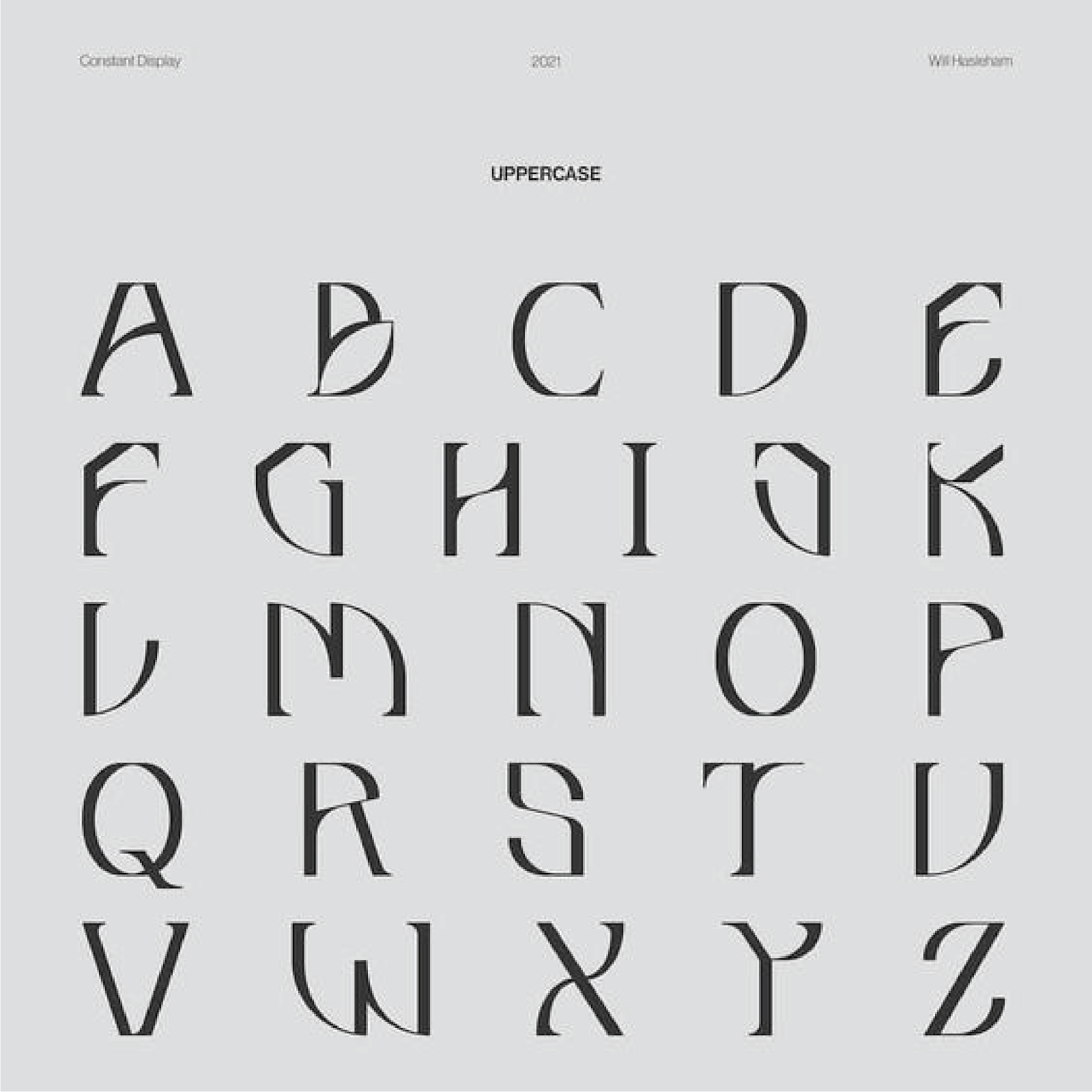
fig 1.9 Fonts Reference JPEG Week 8 (12/06/2024)

fig 1.10 Fonts Reference from a Game Poster JPEG Week 8 (12/06/2024)
I thought the 'x' in this poster was quite cool and I wanna create something similar like this too in my fonts. Here is another one that I've found.

fig 2.0 Fonts Reference from a Game Poster JPEG Week 8 (12/06/2024)
Before I got started with my designs, I decided to use a grid background to help with my designs so I could design them more easily in Illustrator.
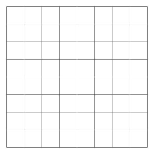
fig 2.1 Grid JPEG Week 8 (12/06/2024)


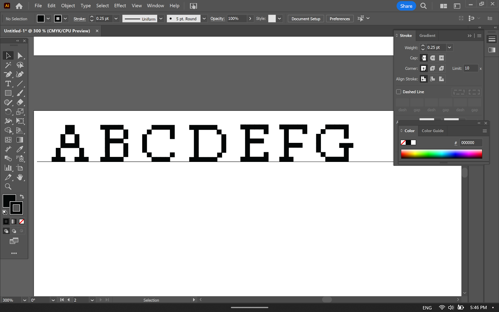
fig 2.2 Design Process JPEG Week 8 (16/06/2024)

fig 2.3 Design Process JPEG Week 8 (17/06/2024)
I thought I could make use of these Minecraft glass blocks on the crossbar of the letterforms on both the uppercase and lowercase.

fig 2.4 Uppercase Attempted JPEG Week 8 (17/06/2024)

fig 2.5 Ascender, x-height, baseline and descender height added JPEG Week 10 (29/06/2024)

fig 2.6 Ascender, x-height, and descender height in the letter 'j' JPEG Week 10 (29/06/2024)

fig 2.7 Ascender, x-height, and descender height in the letter 'e' JPEG Week 10 (29/06/2024)

fig 2.8 Lowercase Attempted JPEG Week 10 (29/06/2024)
I thought some of my lowercase letterforms it's too simple so I tried to improvise it.

fig 2.9 Sketches for the letter 'a' JPEG Week 10 (29/06/2024)

fig 2.10 Sketches for the letter 'e' JPEG Week 10 (29/06/2024)

fig 2.10 Lowercase Attempted JPEG Week 10 (29/06/2024)
Uppercase and lowercase are now done, I went ahead to start with the numbers.

fig 3.0 Sketches for number '3' JPEG Week 11 (30/06/2024)
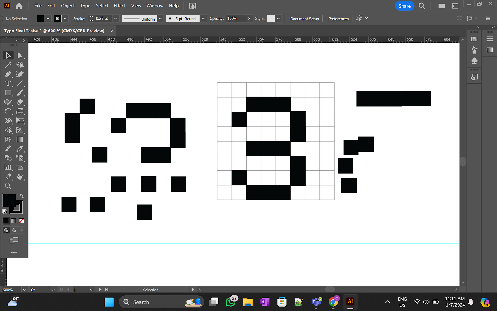
fig 3.1 Process for number '3' JPEG Week 11 (30/06/2024)

fig 3.2 Numbers Attempted JPEG Week 11 (30/06/2024)

fig 3.3 Sketches for numerals '&' JPEG Week 11 (30/06/2024)

fig 3.4 Sketches for numerals '*' JPEG Week 11 (30/06/2024)

fig 3.5 Attempted for numerals JPEG Week 11 (30/06/2024)
'*' It's a bit weird...

fig 3.5 Attempted for numerals #2 JPEG Week 11 (01/07/2024)

fig 3.6 Attempted for numerals #3 JPEG Week 11 (05/07/2024)
After that, I moved my fonts to Fontlab and began the kerning process.


fig 3.7 FontLab Process JPEG Week 11 (05/07/2024)
fig 3.8 Pixelaterif In Font Lab PDF Week 11 (06/07/2024)
fig 3.9 Pixelaterif Fonts PDF Week 11 (06/07/2024)
Font Presentation
These are some of the references for my font presentation.

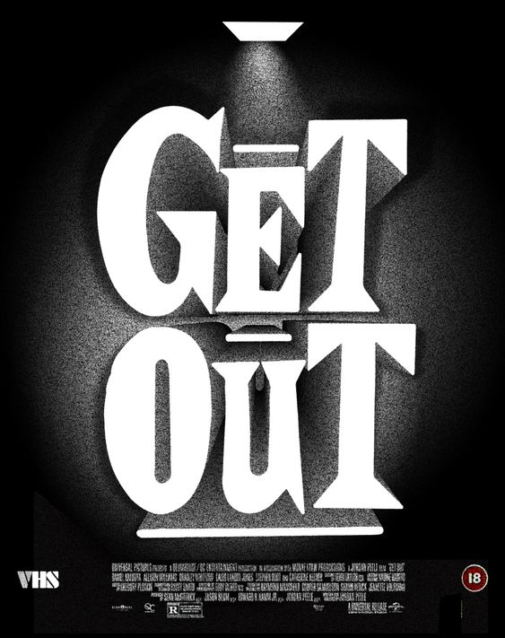


fig 3.10 Fonts Application References JPEG Week 12 (10/07/2024)
I began by finding a background picture on Pinterest... and this is what the original picture looks like but I think it doesn't give the creeps enough so I moved the picture in Photoshop to do some editing and filtering.
 \
\fig 4.0 Original Picture From Pinterest JPEG Week 12 (10/07/2024)


fig 4.1 Editing in Photoshop Process JPEG Week 12 (10/07/2024)
After that, I started to play around with the fonts on this background and for the rest of my fonts presentation as well.


fig 4.2 Font Presentations In Illustrator Process JPEG Week 12 (10/07/2024)

fig 4.2 Font Presentations Attempted JPEG Week 12 (10/07/2024)
After getting feedback from Mr Vinod, I made some changes for the 'Don't Run' and the rest of it as well.


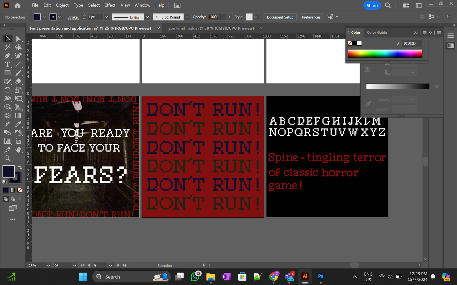
fig 4.3 Process JPEG Week 12 (15/07/2024)

fig 4.4 Final Font Presentations JPEG Week 12 (15/07/2024)
Font Applications
For my font applications, I'm thinking of banners, flyers, CDs, stickers etc...


fig 4.5 Process and Attempted JPEG Week 12 (14/07/2024)
Mr Vinod suggested I put a logo along with the game's name...

fig 4.6 References for Curse Code's Logo JPEG Week 12 (15/07/2024)


fig 4.7 Mockups Editing Process In Photoshop JPEG Week 13 (18/07/2024)
I mainly want to keep my application colour to black and red and just overall want to give out a sense of horror and creepy vibes so for the banner, I used a night view instead of a day view to give out more horror vibes.

fig 4.8 Final Font Applications JPEG Week 13 (18/07/2024)
Final Outcome
Download Pixelaterif Here.

fig 4.9 Pixelaterif Uppercase Forms JPEG Week 13 (18/07/2024)

fig 4.10 Pixelaterif Lowercase Forms JPEG Week 13 (18/07/2024)

fig 5.0 Pixelaterif Numbers & Punctuation Forms JPEG Week 13 (18/07/2024)
fig 5.1 Pixelaterif PDF Week 13 (18/07/2024)
Font Presentation

fig 5.2 Font Presentation #1 JPEG Week 13 (18/07/2024)

fig 5.3 Font Presentation #2 JPEG Week 13 (18/07/2024)

fig 5.4 Font Presentation #3 JPEG Week 13 (18/07/2024)

fig 5.5 Font Presentation #4 JPEG Week 13 (18/07/2024)

fig 5.6 Font Presentation #5 JPEG Week 13 (18/07/2024)
Font Application
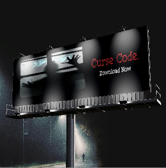
fig 5.7 Font Application #1 JPEG Week 13 (18/07/2024)

fig 5.8 Font Application #2 JPEG Week 13 (18/07/2024)

fig 5.9 Font Application #3 JPEG Week 13 (18/07/2024)
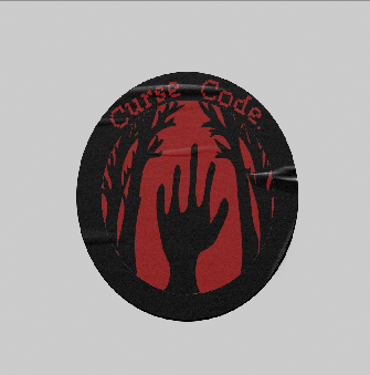
fig 5.10 Font Application #4 JPEG Week 13 (18/07/2024)

fig 6.0 Font Application #5 JPEG Week 13 (18/07/2024)
FEEDBACK
Week 8 (Independent Learning Week)
General Feedback: -
Specific Feedback: -
Week 9
General Feedback: -
Specific Feedback: Topic approved, however, be aware of your design as your topic is quite common and it's everywhere, so do something that makes your design stand out and unique.
Week 10
General Feedback: When having an online session, prepare Illustrator when receiving feedback on your laptop as the lecturer might want to see the process of your artwork. Do take a look at the shared files in teams, this might give you a solution that you haven't thought of. It's not a burden to us but rather to help us.
Specific Feedback: Good job with the letterform, however adding the x-height, descender, and ascender is very important when creating a font.
Week 11
General Feedback: Type out the bracket and compare it to your bracket. After that, move it to font lab. Remember to key in the cap height and the value in font lab before moving all the letterforms. Make sure the preferences, ai thing is turned on before moving your letterforms in font lab.
Specific Feedback: The width is fine, however, the x-height lowercase has to be a bit higher. Make sure the uppercase and lowercase stroke is the same thickness.
Week 12 (Public Holiday)
General Feedback:
Specific Feedback:
Week 13
General Feedback: -
Specific Feedback: Letterforms are great. Fonts in Fontlab are great as well. For the font presentations, try to make it game-ish a little more, maybe like a scene from the game or something. Do play around with the colour schemes, maybe green blue...Consider adding margin around and font to be left-aligned with the second font presentation.
Week 14
General Feedback: -
Specific Feedback: -
REFLECTION
Experience
When I first started this project, I had never thought that a game that I once used to play when I was young would be transformed into an idea for one of my projects. It made it even more fun to make this association with the days of my childhood. The utilised game, with the characteristic pixelated aesthetics, was a gold mine for more intricate inspiration regarding the fonts. Developing these fonts was partly entertaining and partly a task. On the one hand, it was a fascinating process to start designing the shapes and the forms that would help me give life to my ideas. Each of the letters had to be designed ensuring they were true to the pixelated style but were also readable and looked good in the style. This was not an easy task, seeing that it took a lot of time to perfect it. But every time went through stress I was so glad to see that my fonts were coming out the way I had envisioned them.
Observations
I have observed some important things, which helped me to gain deeper insight into Advanced Typography. Thus, referring to my childhood game made the process fun as well as more personal, which contributed to my overall satisfaction with my work. Creating a font that would look good on the computer screen as well as on paper is a very fine line. This was the key to maintaining the style easily legible and mutable in various scales while also becoming a marker of practicality in design. The use of a pixelated font presented another set of issues because each pixel had to be placed in a particular fashion to create the appearance of a font but at the same time still have the basic essence of a pixelated design. I attributed this to the fact that I was constantly adjusting minute details with a view of arriving at that end result. This cyclical process is part of the design profession and reminds us that designing is a long-term endeavour and that people should not be easily discouraged. Thus, by using my fonts on products, I was able to evaluate them in practice which gave useful information on how these fonts can be utilized and to what extent they could be effective. I was also able to get feedback from my fellow students and instructor to make my designs even more refined.
Findings
The process of designing fonts can be a complex one since the fonts have to still be visually beautiful but should not be made so stylised that they can't be read clearly on different media. It is imperative in typography to pay a lot of attention to details since movements on a small level can cause a big change in the general result as well as the discoverability of the font. Developing a perfect font requires trekking and tweaking and they are not an exception to the fact that perseverance and flexibility are some of the key principles of a font developer. Using typeface in real-life items and getting feedback from fellow students and teachers are core practices that allow for shaping the design and its practical functionality.
FUTHER READING
Week 8

fig 1.0 Typography Basics JPEG (10/06/2024)


fig 1.1 Typography Basics JPEG (10/06/2024)
Italics and bold are available in many computer fonts. However, some fonts do not have these styles because they are not meant to be used with them. A common mistake among new designers is to "bold-a-bold" — this means making an extra heavy version by applying the style formatting, or to try and create such types for a letter design that doesn’t support it originally. The problem comes from how when you make the text bolder on your computer, sometimes this action can distort its original characteristics.
Font Styles
Many display, script, and text fonts only come in the "plain" version, even if they appear bold or italic after styling has been applied. Also, in some programs such as PageMaker or FrameMaker, a user could apply any style formatting to a font whether it truly exists or not in that typeface family. For instance: You are working with Times New Roman Regular and want to make it bold by clicking on the bold button in the formatting toolbar; unfortunately, this will not work and should be done by selecting "bold" from the font menu for Times New Roman Italic/Bold.Italic since these variations have been installed along with others of its kind like Light or Condensed styles which may also appear differently under various circumstances depending on implementation. Microsoft Word has been around for a while and it doesn’t have all the fonts installed on your computer; this means you can do anything to text using any type of font irrespective of whether they exist or not. But the printer will only recognize those that actually are. To avoid this problem use weights from the ‘font menu’ instead of selecting styles such as ‘B’ and ‘’ buttons found in the formatting toolbar which might create false bolds if there is no corresponding true bold installed in the current typeface family among other issues. Newer programs like Photoshop, In Design and Illustrator, let users choose from among only those styles which have been installed into their system so far therefore if someone wants to apply let's say ‘bold’ but it is missing then this cannot be possible until such a time when one installs that particular weight whether or not it exists. For instance: You have Gotham Regular and need to make the text bold however unless Gotham Bold has already been installed onto your computer this shall remain impossible until you do so then proceed with selection as required.
Font Families
The term \"font families\" refers to fonts that are designed with the same style but in a different weight. As we mentioned before, many fonts have only one type of weight—regular or plain. But many body-copy fonts offer a variety of styles such as:
- Plain (or Roman)
- Italic (usually Serif font) or Oblique (usually Sans Serif font)
- Bold
- Bold Italic or Bold Oblique
Some typefaces also have other weights, which give the designer(s) more options. In addition, in each weight, an italic or oblique may be included. Popular typefaces will also have condensed and extended that would match the regular width. The weights for a font can go from lightest to heaviest and might include:
- Extra Light, Ultra Light or Extra Thin
- Thin or Light
- Roman or Regular
- Medium or Regular
- Demi Bold or Semi Bold
- Bold
- Heavy, Extra Bold, Black or Super Bold
How these different weights are named is specific to the font designer(s); there is no industry standard here. In one case, the designer may feel a thin font is heavier than a light font, or that an extra bold is heavier than a black. The naming of the standard and condensed fonts might also vary. A \"Book\" weight in the standard version of a font may be titled \"Medium\" in the condensed version.
When one is working with fonts, one wants to be sure to choose from the font menu the correct weight for optimized results. And while it is personally all right to use different fonts from the same family, designers recommend that designers are limited to either one or two categories for font styles for and on a design that is unified.
Week 10
fig 1.2 Typography Basics JPEG (19/06/2024)
fig 1.3 "Typography Basics" Identifying and Selecting a Font JPEG (19/06/2024)


fig 1.4 "Typography Basics" Special Style, Small Caps and All Caps,Special-Purpose Styles,Text Scalling and Outline Shadow JPEG (19/06/2024)
The present excerpt offers an insight into practical application of different font attributes while giving brief background on some terms used in typography. One of the qualitative characteristics of read ability there fore concerns the x-height of the small cases and the contextual relation to the upper and ascender letters. Most specifically, the more the x-height is, with ‘tall ‘lowercase letters, the easier for the reader to go through the text as compared to the usage of fonts with small measures of the x-height. As for the relation between the design of the font and the meaning of the text, this is the main argument that demonstrates the significance of the font’s design in terms of readability. Another important parameter to consider is the arris and extent of descenders – the part of the letters such as ‘g’, ‘j’, ‘p’, ‘q’ and ‘y’ which are printed below the line. Extending or contracting the length of these descenders as well as the curvature could sharply reduce the readability of text.
However, it can be also useful to understand where such terms as ‘uppercase’ and ‘lowercase’ can come from, and they are also connected with the typesetting tradition that was used before; typesetters stored the letters in large cases. They also arranged their work neatly by using capital letters in large albiet and the smaller letters in the low albiet. The language of the new taxation structures that developed over centuries still reflects this historicity.
Special Styles
Computing technology and its effect on typography with a special reference of the added effects. In the past, using a similar technique to generate these effects was a costly affair, which usually someone went to the typesetting house and spent thousands of dollars. Yet these days, the computers have given the common man the ability to easily apply a variety of these specials effects at relatively low costs. This approach of making them easier to produce has, however, led to mistreatment and overapplication, producing text that is hard to comprehend. The effect has to do with how nowadays most design applications provide tools that allow designers to apply special effects indifferently of readability; thus the importance of a rational and controlled usage of such effects. In line with this, one ought to consider the need to achieve a balance between artistic creation and proffering text that is as easily readable as it is artistic.
Underlining
Some of the things erroneous with underlining by many programs. Normally, there are very few ways that a user can alter them, and this may result in the underlines to run close to the letters, making it hard to read. In an ideal world, underlines should be set to below the mass of the text so that they do not act as a barrier to the content. Underlines come in two main styles: This underlining method includes straight (or complete underline) and word underline. A straight underline runs under a block of the text and automatically goes underneath the blank spaces, while a word underline goes under the words and does not highlight the spaces.
Small Caps and All Caps
Small caps can be used for subheads and the first word of a paragraph, but they should be kept to a minimum since they are not very readable when used in large-measure quantities. Using all caps means setting a particular piece of text in capital letters, and it is not advised to use it everywhere since applying it reduces legibility. Writing long sentences in caps is strictly prohibited and so is the use of caps where the intention is to emphasize something. For instance in the example given below caps are used well because it is an email where there are limited options when it comes to formatting.
Special-Purpose Styles
Magnus’s publishing programs also provide many choices of styles for footnotes, references, and formulas used in mathematical norms. The settings often can be adjusted by the users directly, for example the size and the location of the basic characters that define the presentation like the shift baseline and so on.
Text Scaling
As for font control, there is typically interference with the reduction or distortion of the original fonts, and thus the distortion of the condensed and the extended font types. However, the use of a certain number of guideline points distorts the font’s design. Rather than making such changes, it is always good to have either true condensed or extended fonts, or else redesign them totally. There are also such parameters of fonts as vertical stretching, but, in this variant, the change should also be gentle, the main advantage of which is the preservation of the technical side of the type.
Outline and Shadow
Different kinds of outlines, and shadow styles, typically used in the older versions of desktop publishing programs have been utilized and they are rather excessively used and they practically have gone out of fashion in the modern world. Today most programs reimburse these basic environments with the ones that are considerably more stylish and represent a notable change in handling of fonts and typography.
Week 11

fig 1.5 When Typography Speaks Louder Than Words JPEG (03/07/2024)
I found this article online and thought was interesting...
Wise graphic designers enjoy playing with words and finding out how the appearance of types interferes with the meaning of the types. Now, if a message has been to be passed across, then the graphic and the content aspects of any design always have to be well balanced. Rarely, though, designers push the semantic aspect of type as far as the visual aspect, the aspect of the written word which is equal and separate to the semantic aspect. In such things, we just see it, and it speaks for itself; See It Speak For Itself. This article is concerned with identifying the cases when the graphic imagery of type design outweighs meaning.
To further expound on this interaction, you can look at how typography sits on the divide between visual and verbal forms of communication. Visual features include the type of the font and its size and colour and how it is arranged; also, the space between words and lines and are very influential sentiments, tones as well as the ability to grab attention even before one starts to read the actual content. This part propounds the actual text strand in which the Chief comes most directly into play as the relative appeal of the message can be either boosted or compromised by the look of the thing. Striking the right chime entail making sure that the design does not conquer the message, but supplements it in order to produce a maxi that will wangle out the correct message to the audience.
Cal Swan, author of Language and Typography, makes this point well when he says,

fig 1.6 When Typography Speaks Louder Than Words JPEG (03/07/2024)
Let us first define what is meant by the ‘visual language’ and the ‘verbal language’. In professional graphic design visual language indicates semiotic connotations of the appearance of both text and image. In this article, the term ‘visual language was defined concerning the character and significance that arises from the selection of typography. Verbal communication, on the other hand, is the coded nature of the message meaning right from the words, phrases and sentences.
In this first part out of two, I will discuss how typography is a determinant factor that is used to shape meaning. Such cases will be illustrated when verbal language determines visual treatment and vice versa, cases when visual language determines verbal meaning. The choices of fonts will also be discussed to depict that the same message can be provided in different formats to elicit distinct reactions.
As seen, people with different cultural experiences view types differently. Even a skilled and hardworking designer cannot control some important factors that affect the final outcome of designing perception, expectation, knowledge, experience, and preference of the viewer. It is thus helpful for designers to understand these multiple responses, to make effective typographic decisions to reach out to more people.
Week 12
Continue week 11's article...
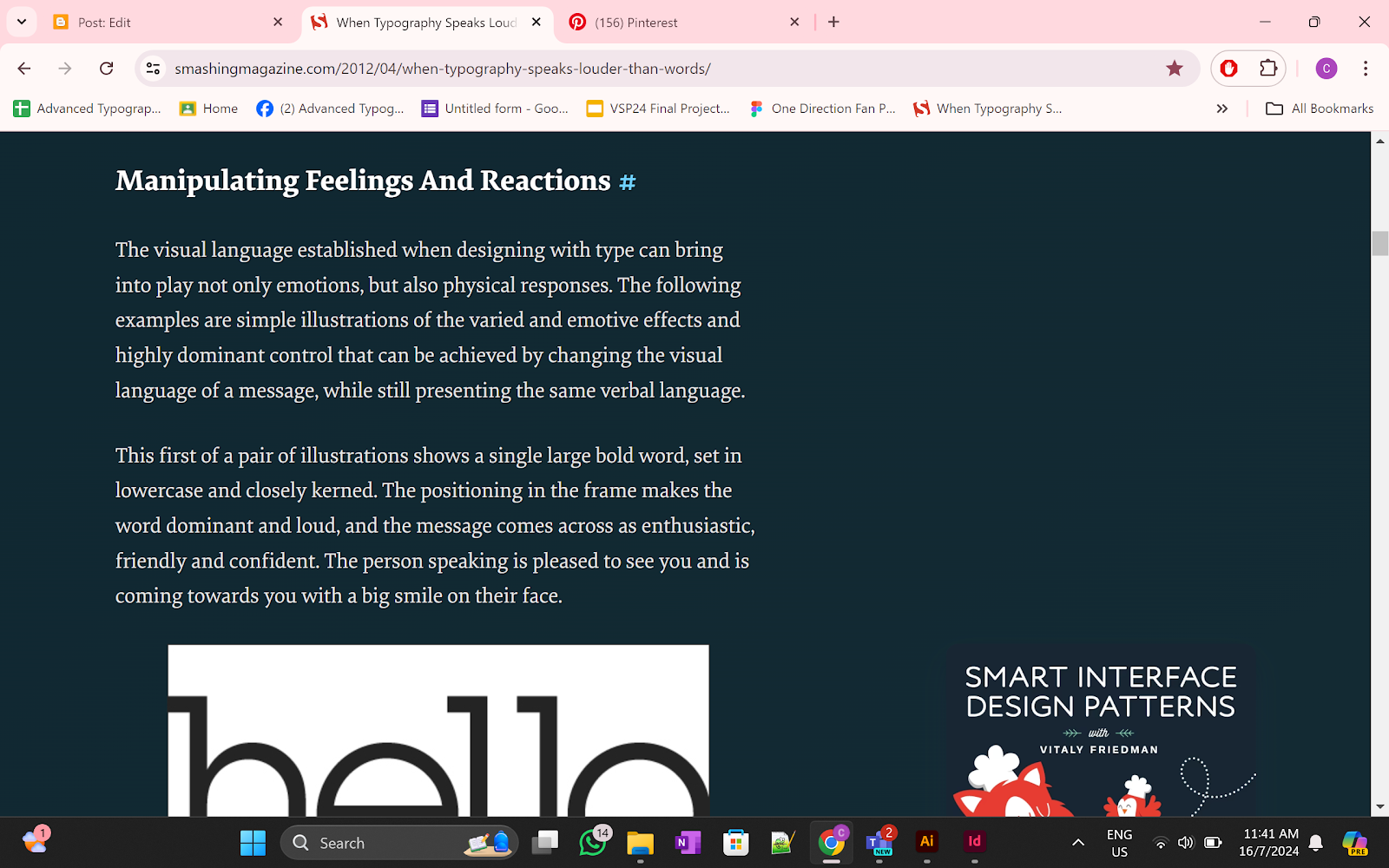
fig 1.7 When Typography Speaks Louder Than Words JPEG (08/07/2024)
Typography can in fact make us feel what we read and even move our physical bodies. The following samples show how changing the nonverbal aspects of a message creates different, emotional impacts and exerts significant influence, without changing the verbal components.
In the first example, the headline of a large, bold, typeface is in lowercase with little space in between the letters. The use of the word is also positioned within the frame giving it a rather loud appearance and this gives the message/word an energetic friendly and confident feel. This is an interesting point; somehow, the speaker is happy to see you and is on their way with a smile on their face.
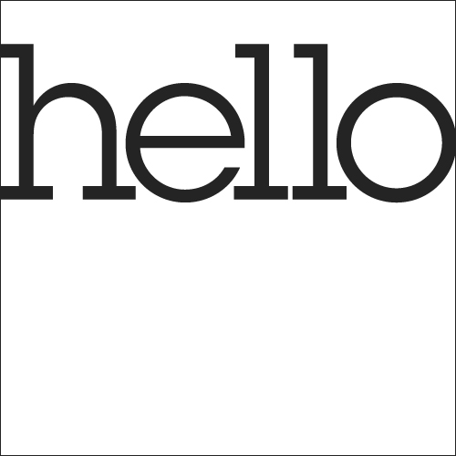
fig 1.8 First Example JPEG (08/07/2024)
The second example is quite the opposite of the first one, although the latter begins with the same word "Hello". The distinction in font style, as well as the use of upper and lower cases as well as the scale, color, and position, express a much more tense message. The speaker seems to hesitate with greetings thus, it feels as if you would rather have the speaker not see you at all.

fig 1.9 Second Example JPEG (08/07/2024)
Making the reader read these examples aloud outpoints the special impact of visual language. The first example would be a raised-voiced cheer, actual happiness, pleasure, friendliness, and a readiness to communicate expressed in words. Reading the first example aloud the same word would be pronounced with relative enthusiasm, confidence and happiness. Therefore, reading the second example aloud, the same word would be read rather quietly almost in a questioning manner. Regarding the modality of pointing there is virtually an infinity of typographic possibilities that can produce variations of tone and voice of a certain thickness or thinness.
Week 13
Continue week 12's article...
Making The Most Of Visual Language
Most of the time, verbal language is employed to pass a message and make motivation and typographic design to achieve a response whereby the reaction of the viewer is optimized. There is a great strategy to combine a design’s implication into its literal sense: the result can be rather striking. Here are the specimens of works that can be an example of inspirations and effects of the verbal language that has been used in guiding the creation of designs:
Our first example is from American graphic designer Herb Lubalin whom Gertrude Snyder and Alan Peckolick wrote in a monograph about him: He was a tenacious typographer, whose graphic concept was the copy, art, and typography and he used available production methods to put emphasis on the drama existing in the message where idea preceded the design.
This quote is appropriate for this article more than any in view of the subject matter tackled by the author. So, it demonstrates Lubalin as a designer who considered words, typography, and layout as a single means of communication. The book continues further to describe that the applied production techniques were not an ostentation, but rather a method that stressed the meaning and message of a project. In the times of Lubalin, such choices meant considerable work by hand, which appears to pose more constraints than in today’s context. Lastly, this quote makes sure that the degree of significance Lubalin gave to the concept was above that of design where according to him, the concept was always before design.
Amongst his many competitions some of which were with the Visual Graphics Corporation in 1964 is an entry that has a quote chosen meticulously from Caskie Stinnett, a US editor and writer.
Thus, such subtlety and restraint in the typographic disposition of the words allow Lubalin to degrade a repulsive message while making its appearance appear pleasant. The quote, “A diplomat is a person who can tell you to go to hell in such a way that you actually look forward to the trip,” has “go to hell” written, in airbrushed, fancy, flowing script. This sort of styling alters the mild profanity of the statement and gives the impression that it is expected and anticipated.
fig 1.10 By Peter Gabor JPEG (16/07/2024)
Hand-lettering designer Alison Carmichael also provides modern cases of typography in managing significance. Her self-promotional advertisement created for the Creative Circle and which won the competition is hand-lettering engraved and inked in a complex way on the cover of an old school desk. At first sight, it looks like a great, perhaps antique example of gothic script, the thing is. However, if, due to the peculiarity of the typographical design, one word is placed next to another, the reader sees the overtones in the text’s significantly less pleasant meaning, proving the extent of the typographical effect.

fig 2.0 Award Winning Self Promotional ad by Alison Carmichael for the creative Circle JPEG (16/07/2024)
Type Tarts is an initiative originating in the UK and whose objective is to inform people of the lives of sex industry in the UK. A call is made to designers to develop type-based promotional fluorescent ‘Tart cards’ for display. In London for instance, most of the working prostitutes continue to use promotional cards posted in the phone booths. These cards have become immensely popular again in light of the Internet, and mobile telephones, and despite the continued police action against the practice, they are collected as works of art.
The examples below are the continuation of the type theme where the authors experiment with the typeface and the typographic arrangement to emphasize the meaning of the shocking message. When it comes to deciphering the cards’ meaning, it is quite clear when situated into the framework of the campaign.

fig 2.1 "Nice and Tight" by Duncan Bancroft JPEG (16/07/2024)

fig 2.2 "Big & Bouncy" by Peter Fletcher JPEG (16/07/2024)
Another perfect example of the language of type is another designer from America who has designed acclaimed music posters or a well known as Jason Munn. For Liars, the work of Bussoli, sections of each letter are strategically eliminated, so the possibility of making a correct guess and see the whole picture is hindered, making the viewer ask, “What is the truth?” The typeface used in this work is characterized by the extreme thin/bold contrast.

fig 2.3 Jason Munn's Poster For The US Band Liars JPEG (16/07/2024)
The designs above incorporate typography in order to amplify the meanings of the statements being made. On the other hand, there is a range of type-based tea towels in the proposed British Battleaxe Collection and their visuals contain quotes of the strong female characters from British comedy shows. These designs rely on bold figures to indicate the speakers’ domineering pitch and purposes.
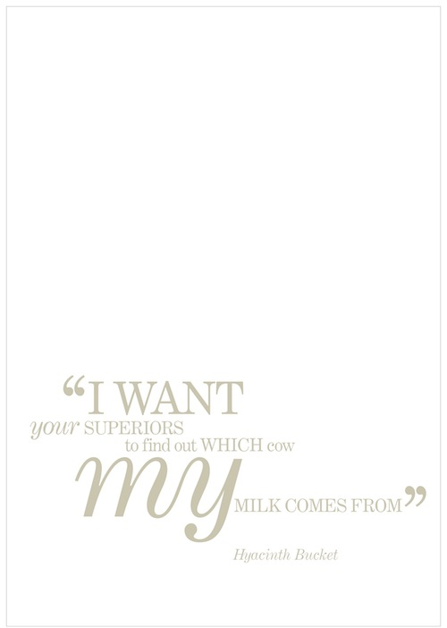
fig 2.4 British Battleaxe Typographic Tea Towel Design JPEG (16/07/2024)
One of them involves a quotation from a BBC situational comedy series known as Keeping Up Appearances; spoken by its main character, Hyacinth Bucket, an ageing, self-opinionated, domineering female who’s obsessed with class. The scale of the words “I want” and “my” was enlarged in contrast to the size of other words, which quite illustrates her desires; In the word “superiors”, the lettercase is large while the lettercase of the word “your” is small, this is because Hyacinth has no regard for other people.
The typeface used in this design is deliberately selected depending on the nature of the character’s personality. Stylish italics and capital letters of a serif work relevant to set the cultural context and the personality of a ‘post-feminism’ or a ‘woman of a certain age. ’ Typography explores emotions like the tone of voice, personality, age, gender and mood; all of which are adjustable. For example, when the Serif font is substituted for a Slab Serif font, the nature of the character and everyone’s emotions are transformed. In turn, the narrator could be described as being less obviously female, younger, and angrier. This example shows why and how the choice of typeface can change the pace and climate very rapidly.
Week 14
Continue week 13's article...
The Power of Typography Cannot Be Underestimated
All the examples discussed in this article demonstrate how typographic treatment works alongside verbal language to create, enhance, and alter meaning. While the aesthetic value of design is always important, the impact of type on influencing meaning should not be underestimated.
The role—and indeed the obligation—of the designer in establishing a tone that adds meaning to the verbal message is frequently debated. Many graphic designers and academics argue that designers have a responsibility to add "flavour" to their work, not only to help convey and enhance meaning but also to make the message enjoyable, engaging, and memorable.


Comments
Post a Comment