Advanced Typography | Task 1: Typographic Systems & Type and Play
22/04/2024 - 06/05/2024 | Week 01 - Week 03
Wong Jia Yi Carmen | 0357198 | Section 03
Advanced Typography | Bachelor Design (Hons) In Creative Media
Task 1: Exercise 1 (Typographic Systems) & Excercise 2 (Type and Play)
Table Of Contents
LECTURES
Week 1: Typographic Systems
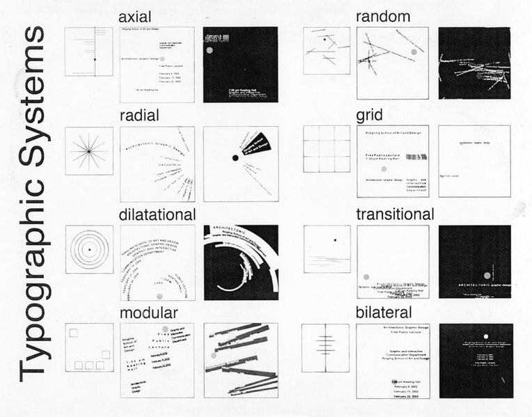
fig 1.0 Typographic Systems JPEG Week 1 (22/04/2024)
Every design is built around a structural framework, of which Elam (2007) states that there are eight 8 versions and an endless number of possible permutations. The following are these eight significant variations:
- Axial
- Radial
- Dilational
- Random
- Grid
- Modular
- Transitional
- Bilateral
"Each component of the typographical organization depends on the others for proper operation, it is a complicated system. Other factors including hierarchy, readability order, contrast, and legibility are also taken into consideration. The typographic systems resemble "shape grammars," as architects put it. The similarities across typographic systems include their own set of norms and feeling of purpose, which serve to concentrate and guide decision-making." (Elam, 2007).
Although some would argue that this imposition diminishes intuition from a teaching perspective, it really offers a flexible framework that enables students to be guided in their investigation as their intuition grows and develops.
Axial Systems

fig 1.1 Axial Systems from Type 365 JPEG Week 1 (22/04/2024)

fig 1.2 Axial Systems from Student Designer Julius Teoh Hoong Boon JPEG Week 1 (22/04/2024)
Radial Systems

fig 1.3 Radial Systems from Type 365 JPEG Week 1 (22/04/2024)
fig 1.4 Radial Systems from Type 365 JPEG Week 1 (22/04/2024)
All elements are extended from a point of focus.
Dilational Systems

fig 1.5 Dilational Systems from Type 365 JPEG Week 1 (22/04/2024)

fig 1.6 Dilational Systems from Student Designer Julius Teoh Hoong Boon JPEG Week 1 (22/04/2024)
Random Systems

fig 1.7 Random Systems JPEG Week 1 (22/04/2024)

fig 1.8 Random Systems from Student Designer Tamara Audrey, Far Right: Vedha Vania JPEG Week 1 (22/04/2024)
Grid Systems

fig 1.9 Grid Systems JPEG Week 1 (22/04/2024)

fig 1.10 Grid Systems from Tamara Audrey JPEG Week 1 (22/04/2024)
Transitional System

fig 2.0 Transitional System from Type 365 JPEG Week 1 (22/04/2024)

fig 2.1 Transitional System from Student Designer Julius Teoh Hoong Boon, Far Right Top: Vedha Vania and Far Right Bottom: Tamar Audrey JPEG Week 1 (22/04/2024)
Modular System

fig 2.2 Modular Systems JPEG Week 1 (22/04/2024)

fig 2.3 Modular System from Student Designer Tamara Audrey, Far Right: Julius Teoh Hoong Boon JPEG Week 1 (22/04/2024)
Bilateral System

fig 2.4 Bilateral System JPEG Week 1 (22/04/2024)

fig 2.5 Bilateral System from Student Designer Tamara Audrey, Far Right Bottom and Below: Vedha Vania JPEG Week 1 (22/04/2024)
Week 2: Typographic Composition
Principle Of Design Composition
When considering composition, we contemplate the fundamental concepts that shape design, such as emphasis, isolation, repetition, symmetry, asymmetry, alignment, and perspective, among others. However, translating these abstract ideas into typographic layouts or compositions can prove challenging. They appear more suited to visual imagery rather than intricate informational units comprised of diverse elements. Applying these principles to actual content -- can be images, text, or colour on a page or screen can sometimes feel disjointed. Nevertheless, some principles are more readily adaptable than others.

fig 2.6 Example Of Emphasis JPEG Week 2 (01/05/2024)
The Rule Of Thirds
The rule of thirds serves as a guideline for photographic composition. Essentially, it proposes that a frame or space can be divided into three columns and three rows. The intersecting lines created by this division are then utilized as guides for positioning points of interest within the designated space.
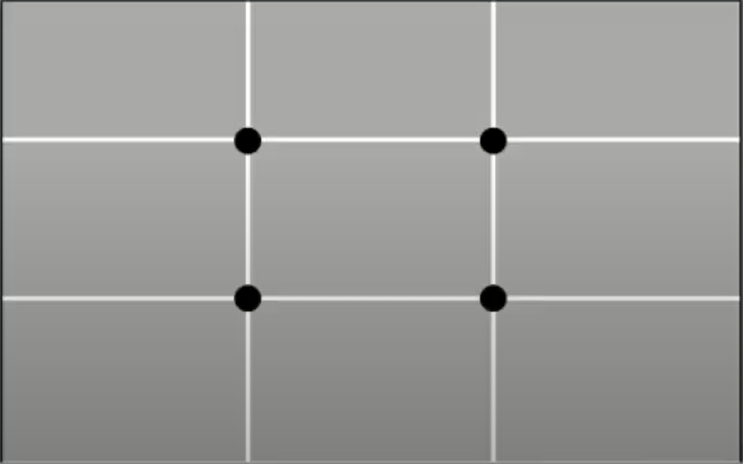
fig 2.7 The Rule OF Thirds JPEG Week 2 (01/05/2024)
In practical terms, the rule of thirds is rarely employed when preferable alternatives exist. Focal points within the layout typically coincide with the intersecting points.

fig 2.8 Example of The Rule OF Thirds JPEG Week 2 (01/05/2024)
Typography Systems
These 8 systems are both theoretical and practical. Among them, the most practical and commonly used is the Grid system (or Raster System), originating from the gridded composition of Letter Press Printing. This system was refined over time and is now associated with what is known as the Swiss (Modernist) style of Typography. Key figures in advancing this style include Josel Muller Brockmann, Jan Tchichold, Max Bill, and others.
fig 2.9 Example of The Grid Systems JPEG Week 2 (01/05/2024)
Despite appearing antiquated or inflexible, the Grid System's inherent versatility and somewhat modular structure enable countless adaptations. It's this characteristic that has sustained its popularity over time.
Younger designers rebelled against the structured Typography of the modernist era, giving rise to the post-modernist movement. They embraced chaos, randomness, and asymmetry, led by figures like David Carson, Paula Scher, and Jonathan Barnbrook. This departure from the traditional order reflected the influence of Punk culture and led to the adoption of asymmetry, randomness, and other unconventional techniques in design.

fig 2.10 Left to Right: Paula Scher, Jonathan Barnbrook and David Carson JPEG Week 2 (01/05/2024)
Other Models / Systems
Environmental Grid
This approach revolves around examining an existing structure or multiple structures and extracting essential lines, whether curved or straight. The designer then arranges information around this overarching framework, incorporating non-objective elements to generate a distinctive blend of texture and visual interest. This method offers an intriguing exploration that contextualizes the forms within the designs. This context arises from developing the system or structures around significant features of the environment relevant to the message communicators.

fig 3.0 Example from lecture Brenda Magmannusof Pratt Inst. from the book: Typographic Form and Communication, pp211 JPEG Week 2 (01/05/2024)
Form and Movement
This system involves exploring existing Grid Systems. Its purpose is to encourage students to delve into the numerous possibilities offered by the grid, to break away from the seriousness typically associated with its application, and to perceive the turning of book pages as a slowed-down animation influencing the arrangement of images, text, and colour. Placing any form on a page, regardless of its nature, across multiple pages generates a sense of movement. Whether the medium is paper or screen is inconsequential.

fig 3.1 Sequential Composition Using The Grid System (follows from one spread to another) JPEG Week 2 (01/05/2024)
In the static rendition, forms were positioned across spreads with the grids concealed. Particular attention was given to creating visual links and unexpected elements on each page. These forms could depict images, text, or colour. In the animated iteration, the book spreads emulate the sequential progression akin to moving frames on a screen.
In these exercises on composition, complexity grows gradually as new elements are introduced step by step: starting with the addition of one colour, followed by images, then dummy text, and so forth.


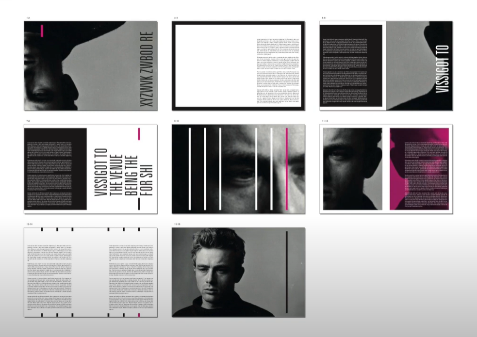
fig 3.2 Progressive Addition of Elements into Sequence JPEG Week 2 (01/05/2024)
Week 3: Context & Creativity
Handwriting
Why is handwriting important in the study of type/typography?
We explore handwriting due to its historical significance, as the earliest mechanically produced letters aimed to replicate its style. Handwriting established the norms for letter shape, spacing, and conventions, which mechanical type sought to emulate.
The appearance and structure of handwritten letters are shaped by the tools and mediums employed in their creation. Various implements such as sharpened bones, charcoal sticks, quills, brushes, and steel pens each imparted distinct qualities to the letterforms.
Furthermore, the choice of writing surface, including clay, papyrus, palm leaves, animal skins (such as vellum and parchment), and paper, also influenced the characteristics of the letterforms.

fig 3.3 The Evolution Of The Latin Alphabet JPEG Week 3 (06/05/2024)
Cuneiform, the earliest known writing system, was utilized across several languages from around the 34th century B.C.E. until the 1st century C.E. Its unique wedge-shaped characters were formed by pressing into moist clay tablets.
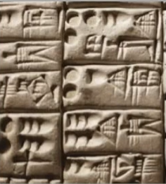
fig 3.4 Cuneiform JPEG Week 3 (06/05/2024)
The Egyptian writing style intertwines with relief carving techniques. This writing system combines both rebus and phonetic characters, representing an early step towards the development of an alphabetic system. Hieroglyphic images serve three distinct functions:
1. They act as ideograms, directly depicting the objects they represent.
2. They serve as determinatives, clarifying that the preceding signs are to be interpreted as pictograms and indicating the general concept of the word.
3. They function as phonograms, representing sounds to phonetically spell out individual words.

fig 3.5 Hieroglyphic 2613-2160 B.C.E JPEG Week 3 (06/05/2024)
Derived from the Egyptian logo-consonantal system, the Phoenicians devised a phonetic alphabet comprising 22 letters. Subsequently, the Greeks adopted this system and incorporated the necessary vowels.
Initially, words might have been arranged in rows, but the reading direction was not yet standardized. Greek text often followed a boustrophedon pattern, akin to how an ox plows a field: one row read from left to right, then the next row from right to left.
The earliest Greek letters were hand-drawn without the aid of compasses or rulers, lacking serifs—neither the casual marks made by a relaxed writer nor the symmetrical strokes typically added by formal scribes.
Over time, these letters evolved, with thicker strokes, reduced apertures, and the emergence of serifs. This new form, widely used in inscriptions across the Greek empire, became a model for formal lettering in imperial Rome. Roman inscriptional letters, created with a flat brush and then carved into stone with a chisel and mallet, have since served as inspiration for calligraphers and type designers over the past two millennia.

fig 3.6 Early Greek / 5th C.B.C.E JPEG Week 3 (06/05/2024)
By the 4th century, Roman letterforms were gradually adopting a more rounded shape, which facilitated faster writing with fewer strokes.

fig 3.7 Roman Uncials Week 3 (06/05/2024)
In England, the uncial script underwent a transformation into a more inclined and deliberate style. While English and Irish uncials progressed, writing on the European continent experienced a significant decline and required reform. Fortunately, this reform was ushered in by the Carolingian Handwriting Reform.

fig 3.8 English Half Uncials, 8th C Week 3 (06/05/2024)
Following the collapse of the Roman Empire, the absence of a centralized, sophisticated culture led to widespread illiteracy and the fragmentation of handwriting into various regional styles. Over the course of 300 years, the practice of writing remained preserved primarily in distant and isolated communities.


fig 3.9 Emperor Charlemage 8C. CE Week 3 (06/05/2024)
Carolingian Minuscule
Under Alcuin of York's direction, a court school was established, and Charlemagne's support led to increased book production and language standardization, including pronunciation, spelling, and writing conventions. The Carolingian minuscule emerged as a new script, unifying communication across the expanding European empire and serving as a model for fifteenth-century Humanistic writing.
What is Gothic?
Gothic represented the pinnacle of artistic expression during the Middle Ages, spanning approximately from 1200 to 1500. The term "Gothic" originated from Italians, who used it to describe cultures they deemed crude or barbaric, particularly those situated north of the Italian Alps.


fig 4.0 Black Letter Week 3 (06/05/2024)
The Italian Renaissance
While the Gothic movement flourished in Western Europe, Humanist scholars in Italy were rediscovering the culture of antiquity. The Renaissance fascination with ancient Greek and Roman culture ignited a surge of creativity in Italian art, architecture, literature, and letterform design.
Humanists were particularly drawn to the Carolingian script for its clear and open handwriting. They referred to the newly rediscovered letterforms as "Antica." The Renaissance's analytical approach to form, evident in art and architecture, extended to letterforms, resulting in a more refined and rationalized design.


fig 4.1 The Italian Renaissance Week 3 (06/05/2024)
Movable Type 11 C. - 14C.
Printing, initially in the form of woodblock printing, had been practised in China, Korea, and Japan as early as the Dharani Sutra in AD 750. The earliest known printed book, the Diamond Sutra, dates back to AD 868 and features the world's first printed illustration on a 16-foot scroll. Despite attempts in China to use movable type, they faced challenges due to the vast number of characters.
In the late 14th century, several decades before the advent of printing in Europe, Koreans developed a method to cast movable type in bronze, enabling the dismantling and resetting of text. Additionally, with the creation of their new script, Han'gul, Koreans succeeded where the Chinese had failed.
In summary, the introduction of movable type occurred between 1000 and 1100 CE, pioneered in China but realized in Korea with the Diamond Sutra. By the late 1300s, decades ahead of European printing, Koreans established a foundry for casting movable type in bronze.


fig 4.2 Movable Type Week 3 (06/05/2024)
Why do we talk about Greek influence on Rome, but not Egyptian or Near Eastern influence on Greece?
During the 19th century and the emergence of the modern British Empire, there was a prevailing tendency to attribute little value to Africa or Africans, leading to the elevation of Greece and Rome over significantly older and more influential civilizations such as Ancient Egypt, as well as other civilizations like Mesopotamia, the Indus Valley, and China.
An illustration of this bias is evident in the establishment of the discipline of "Indology" within European academia. Figures like Max Mueller, who played a central role in this, never physically visited India. Through the lens of colonial perspectives, historical evidence was interpreted in a manner that served their own interests, as seen in the propagation of ideas like the Aryan theory.
Similar biases influenced fields such as Classicism, Egyptology, Africanism, Indology, and Orientalism.
Handwriting
It's noteworthy that later typographers, driven by research, curiosity, and a reverence for history, paid tribute to these historical developments. This led to the writing and publishing of books and the recreation of handwritten styles into mechanical forms for printing.
The advent of the digital revolution prompted the Western world to digitize many of its historical creations, with type foundries producing, marketing, and selling or licensing them. The acknowledgement of the significance of these historical letterforms is something to be appreciated and emulated.
However, with the colonization of the East by the West, much of the heritage and cultural practices in literature, arts and crafts, language, and scripts were either halted or stunted.
The development of Middle Eastern alphabets is significant, particularly with the Phoenician letter marking a pivotal shift towards representing sounds in writing. It's worth considering that the script may have been influenced by Egyptian Hieroglyphics and Hieratic Scripts.

fig 4.3 Evolution Of Middle Eastern Alphabets Week 3 (06/05/2024)
The progression of the Chinese script spans from Oracle bone to Seal Script to Clerical Script, eventually leading to the development of both Traditional and Simplified scripts.

fig 4.4 The Evolution Of The Chinese Script Week 3 (06/05/2024)
The earliest known writing discovered in the Indian subcontinent belongs to the Indus Valley Civilization (IVC) script, dating back to 3500-2000 BCE. However, this script remains undeciphered and appears to have been somewhat logo-syllabic in its structure. Some scholars speculate that these symbols may not have been linguistic in nature.

fig 4.5 Indus Valley Civilization (IVC) Script 3500-200 BCE Week 3 (06/05/2024)
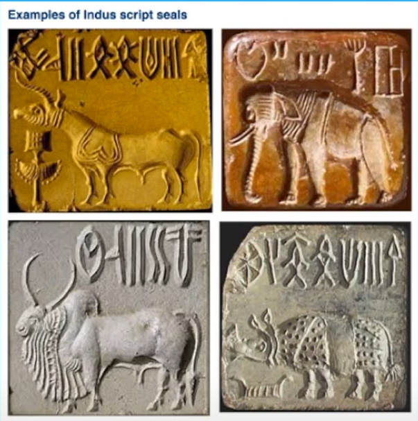
fig 4.6 Example Of Indus Script Seals Week 3 (06/05/2024)
The Brahmi Script, originating between 450-350 BCE, emerged as the earliest writing system in India following the Indus script. Its influence is profound, as it serves as the foundation for numerous modern Indian scripts, as well as several hundred scripts found in Southeast and East Asia.
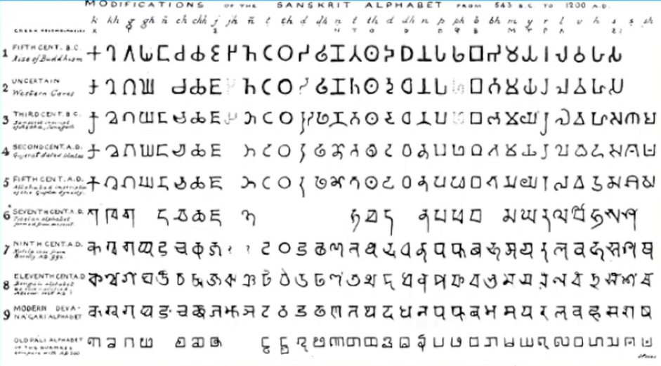
fig 4.7 The Brahmi Script Week 3 (06/05/2024)
Handwriting
The earliest writing systems in Southeast Asia were of Indian origin. Among these, one of the most significant was the Palava script, known as Pallawa in Malay, originating from South India for writing Sanskrit and Tamil. Pallava exerted considerable influence and served as the foundation for various writing systems across Southeast Asia. However, Pallava was not the sole Indian script in use in the Malay Archipelago; another was Pra-Nagari, an early iteration of the Nagari script, employed in India for writing Sanskrit.

fig 4.8 Kedukan Bukit Inscription From Sumatra Week 3 (06/05/2024)

fig 4.9 Pra- Nagari, an early form of the Nagri Script Week 3 (06/05/2024)
Does this mean Nusantara never had writing systems of its own? Were they all just borrowed from India?
What could be considered Indonesia's paramount historical script: Kawi. While it drew from Nagari, it originated within Java. The term "Kawi" stems from the Sanskrit word "kavya," meaning poet. Notably, Kawi served as the script for communication with other kingdoms. Due to its extensive usage, Kawi formed the foundation for scripts in both Indonesia and the Philippines. Consequently, ancient kingdoms in the Malay Peninsula likely employed both Indian scripts and Kawi for writing in the old Malay language.
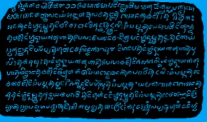
fig 4.10 Laguna Copperplate Inscription Week 3 (06/05/2024)
Fast forward,
Indonesia boasts a vast array of historical writing systems. We should examine the scripts used by communities that integrated into Peninsula Malay societies.
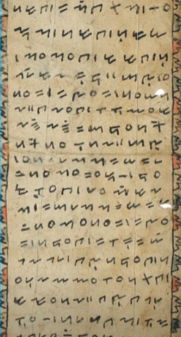
fig 5.0 Incung Week 3 (06/05/2024)
Now for some later examples. This is Incung from Kerinci. This is the "tulisan asal" or original writing system, not Jawi if you have family from Kampung Kerinchi.
---
Jawi, the Arabic-based alphabet, was introduced alongside Islam, but its adoption is more intriguing than simply attributing it to religious conversion. In ancient Hindu societies of South and Southeast Asia, which were often class-based, literacy was typically restricted to the upper classes. Although Islam didn't entirely dismantle this structure, it promoted education for proselytizing purposes.
Muslim traders who were also missionaries likely taught Jawi to people who otherwise might not have learned to read and write. This facilitated the spread of Jawi among the upper and middle classes in trading ports. However, it took some time for Jawi to replace other scripts, and in certain areas, it eventually became the predominant writing system.

fig 5.0 Record Of Sale for a Female Batak Slave to a British Week 3 (06/05/2024)
Demak was a Muslim Javanese kingdom, in modern Malaysia, Jawi holds significant importance as it is the script used for all our renowned literary works, including every hikayat and Malay char book. Unlike Indonesia, Malaysia lacks a substantial collection of pre-Jawi inscriptions and writings. This scarcity partly explains why some people mistakenly claim that Jawi is the 'original Malay script,' which is not accurate.

fig 5.1 Manuscript From The 19th Century which still uses Traditional Javanese Week 3 (06/05/2024)
Programmers and Type Design
Software giants like Google are producing more vernacular scripts, thanks to their employment of numerous Asian programmers and designers. Increasingly, vernacular and 'multi-script' typefaces—a term coined by Muthu Nedumaran—are being developed to address situations where written content is presented in both vernacular and Latin scripts.
fig 5.2 Baloo Week 3 (06/05/2024)
Local Movements and Individuals
In Malaysia, Muthu Nedumaran, a programmer and typographer, led Murasu.com. Muthu developed the programming language necessary to support various vernacular writing systems, which is now used in mobile phones and desktops.
Huruf, a local group of graphic designers, focuses on the localized lettering of Latin and vernacular scripts found on walls and signage. They are a leading organization in digitizing and revitalizing typefaces in Malaysia. In India, Ek Type and the Indian Type Foundry have made significant advancements in developing vernacular typefaces. In Southeast Asia, the movement for developing vernacular typefaces has not yet been organized and coordinated effectively. However, growing awareness and examples from larger neighbouring countries like India, with their vast talent pool and resources, have made the knowledge of methods and approaches more accessible.
Creativity and originality are often intertwined. It is crucial for young designers to look inward and examine their own histories, civilizations, cultures, and communities. This reflection allows them to bring past developments into the future and build upon them, rather than blindly adopting cultures and innovations that lack context, reliability, or relevance. Creativity and inspiration should start with observing our surroundings and exploring our collective histories.
INSTRUCTION
fig 1.0 Advanced Typography Module Information PDF Week 1 (22/04/2024)
Task 1 / Exercises: Typographic Systems & Type & Play
Timeframe: Week 01 - Week 03
Deadline: Week 04
The exercises are as follows:
1) Typographic Systems (1 Week)
• Axial, Radial, Dilatational, Random, Grid, Modular,
Transitional and Bilateral
2) Type & Play Part 1 & 2 (2 Week)
1. Typographic Systems
We were given 8 Typographic Systems to explore using a given content.

fig 1.1 Given Content JPEG Week 2 (01/05/2024)
1. Axial System
Axial System seemed very interesting to me, especially the composition, so I decided to go to Pinterest to find some inspiration.

fig 1.2 Inspiration for Axisl System JPEG Week 2 (01/05/2024)
I wanna play around with the layout based on this picture. The elements especially caught my eye and I thought to give it a try.

fig 1.3 Progession for Axial System JPEG Week 2 (01/05/2024)
2. Radial System


fig 1.4 Inspiration For Radial System JPEG Week 2 (01/05/2024)
I thought I could use the circle from the inspiration picture from Axial System for my Radial System and these 2 pictures are mainly my inspo for the Radial System.

fig 1.5 Progression For Radial System JPEG Week 2 (01/05/2024)
3. Dilational System


fig 1.6 Inspiration For Dilational System JPEG Week 2 (01/05/2024)
I wanna keep my layout clean though unlike the inspo picture...

fig 1.7 Progression For Dilational System JPEG Week 2 (01/05/2024)
4. Random System
Since it's literally called a 'Random' system. I decided to just have fun with it with the messiness and the layout.


fig 1.8 Inspiration For Random System JPEG Week 2 (01/05/2024)

fig 1.9 Progression For Random System JPEG Week 2 (01/05/2024)
5. Grid System
The bold yellow line was kinda cool...


fig 1.10 Inspiration For Grid System JPEG Week 2 (01/05/2024)

fig 2.0 Progression For Grid System JPEG Week 2 (01/05/2024)
6. Transitional System
The curviness really caught my eye so I thought of making something like a worm shape...


fig 2.1 Inspiration For Transitional System JPEG Week 2 (01/05/2024)

fig 2.2 Progression For Transitional System JPEG Week 2 (01/05/2024)
7. Modular System

fig 2.3 Inspiration For Modular System JPEG Week 2 (01/05/2024)

fig 2.4 Progression For Modular System JPEG Week 2 (01/05/2024)
8. Bilateral System

fig 2.5 Inspiration For Bilateral System JPEG Week 2 (01/05/2024)

Final Outcome:

fig 2.7 Axial System JPEG Week 2 (01/05/2024)

fig 2.8 Radial System JPEG Week 2 (01/05/2024)

fig 2.9 Dilational System JPEG Week 2 (01/05/2024)

fig 2.10 Random System JPEG Week 2 (01/05/2024)

fig 3.0 Grid System JPEG Week 2 (01/05/2024)

fig 3.1 Transitional System JPEG Week 2 (01/05/2024)

fig 3.2 Modular System JPEG Week 2 (01/05/2024)

fig 3.3 Bilateral System JPEG Week 2 (01/05/2024)
fig 3.4 Final Outcome With Grids PDF Week 2 (01/05/2024)
fig 3.5 Final Outcome With Grids PDF Week 2 (01/05/2024)
2. Type & Play Part 1 & 2
Task info: Finding type -- We are asked to select an image of a man-made object. Then we have to dissect and identify letterforms from the image we've picked.
This is an image that I've found on Pinterest, and I thought it could be fun to begin with. I immediately saw some letterforms and began extracting them.
Extracting Letterform and Selecting A Typeface For Reference:

fig 3.6 Image From Pinterest JPEG Week 2 (02/05/2024)
I used the pen tool from Illustrator and traced out all the letterforms that I could see.

fig 3.7 Letterform extraction JPEG Week 2 (02/05/2024)
There are quite several letterforms that I've found in this image but I decided to only choose 4 of them. Which is K, A, E, and P.

fig 3.8 Extracted Letterforms JPEG Week 2 (02/05/2024)

fig 3.9 Dissected Letterforms JPEG Week 2 (02/05/2024)
After that, I began by choosing the typeface for reference from the 10 fonts provided from the last semester during Typography. I decided to go for Bembo Std (Bold Italic).

fig 3.10 Letterforms Referenced In Bembo Std (Bold Italic) JPEG Week 2 (02/05/2024)
Before I started on refinement, I did a rough sketch of how I wanted my final letterforms to be, so I could visualise it better and also work better.

fig 4.0 Final Outcome in sketch JPEG Week 2 (02/05/2024)
Refinement

fig 4.1 Adjusting the width and height JPEG Week 2 (02/05/2024)
After that, I started to adjust the height and the letterforms using the Curvature Tool and Anchor Point Tool. I wanted my letterforms to keep their original stage as close as possible and keep the curvy and the fatness.

fig 4.2 Process of Adjusting JPEG Week 2 (02/05/2024)

fig 4.3 Letterforms Height and Weight Adjusted JPEG Week 2 (02/05/2024)
Here I tried to straighten the letterforms while also maintaining their original state as close as possible. Next, I wanted to add serif to the letterforms.

fig 4.4 Letterforms Straighten JPEG Week 2 (02/05/2024)
The Anchor Point Tool and The Curvature Tool really helps a lot when it comes to dissecting the serif on my letterforms. When dissecting the letter 'P', I used the knife tool to cut off the connecting point.


fig 4.5 Process of Adding Serif and Cutting the Connecting Point On The Letter 'P' JPEG Week 2 (02/05/2024)

fig 4.6 Serif Added To My Letterforms JPEG Week 2 (02/05/2024)
I adjusted using the pointy part of the letter 'K' and transformed it into serif and some more adjustments here and there.

fig 4.7 Comparison Between The Original Extraction and Outcome JPEG Week 2 (02/05/2024)
For the letter 'A' I only adjusted the width of the letter while still keeping the curve and adding serif to it.

fig 4.8 Comparison Between The Original Extraction and Outcome JPEG Week 2 (02/05/2024)
Each of the strokes of the letter 'E' is long so I tried to shorten it.

fig 4.9 Comparison Between The Original Extraction and Final Outcome JPEG Week 2 (02/05/2024)
I like the letter 'P' the most as I think it's quite unique. Here I cut off the connecting point with the Knife tool.

fig 4.10 Comparison Between The Original Extraction and Final Outcome JPEG Week 2 (02/05/2024)

fig 5.0 Overall Look JPEG Week 2 (02/05/2024)
After receiving feedback from Mr Vinod, he thinks I need to improve more on the letters 'E' and P' as it is very far from my chosen picture and they do not look synced together.
I tried to reference from my letters 'K' and 'A'.
Final Results

fig 5.1 Final Letterforms JPEG Week 3 (06/05/2024)
Showcase
We were to select a related image that complements our letterforms, I tried to look something similar in Pinterest and this is my Picture.

fig 5.2 Choosen Picture JPEG Week 3 (06/05/2024)


fig 5.3 Process JPEG Week 3 (06/05/2024)

fig 5.4 Process JPEG Week 3 (06/05/2024)
Receiving Feedback from Mr Vinod, he said that the contrast of my fonts could be better rather than just slapping on white fonts. The image can be darker
And I made my changes.
Final Results

fig 5.5 Final Poster JPEG Week 4 (06/05/2024)
FEEDBACK
Week 1
General Feedback: Start by sketching out the layout for each of the typographic systems, and experience it. Remember to complete all the necessary lectures in your e-portfolio. Refer to videos for a fresh start.
Personal Feedback: -
Week 2
General Feedback: Make sure the portfolio is tidy and includes futher reading and the necessary lectures. A different section is required.
Personal Feedback: -
Week 3
General Feedback: It is okay if you want to add something in your fonts but make it make sense. Make sure the final result of your font is still related to the picture you've choosen.
Personal Feedback: The letters 'K' and 'A' are good. However, the letters 'E' and 'P' are very far from your choosen picture, so try to reference them from your letter 'E and 'P' and refine it a little bit.REFLECTION
Experience
My experience with typography exceeded my expectations of diversity and complexity during semester 1 back then. I anticipated a challenging journey, knowing typography involves more than just arranging letters—it's a blend of art, psychology, and communication. I was worried that Advanced Typography was gonna be more challenging. While the journey ahead may be long and arduous, I am reminded that every step forward brings me closer to a deeper understanding of advanced typography.
Observation
Going through the intricate process of looking for means of advanced typography among which, one has to put a lot of effort into finding interesting ways of metamorphosing letterforms from images. Such a process has been the same as for an archaeologist who digs up unknown treasures on the surface of the visual landscape. The skill of pointing out and separating typographic works of art from pictures has evidently sharpened my eye for the details as well as revealed my love for intricate classifications of typography.cTo experiment with our handwritten forms, the handmade movie poster has been the fun part of this learning process. This process gives me the excitement of a puzzle where the letterforms become like pieces with distinct characters and attributes to determine the overall character and visual appeal of the final product. Taking risks with the contrasts was a turning point for me because of the fact that it enabled me to regulate the visual hierarchy and accentuate some effects which were important.
Findings
I’ve made some crucial discoveries due to the type of advanced typography research I have been doing. The first step to the visual perception is where I actually make letterforms from the pictures which I, unintentionally, have intensified my ability to analyze typography from different perspectives. Then again, I discovered the ability to be creative and adapt to different situations by doing some artistic design of the movie letters that can be used in conveying messages and emotions. Finally, the shape-up the one of a very important role in the area of the establishment of visual hierarchy, emphasis, and mood of a composition is also revealed by this experimentation. Moreover, the step has brought in daring experiments and stirred curiosity and innovation which have gone far as to break with traditional notions of design allowing space for new playful channels of creative expression.
FURTHER READING
Week 1

fig 1.0 Typography Basics JPEG Week 1 (22/04/2024)

fig 1.1 Typography Basics JPEG Week 1 (22/04/2024)
In Mono-Spaced fonts, the majority are proportionally spaced, meaning smaller characters occupy less space compared to larger ones. For instance, "i" is narrower than "M". However, monospaced fonts, often resembling typewriter-style fonts, allocate equal space to each letter regardless of its size.
Dingbats are decorative symbols used to enrich text or page design. Although Zapf Dingbats and Wingdings are widely recognized, numerous other designs exist, numbering in the hundreds or even thousands.
Week 2

fig 1.2 Finding Type: A Novel Typographic Exercise JPEG Week 2 (01/05/2024)
The passage talks about how typography education has evolved at Taylor’s University's Design School. Before, students only had one semester to learn typography, which wasn't enough. So, Mr Vinod introduced an Advanced Typography module in the new Creative Media programme. This module helps students develop skills in typography for various fields like UI/UX, graphic design, and animation.
The curriculum focuses on tasks like "Finding Type," where students explore unique typefaces used in movies, games, and animation. These typefaces are crucial for branding and can even become iconic. Overall, the passage stresses the importance of adapting typography education to match the demands of modern media.

fig 1.3 Colours extracted from images to form a colour palette. An Exercise by Kua Ruo Yan JPEG Week 2 (01/05/2024)
1. Finding an image: This step involves selecting a visual source that possesses distinct and preferably repetitive characteristics. The image could depict either natural elements like landscapes or manmade objects like buildings or machinery.

fig 1.4 Images JPEG Week 2 (01/05/2024)
2. Deconstructing an image: Once an image is chosen, it needs to be broken down into its fundamental components. This involves analyzing the shapes, lines, and forms present within the image.

fig 1.4 Example Of Deconstructing an Image JPEG Week 2 (01/05/2024)
3. Identifying letterforms: From the deconstructed elements of the image, the designer identifies shapes or patterns that resemble or can be adapted into letterforms. This involves recognizing potential letters within the visual elements.

fig 1.5 Example Of Identifying Letterforms JPEG Week 2 (01/05/2024)
4. Extracting Letterforms: Once letterform candidates are identified, they are extracted or isolated from the rest of the image. This separates them for further manipulation and refinement.

fig 1.6 Example Of Extracting Letterforms JPEG Week 2 (01/05/2024)
5. Identify A Reference: At this stage, a reference or template is identified for the letterforms. This could be a specific font or typographic style that the designer aims to emulate or modify.

fig 1.6 Example Of Identify A Reference JPEG Week 2 (01/05/2024)
6. Refining Letterforms: The extracted letterforms are refined and adjusted to align more closely with the chosen reference. This may involve tweaking the shapes, proportions, and details to enhance legibility and aesthetics.

fig 1.6 Example Of Refining Letterforms JPEG Week 2 (01/05/2024)
Week 3

fig 1.7 Typography Referenced JPEG Week 3 (06/05/2024)

fig 1.8 Type History and Timeline JPEG Week 3 (06/05/2024)
Fifth Century BCE
Greek lapidary letters, carved into hard surfaces such as stone and marble, represent one of the earliest formal uses of Western letterforms. Originating around the 8th century BCE, the Greeks adopted and modified the Phoenician alphabet, introducing vowels and creating a script suited to their language. These letters, characterized by their geometric precision and clear, readable forms, were used for monumental inscriptions, public decrees, and grave markers. Variations emerged across different Greek city-states, but by the Classical period, the letterforms became more standardized. The Greek alphabet laid the foundation for the Latin alphabet, which the Romans adapted and spread throughout their empire, influencing the development of Western writing. The legacy of Greek lapidary letters endures in modern typographic design, reflecting their historical significance and aesthetic influence.Second Century BCE
Roman lapidary letters, influenced by ancient Greek forms, signify a transitional period in the evolution of Western letterforms. Carved into durable materials like stone and marble, these letters exhibit a balance of straight lines and curves, characterized by symmetry and elegance. Examples such as the inscriptions on Trajan's Column showcase the precision and beauty of Roman letter carving, reflecting their importance in public communication and record-keeping. The proportions and aesthetics of Roman lapidary letters have left a lasting impact on modern typography, with many contemporary serif fonts drawing inspiration from their classical elegance. This enduring legacy underscores their significance in shaping the visual language of Western civilization.
First Century BCE
Roman monumental capitals are not only the foundation of Western typedesign but also the ancestors of all serif typefaces. These majestic letters, with their balanced proportions and distinctive serifs, were carved into stone monuments during the Roman Empire. Their influence can be seen in contemporary serif fonts, highlighting their enduring legacy in shaping Western typography and visual communication.
Fourth and Fifth Centuries CE
During this time period, square capitals emerged as formal hand-written letters, evolving from the Roman monumental capitals. Square capitals maintained the monumental style's geometric precision and clarity but were adapted for handwritten manuscripts. These letters were characterized by their square, block-like shapes and were commonly used in important documents, religious texts, and official inscriptions. The transition from monumental capitals to square capitals marked a shift in letterforms from monumental inscriptions to handwritten manuscripts, reflecting changes in writing practices and the evolution of Western writing systems.
Eighth through Eleventh Centuries
Thanks to Charlemagne, Carolingian minuscule became the basis for the standard lowercase alphabet. Carolingian minuscule was a script developed during the Carolingian Renaissance under the direction of Charlemagne and his advisors. It was characterized by its clear, legible forms and uniformity, which facilitated the copying and dissemination of texts across the Carolingian Empire. This script laid the foundation for the modern lowercase alphabet, introducing innovations such as ascenders and descenders, which improved readability and paved the way for the development of movable type printing. The influence of Carolingian minuscule on subsequent scripts and typefaces underscores its importance in the history of writing and typography.


Comments
Post a Comment