Advanced Typography | Task 2 (A) & 2 (B) - Key Artwork & Collateral
13/04/2024 - 06/06/2024 | Week 04 - Week 07
Wong Jia Yi Carmen | 0357198 | Section 03
Advanced Typography | Bachelor Design (Hons) In Creative Media
Task 2(A) & 2(B) : Key Artwork
Table Of Contents
LECTURES
Week 4: Designing Type
So why design another typeface? Xavier Dupre (2007) in the introduction of his typeface Malaga suggested two reasons for designing a typeface:
- Type Design carries a social responsibility so one must continue to improve its legibility.
- Type Design is a form of artistic expression.
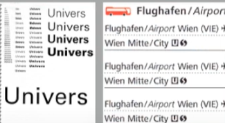
fig 1.0 Left: UNIVERS by Adobe Illustrator, InDesign (2015). Right: Airport Signage using Frutiger Week 4 (14/05/2024)
Adrian Frutiger, a prominent Swiss graphic designer of the twentieth century, excelled in typeface design. He is credited with significantly advancing typography, creating notable typefaces such as Univers and Frutiger. The Frutiger typeface, a sans serif font, was designed by Adrian Frutiger in 1968 for the newly constructed Charles de Gaulle International Airport in France.
Purpose: The aim of this typeface was to develop a clear, distinctive, and easily readable font that would be visible both up close and from a distance, prioritizing functionality.
Considerations/Limitations: The letterforms had to be legible even in low light or when viewed by people moving quickly past the signs. Frutiger tested the typeface with blurred letters to ensure they remained identifiable.

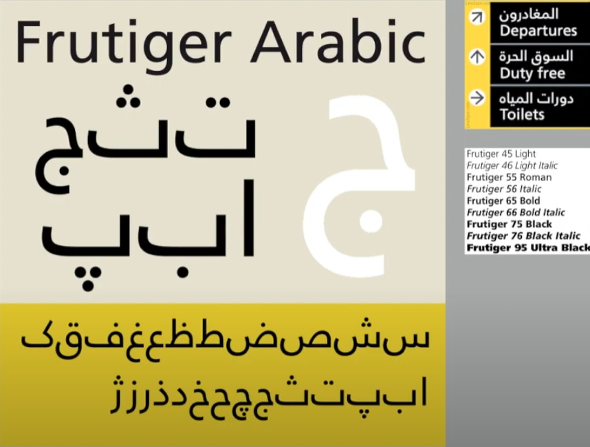
fig 1.1 UNIVERS by Adobe Illustrator, InDesign (2015). Week 4 (14/05/2024)
Adrian Frutiger received numerous accolades, but he considered his experience at a university in Varanasi, the "holy city of India," to be the highest honour, even though it came without medals or certificates. At the request of the Indian Design Institute, he created a new Devanagari font suited for modern typesetting and printing. His objective was to simplify the sacred characters while preserving their ancient calligraphic essence. As Frutiger waited on the cool floor of a high-vaulted university room, surrounded by religious dignitaries in ceremonial attire, a group of "wise men" spent considerable time evaluating his initial draft. Eventually, they delivered their verdict: they "approved" his new Devanagari design and felt it did not "desecrate something that was, for them, sacred.

fig 1.2 Adrian Frutiger at the National Institute of Design (NID), India 1964 Week 4 (14/05/2024)
Matthew Carter, son of Harry Carter, a Royal Designer for Industry and esteemed British type designer, is a contemporary type designer and master craftsman. Carter trained as a punchcutter under Paul Radisch at Enschede, managed Crosfield's typographic program in the early 1960s, and served as Mergenthaler Linotype's house designer from 1965 to 1981. Many of Carter's fonts were developed to address specific technical challenges, such as those presented by early computers. An example is Verdana (1996), created for Microsoft.
Purpose: Verdana was designed to be highly legible even at very small sizes on screens, catering to the increasing use of the internet and electronic devices.
Consideration/Limitation: Verdana's design is influenced by the pixel rather than traditional tools like the pen, brush, or chisel. It addresses commonly confused characters, such as the lowercase i, j, and l.

fig 1.3 Gorgia(TopRight) and Verdana(BottomLeft) Week 4 (14/05/2024)

fig 5.7 Bell Centennial Week 4 (14/05/2024)
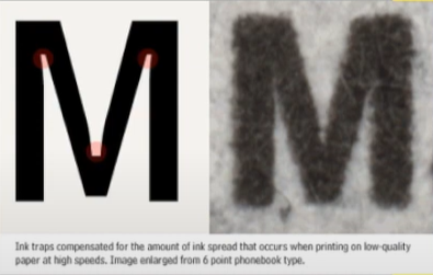
fig 1.4 Comparison between Font and Printed Week 4 (14/05/2024)
Edward Johnston created the highly influential London "Underground" typeface, later known as "Johnston Sans," in 1916. He was tasked with designing a typeface that embodied "bold simplicity," combining modernity with traditional elements. Johnston's design achieved this by blending classical Roman proportions with a humanist warmth.
Purpose: The London Underground Railway commissioned calligrapher Edward Johnston to develop a new typeface for its posters and signage. He provided detailed examples of letter shapes that would influence printed text up to the present day.
Consideration/Limitation: Johnston's goal was to unify the various companies within the London Underground Group, which used the same rails and tunnels but had disparate advertising and signage. The existing signage was a chaotic mix of different letter styles. Johnston used the proportions of Roman capital letters to root his typeface in history and traditional calligraphy while ensuring it had the elegance and simplicity suited for the modern era.

fig 1.5 Typeface By Edward Johnston Week 4 (14/05/2024)
General Process of Type Design:
- Research
When designing type, it's essential to understand type history, anatomy, and conventions, as well as terminologies like side-bearing, metrics, and hinting. It's crucial to define the typeface's purpose and the specific applications it will be used for, such as school buses or airport signage. Additionally, examining existing fonts currently in use can provide inspiration, ideas, references, context, and insights into usage patterns.
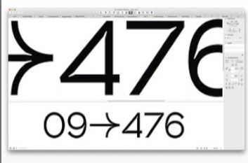
fig 1.6 In traps Week 4 (14/05/2024)
- Sketching
Certain designers prefer to sketch their typefaces using traditional tools like brushes, pens, ink, and paper before scanning them for digitalization. They feel more confident and have better control using these tools.
Others opt to sketch their typefaces digitally using tools like Wacom tablets directly within font design software. While this method is quicker, more persistent, and consistent, it can occasionally hinder the natural flow of hand strokes. Each approach has its advantages and drawbacks.

fig 1.7 Sketch of Johnston Sans, designed by Edward Johnson Week 4 (14/05/2024)
- Digitization
Several professional software programs are employed in the digitization process of typefaces, with leading options including Fontlab and Glyphs App. Some designers utilize Adobe Illustrator to create or refine letterforms before importing them into specialized font applications. However, this approach is criticized by purists. During this stage, it's crucial to not only focus on the overall form of the typeface but also on the counter form. The readability of the typeface greatly relies on both aspects.

fig 1.8 Glyphs and FontLab Week 4 (14/05/2024)
- Testing
Testing plays a crucial role in the design thinking process. The outcomes of testing contribute to refining and correcting various aspects of the typeface. Prototyping is integral to testing and provides valuable feedback.
The readability and legibility of a typeface are significant considerations, particularly based on its category (display or text type). However, if the typeface falls into the display category, where expressing form is prioritized to some extent, readability and legibility may not be as critical.

fig 1.9 Prototype Stencil (Stenz) developed and designed by Vinod J.Nair Week 4 (14/05/2024)
- Deploy
Even after a typeface is deployed, unforeseen issues may arise that were not evident during the prototyping and testing phases. Therefore, the need for revision persists even after deployment. Rigorous testing is crucial to ensure that any emerging issues remain minor in nature.

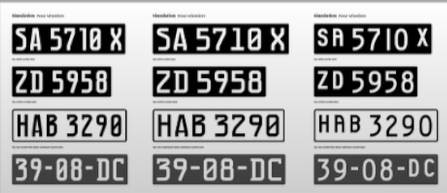
fig 1.10 Prototype Number Plate Typeface Myno & Nomy developed and designed by Vinod J.Nair Week 4 (14/05/2024)
Typeface Construction:
Roman Capital: The grid comprises a square enclosing a circle that touches the corners of the square at four points. Inside the square, there is a rectangle positioned centrally, measuring three-quarters the size of the square. Therefore, employing grids with circular forms can simplify the construction of letterforms and is a viable method for their creation and design.
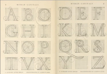
fig 2.0 Construction Grid For The Roman Capital Week 4 (14/05/2024)
Construction and Considerations:
The 26 characters of the alphabet can be organized into groups based on their form and structure. These groups typically distinguish between uppercase and lowercase letters.

fig 2.1 Classification According To Form and Construction Week 4 (14/05/2024)
When designing a new typeface, various forms and constructions need consideration. One crucial visual adjustment involves ensuring that curved forms extend appropriately beyond both the baseline and cap line. This principle also extends to aligning curved and straight forms vertically.
Another visual correction concerns the spacing between letters. It's insufficient to merely place letters adjacent with equal spacing between them. Instead, adjustments must be made to achieve a uniform "visual" white space between letters, a process known as "fitting" the type.
Week 5: Perception and Organisation
Perception is defined as "how something is regarded, understood, or interpreted." This raises the question: Is perception based on what you directly see and comprehend, or is it influenced by external factors shaping your understanding? In typography, perception involves how a reader visually navigates and interprets content through elements like contrast, form, and organization. This content can be textual, visual, graphical, or involve colour. But how does contrast function in this context, and what does form encompass?
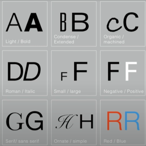
fig 2.2 Example Of Contrast by Rudi Ruegg Week 5 (24/05/2024)
Contrast
There are various techniques in typography to create contrast, with the method on the left being developed by Rudi Ruegg. These methods are straightforward and easy to understand.
Carl Dair, on the other hand, introduces two additional principles—texture and direction—to enhance design clarity and impact using contrast in typography. Dair outlines seven types of contrast (many of which overlap with Rudi Ruegg's concepts, albeit with different terminology)
1. Size
2. Weight
3. Form
4. Structure
5. Texture
6. Color
7. Direction
These principles aim to make the design stand out clearly and stylishly.

fig 2.3 Example Of Contrast by Carl Dair Week 5 (24/05/2024)
Contrast In Size
Contrast in size captures the reader's attention by creating a focal point. For instance, when there is a large letter next to a small one, the large letter naturally draws the eye first. This technique is commonly used to make titles or headings significantly larger than the body text, ensuring they stand out.

fig 2.4 Example Of Contrast In Size Week 5 (24/05/2024)
Contrast In Weight
Weight refers to how bold type can stand out amidst lighter type of the same style. Besides using bold text, incorporating elements like lines, spots, or squares can also create a "heavy area" that serves as a strong visual focal point or emphasis, providing contrast not just through varying text weights.


fig 2.5 Example Of Contrast In Weight Week 5 (24/05/2024)
Contrast In Form
The contrast of form refers to the differences between a capital letter and its lowercase counterpart, or between a Roman letter and its italic version. This also includes the variations between condensed and expanded typefaces.


fig 2.6 Example Of Contrast In Form Week 5 (24/05/2024)
Contrast In Structure
Structure refers to the different letterforms or types of typefaces. For instance, it includes contrasts between a monoline sans serif and a traditional serif, or between an italic and a blackletter typeface.


fig 2.7 Example Of Contrast In Structure Week 5 (24/05/2024)
Contrast In Texture
By combining contrasts of size, weight, form, and structure and applying them to blocks of text on a page, you create contrast in texture. Texture pertains to the overall appearance of lines of type both up close and from a distance. This effect depends on the letterforms themselves and their arrangement.


fig 2.8 Example Of Contrast In Texture Week 5 (24/05/2024)
Contrast In Direction
The contrast of direction involves the opposition between vertical and horizontal orientations, as well as the angles in between. Rotating a word to its side can significantly impact a layout. Text blocks also exhibit vertical or horizontal directional aspects. Combining wide blocks of long lines with tall columns of short lines can also create a directional contrast.


fig 2.9 Example Of Contrast In Direction Week 5 (24/05/2024)
Contrast In Colour
The use of colour suggests that a second colour often has a less emphatic impact than plain black on white. Therefore, it's important to consider which elements need emphasis and to pay attention to the tonal values of the colours used.


fig 2.10 Example Of Contrast In Colour Week 5 (24/05/2024)

fig 3.0 The Correct Use Of Contrast Week 5 (24/05/2024)
Form
fig 3.1 Example Of Form Week 5 (24/05/2024)
Originating from the Greek words "typo" (form) and "graphics" (writing), typography means writing in accordance with form. Typography serves two functions:
1. To represent a concept
2. To convey it visually
Displaying type as a form highlights the unique characteristics and abstract presentation of letterforms.


fig 3.2 Examples Week 5 (24/05/2024)
The interplay between meaning and form creates a balanced harmony in both function and expression. When a typeface is seen as a form, it ceases to be read as a letter because it has been altered through distortion, texture, enlargement, and extrusion into space.


fig 3.3 Example Of Forms and Communication In Together Week 5 (24/05/2024)
Organisation / Gestalt
Gestalt is a German word that means the way something has been "placed" or "put together." Gestalt Psychology seeks to understand the laws behind our ability to acquire and maintain meaningful perceptions. Gestalt psychologists, particularly Max Wertheimer, developed several "laws" that predict how perceptual grouping happens under various conditions. Technically, in science, laws are predictions that are always true. However, in practice, these laws are more accurately described as principles.
Gestalt theory emphasizes that the whole is greater than the sum of its parts, based on the idea that we perceive things as unified wholes. Instead of analyzing thoughts and behaviours into their smallest elements, Gestalt psychologists believed in considering the entire experience. In design, this means that the components or elements of a design are only as effective as the overall visual form. While each component may function well individually, the overall form is more significant than the sum of its parts.
Organisation / Gestalt: Perceptual Organisation / Groupings
1. Law Of Similarity
2. Law Of Proximity
3. Law Of Closure
4. Law Of Continuation
5. Law Of Symmetry
6. Law Of Simplicity (Praganz)

fig 3.4 Gestalt Principles Week 5 (24/05/2024)
The Law of Similarity, a Gestalt grouping principle, states that elements that are similar to each other are perceived as a unified group. Similarity can involve various features such as colour, orientation, size, or motion.
The Law of Proximity, another Gestalt grouping principle, states that elements that are close to each other are perceived as a unified group. This principle suggests that items near each other tend to be grouped together, while items that are farther apart are less likely to be seen as a group.

fig 3.5 Similarity and Proximity Week 5 (24/05/2024)
The Law of Closure describes the mind's inclination to perceive complete figures or forms even when a picture is incomplete, partially obscured by other objects, or missing some information needed to form a complete image.
The Law of (Good) Continuation states that humans tend to perceive two or more intersecting objects as distinct, continuous, and uninterrupted entities. The alignment of these objects or forms is crucial for this principle to take effect.

fig 3.6 Continuation and Closure Week 5 (24/05/2024)
The Law of Symmetry (Law of Praganz)
We can learn more about these laws by checking the provided links or searching online. However, be aware that interpretations may vary, and you'll need to evaluate them to form your own understanding.
The goal is to ensure awareness and inform your work process. Organizing complex content hierarchically requires practice and the knowledge gained here, as well as from other sources. Knowledge from reading, listening, and viewing must be applied and practised to be retained and effective.

fig 3.7 Symmetry Week 5 (24/05/2024)
INSTRUCTION
fig 1.0 Advanced Typography Module Information PDF Week 4 (14/05/2024)
Task 2(A) - Key Artwork
Timeframe: Week 04 - Week 05
Deadline: Week 06
Description: The key artwork is a lettering, but is also an artwork. As a lettering, it is used to identify a person but it is also used as an artwork that might adorn a lapel pin/T-shirt/poster. The key artwork can be disassembled into constituent shapes to form vibrant patterns that continue to maintain and expand its visual identity.
I wanted my artwork to be on the cute side so I asked my friends what they thought of my personality and most of them said that I looked like a bunny and I love the colour pink. I also want my artwork to be curvy.
I used my name 'Carmen' to be my artwork.
Personality: Bunny, Pink Coquette, Lovely, Bubbly
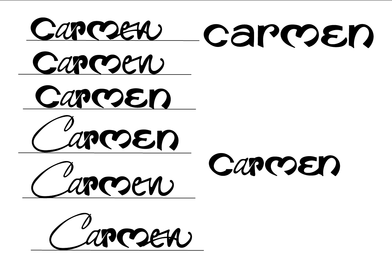
fig 1.1 Keywork Attempt #1 JPEG Week 4 (16/05/2024)
Here I tried to make the letter 'm' into a heart shape and tried different kinds of styles but I just thought It was a bit too simple so I tried to explore more.

fig 1.2 Keywork Attempt #2 JPEG Week 4 (16/05/2024)
Here I have 2 different styles that I explored. The first design was supposed to be a ribbon with the letters 'Car". The next design was literally a rabbit made out of my name with the letters 'Car'. For the last design, the 'men' is a carrot.
After receiving feedback, I found out that my design has too much white space, idea is good but not applicable. I decided to only focus on Bubby and Coquette so I made some changes.
Here are some visual references that I've found:


fig 1.4 Process JPEG Week 5 (24/05/2024)

fig 1.5 Keywork Attempt #3 JPEG Week 5 (24/05/2024)
After receiving feedback from Vinod, I need to focus on the basic shape and work on that, it is bubbly but it is not right. I still like the bunny artwork tho :((

fig 1.6 Final Keywork Attempt JPEG Week 6 (27/05/2024)
Task 2 (B) - Collateral
I feel like my artwork is a bit too plain and simple so I decided to move down the 'men' to add a bit more contrast.


fig 1.7 Example 1 & 2 JPEG Week 6 (28/05/2024)
I decided to go for example 2. And begin with the design for the Instagram post.

fig 1.8 Designing Process JPEG Week 6 (01/06/2024)

fig 1.9 Colour Palette JPEG Week 6 (01/06/2024)

fig 1.10 Instagram Post JPEG Week 6 (01/06/2024)
After week 7 feedback, I need to make quite a lot of changes to my artwork. I was advised to connect the 'car' and 'men' together instead of breaking them down into two.

fig 2.0 Re-attempt Keywork JPEG Week 7 (05/06/2024)
I got rid of the background and the circle part of the apex of the letter M as I think the connection between 'r' and 'm' is weird.
I then begin with a new colour palette and work with my keyword. I wanted to go for the pink warm series for my keywork.
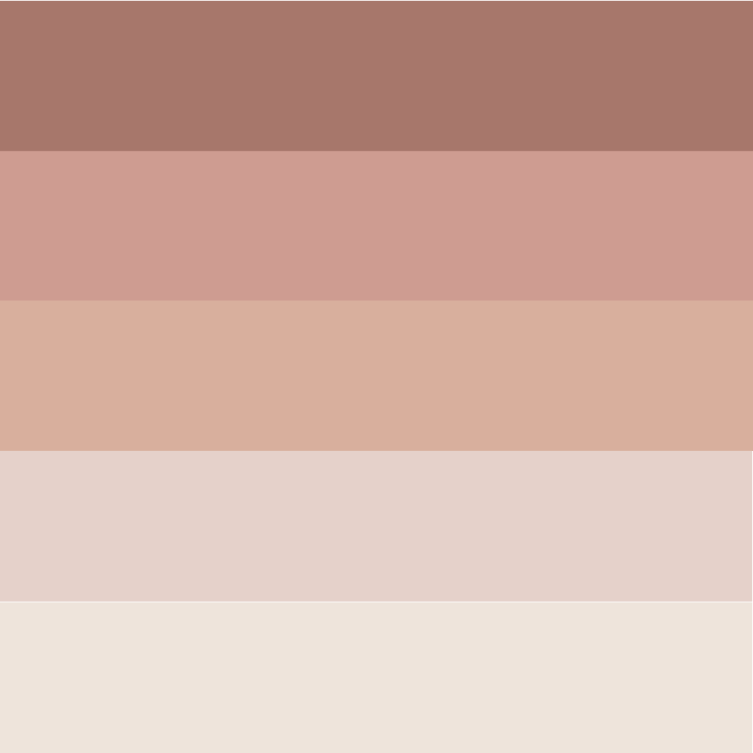
fig 2.1 Colour Palette JPEG Week 7 (06/06/2024)
Mr Vinod suggested that I could explore patterns like this and I thought it goes well with my theme so I give it a try...

fig 2.2 Suggestion From Mr Vinod In Teams Screengrab Week 7 (06/06/2024)
Doing the mockups was fairly easy because I knew I wanted to go for a more comfortable vibe while it also gave off a feminine feeling. I then also played around with the element for the self-portrait part, It gives of Christmas vibes~


fig 2.3 Process in Illustrator JPEG Week 7 (06/06/2024)
Final Outcome 2(A):

fig 2.4 Black Wordmark on White Background JPEG Week 7 (06/06/2024)
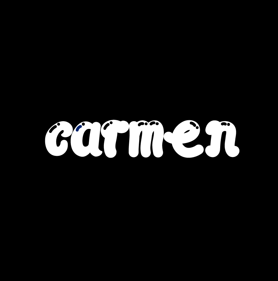
fig 2.5 White Wordmark on Black Background JPEG Week 7 (06/06/2024)

fig 2.6 Colour Palette JPEG Week 7 (06/06/2024)
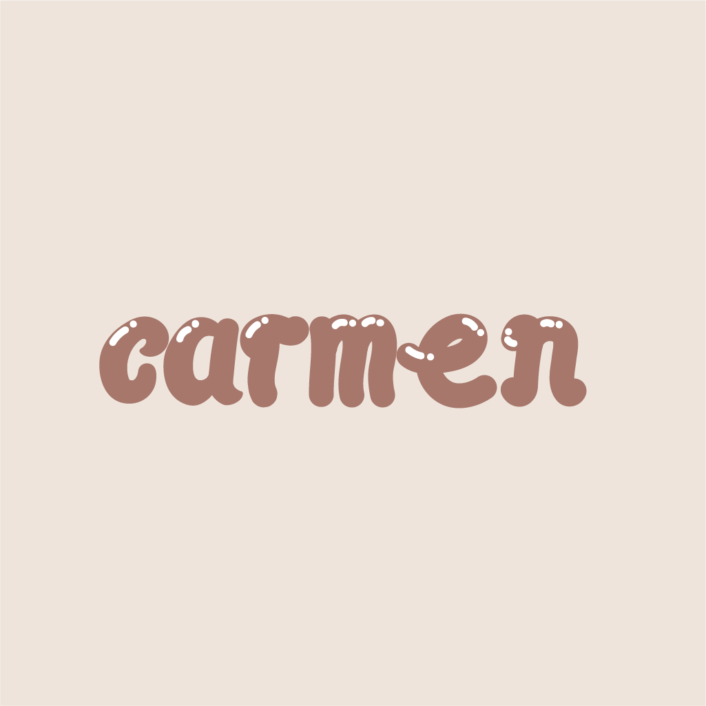
fig 2.7 Wordmark in actual colour on highest shade JPEG Week 7 (06/06/2024)

fig 2.8 Wordmark in the highest shade on darkest shade JPEG Week 7 (06/06/2024)
Final Outcome 2(B):
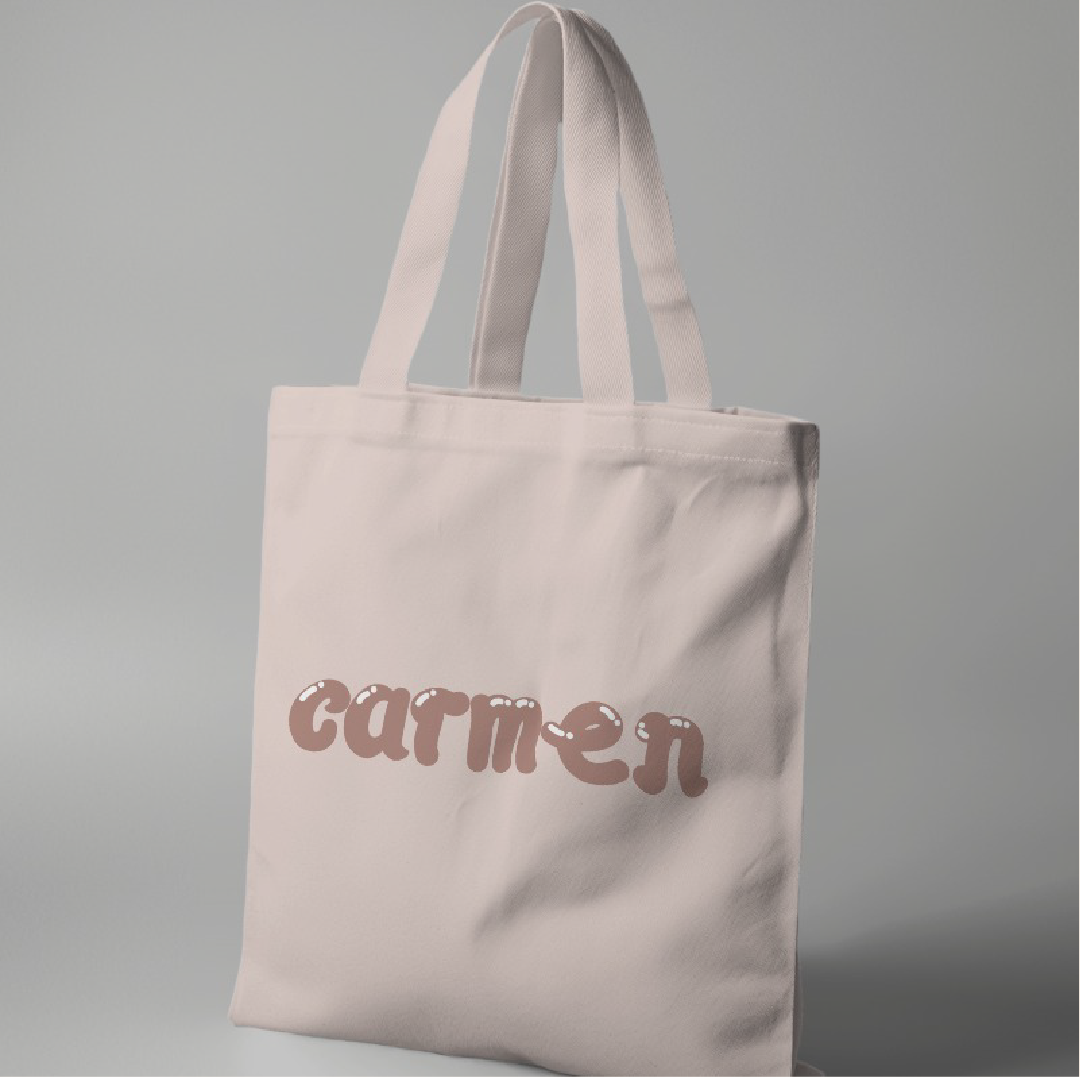
fig 2.9 Colletral 1 JPEG Week 7 (06/06/2024)
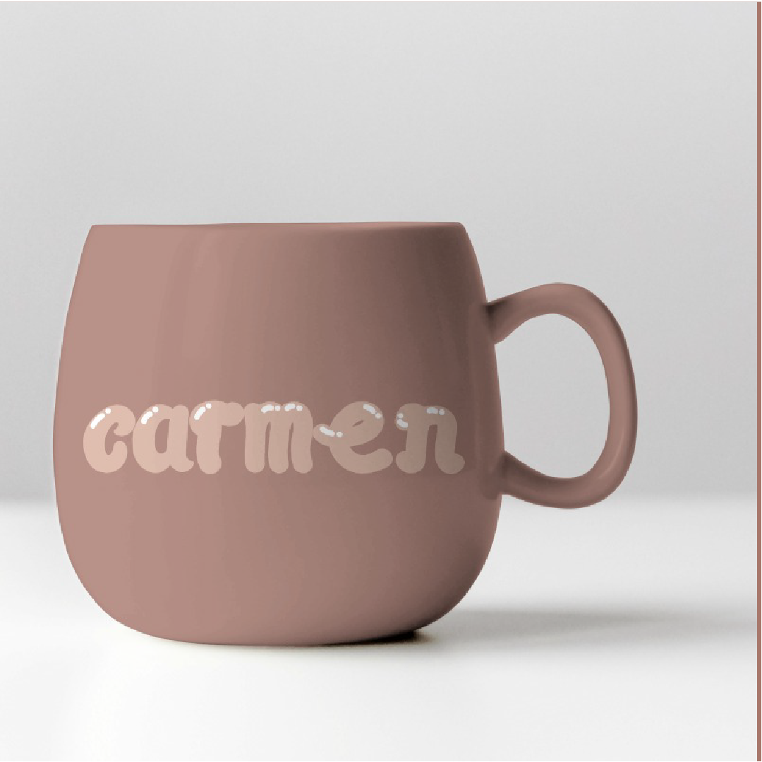
fig 2.10 Colletral 2 JPEG Week 7 (06/06/2024)

fig 3.0 Colletral 3 JPEG Week 7 (06/06/2024)
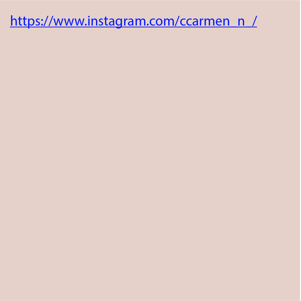
fig 3.1 Instagram Link JPEG Week 7 (06/06/2024)

fig 3.2 Instgram Screengrab Week 7 (06/06/2024)
FEEDBACK
Week 4:
General Feedback: The background of the poster can't be too focused, make sure your fonts stand out the most. Readability is important too, watch out. The colour of your fonts is very important as well. Be aware of the brief or the outcome of each assignment, make sure to not go overboard and make sure it is what is asked of you.
Personal Feedback: The contrast of the fonts can be better, work better on the background, and either bring up the contrast or bring down the contrast. Play with the interplay more. Maybe adding shadows to the letterform helps. Play around.
Week 5
General Feedback: What is your artwork trying to tell the audience? What does it represent yourself as? Your artwork describes the person itself. Make sure the readability is clear. White space is your enemy, don't make your artwork too small or too big then small then big again. You'll need to control what is going on in your keyword.
Personal Feedback: Control the white space in your keyword, and tighten it. Start with an existing typeface and draw it out. See properly. Too much white space will weaken your artwork. Suggest folded ribbon but the sharp edges can change to suit the bubbly effect. Ideas are good but not the fonts.
Week 6
General Feedback: Make sure all the fonts and shapes are the same size. Make sure there's minimal curvature in your artwork as this will create white space and a weird angle.
Personal Feedback: Focus on one shape for your artwork. There's too much abnormality in the letter. Reconsider starting with a basic shape and focus on that
Week 7
General Feedback: We're creating a brand name for our keywork on a product, be aware of what you put your keywork on a certain product. Make sure the background of your keywork either the brand or the collateral is not too messy, focus on your artwork, and do not overuse it.
Specific Feedback: The colour palette is not right, you should choose a colour that makes your artwork stand out, your choice is dull, change that, the colour of the background for the collateral must be isolated from your product, choose a plain and simple mockups to showcase your brand. You need to work on your artwork again, instead of breaking down your keyword into two.REFLECTION
Experience
I came across several instances during my studies which proved that well-made Key Artwork can arouse emotions, convey messages and attract attention. The power of Key Artwork lies in its ability to turn complicated stories into simple visual designs; this can be seen in movie posters as well as album covers and advertising campaigns. One of the most enlightening parts of my exploration into learning about effective key artworks was finding out what makes them good. I discovered that composition, colour schemes, typography and imagery are important aspects that should not be overlooked when coming up with impactful visuals. It was particularly interesting for me to learn why certain colours are chosen over others and how these choices affect people’s perceptions; this further cemented my belief that every decision in design carries weight behind it. Studying different cases helped me realize the amount of planning and creativity put into developing Key Artwork. The ability some designers have had to tell stories through pictures amazed me; I drew inspiration from various artists whose works spoke volumes visually while connecting with huge numbers of individuals at the same time – such is only possible due to their skillfulness and inventiveness. Practical application was pivotal in ensuring that I grasped all the concepts taught during this course.
Observation
Key Art is essential for visual communication as it represents a single view of a brand or project. In my learning process, I have seen many instances where well-made key arts can stir up feelings, express ideas and grab attention. Key art has the power to change complex stories into simple but attractive designs – this is most evident in movie posters, album covers and ad campaigns. The most enlightening part of this learning journey has been studying what makes key art effective. Composition, colour scheme, typography and image were some elements I came to understand their significance and how they all work together to produce one beautiful picture. It was interesting to learn why people use different colours when making choices on which ones go where based on how viewers will perceive them; thus showing that no design decision should be made without reason or purpose. By looking at various examples, I got to appreciate how much planning and creativity are involved in creating key artwork. The ability of artists to tell stories through visuals fascinated me a lot because now they not only have this power but also possess skills that enable them to do so while connecting with as many people as possible within certain demographics.
Findings
One of the most enlightening discoveries I made during this learning experience was identifying what makes a piece of Key Artwork effective. I learned that composition, colour schemes, typography and imagery all come together to form a unified and captivating design. It was particularly interesting for me to find out why certain colors are chosen over others, and how they can affect the way people see things. This taught me that even the smallest decisions in art have meaning behind them. Studying different examples showed me just how much thought and imagination is put into creating Key Artwork. I admire many well-known designers and artists who are able to tell stories through visuals. Their works not only represent brands perfectly but also resonate with the broad public due to their high level of creativity. In order to learn, I had to put theory into action. I experimented with various design tools and methods so as to develop my own concepts for Key Artworks. During this process I realized that sometimes you need to try different things before finding the right one; therefore feedback is a crucial part of the design process which should be improved upon continually until satisfaction is attained.
FURTHER READING
Week 4

fig 1.0 Typography Referenced JPEG Week 4 (13/05/2024)

fig 1.1 Typography Referenced JPEG Week 4 (13/05/2024)
Fourteenth and Fifteenth Centuries
Johannes Gutenberg is recognized for his pivotal role in the development of typography, despite not inventing movable type or the printing press. He synthesized existing technologies into a practical system, such as his adjustable mould for replicating letterforms. Gutenberg's works, notably the Gutenberg Bible, remain iconic examples of typographic art. Other significant figures include Nicolas Jenson, who popularized Roman letterforms, and William Caxton, who introduced printing to England and imported fonts from Europe. Aldus Manutius and Francesco Griffo collaborated on notable typefaces like Bembo and are credited with the invention of italic type as a marketing tool.

fig 1.2 Typography Referenced JPEG Week 4 (13/05/2024)
Sixteenth Century
Claude Garamond (1500–1567) was a leading Renaissance type designer known for replacing Gothic fonts with Roman typefaces in France, first appearing in 1530. He also pioneered oblique capitals to complement italic lowercase letters. Although Garamond's designs were popular, they were later overshadowed by new styles until their revival in the early 20th century. Robert Granjon (1513–1589), closely associated with Garamond, introduced italic type and influenced fonts like Plantin and Times New Roman. Jean Jannon (1580–1658) created the typeface that most modern Garamond revivals are based on, working over 80 years after Garamond.
Seventeenth and Eighteenth Centuries
William Caslon I (1692–1766) founded the Caslon Type Foundry, creating typefaces that, while not perfectly uniform, appeared harmonious in text. His designs were later revived in the U.S. as Old Style and evolved into versions like Monotype Caslon and Adobe Caslon. John Baskerville (1706–1775) improved printing technology by developing his own press, ink, and paper. Initially unpopular, Baskerville's typeface became widely used and is now a staple in type libraries worldwide.
Week 5
fig 1.3 Typography Referenced JPEG Week 5 (21/05/2024)

fig 1.4 Typography Referenced JPEG Week 5 (21/05/2024)
Early Nineteenth Century
In the early 19th century, Lord Stanhope invented the first printing press made entirely of cast-iron parts, significantly reducing manual labour and doubling the possible paper size. In 1816, William Caslon IV, a descendant of the original William Caslon, designed the first sans serif font, believed to be inspired by Greek lapidary letters from the fifth century. This sans serif design resembles the capitals in typefaces like Futura and ITC Avant Garde Gothic.
In 1818, Bodoni's Manuale, completed by his wife after his death, showcased the quintessential modern type. Today, hundreds of Bodoni revival designs are based on this benchmark work in typography. In 1821, Italienne, one of the first commercially popular advertising display designs, was introduced. This style, where serifs are heavier than the main character strokes, is also known as reversed Egyptian.
The 1840s brought significant developments in typography. Early in the decade, Edward Binn's "The Anatomy of Sleep" became the first book typeset by a mechanical typesetting machine, published in London. In 1844, R. Besley & Co. Type Founders released Clarendon, a heavy face designed to accompany the standard text in directories and dictionaries. Clarendon gained popularity as an advertising display face and was eventually imitated by other foundries.
Week 6

fig 1.5 Typography Referenced JPEG Week 6 (29/05/2024)


fig 1.6 Typography Referenced JPEG Week 6 (29/05/2024)
Frederic Goudy (1865–1947) was a renowned American type designer known for his originality and technical skill, in creating a vast range of typefaces. Self-taught, he began his career at thirty and effectively marketed his designs through specimen books and promotional materials. Morris Fuller Benton (1872–1948), though less recognized, was pivotal in U.S. type design, leading American Type Founders' (ATF) type development and creating significant typefaces like Broadway and Franklin Gothic.
Internationally, notable type designers included Emil Rudolf Weiss, Rudolf Koch, Lucian Bernhard, and Paul Renner. Koch, known for Kabel, and Renner, famous for Futura, made substantial contributions to typography. Lucian Bernhard designed numerous typefaces, including Bernhard Gothic, while living an eccentric lifestyle.
In the U.S., Oswald Bruce Cooper, a student of Goudy, designed many advertising display typefaces, including Cooper Black. William Addison Dwiggins focused on practical typefaces for machine composition, creating designs like Caledonia and Electra during his 27-year collaboration with Mergenthaler Linotype.
Week 7

fig 1.7 Typography Referenced JPEG Week 7 (04/06/2024)


fig 1.8 Typography Referenced JPEG Week 7 (04/06/2024)
Late Nineteenth and Early Twentieth Centuries
After the separation of growth and great development in 1892, the American Type Founders was formulated as a cooperative of twenty-three individual type foundries. In the last quarter of the eighteen hundreds, there was an enormous call for type and yet the situation was disorderly and disorganized and there was an incredible number of type foundries each engaged in designing, manufacturing, selling and distributing its own fonts. ATF came out of this milieu as an attempt to boost the commercial profitability and desirability of type problems and to provide some measure of stability to an industry in turmoil. It is important to understand that the formation of the consortium not only satisfies its commercial objectives, but it enriches the design community tremendously providing a prodigious output-type design. From 1900 to 1935, ATF established the basic pattern of U. S. type design into its current form.
Around this same time though and more to the point the Lanston Monotype Machine was created in Washington D. C. Its first typeface called the modem condensed was released in 1896. Blower Linotype, designed by Ottmar Mergenthaler was first installed in New York Herald Tribune. Akzidenz Grotesk was the so-called great-grandfather of Helvetica: in 1898, the H. Berthold AG company launched it. Late script geometric sans serif varieties have been in popular usage only from the last decade of the 1930s as a ‘jobbing face’ for Akzidenz Grotesk. Originally designed by Ludwig & Agathe Tillmann in 1901, the font was recycled by Max Miedinger in 1957.
A number of key industry personalities- type designers and otherwise- also began their careers during this period.
Eric Gill
Eric Gill was born in 1882 and passed on in 1940, he was an Englishman who embraced carving as a sculptor and stone cutter and was also an artist and type designer. His most iconic design and the only one that was designed without serif is Gill Sans. He also designed persons such as Joanna, Perpetua, and Pilgrim. This man is well known for his political stance and personal scandal He got into type designing through his friends – Stanley Morison typesetter and Beatrice Warde, normally known as the First Lady of typography. It is suggested that Morison thought that since Gill was a stonemason he would have a sort of apprenticeship of the anatomy of letters and the use of serifs to call for the first typeface known as Perpetua. He paid Gill for the type design to ask Monotype to supply it since Europe began producing numerous geometric sans-serif typefaces. While Gill Sans was not fully geometric, it became widely used and is now considered to be one of the most well-liked sans serif typefaces in Great Britain.
Stanley Morison
If, however, one limits oneself to the strictly professional categorization of the designer of typefaces, the lettering artist, or the calligrapher, one will not be able to count Stanley Morison (1889–1967) among the key players in modern British typography. For several decades, Klimt served as the typographical advisor of the Monotype Corporation and supervised numerous famous fonts, like Rockwell, Gill Sans, Perpetua, Albertus and the most famous one, Times New Roman. Aside from new type styles, he also advocated five revivals, which were Bembo, Baskerville, Ehrhardt, Fournier, and Walbaum, which undoubtedly was unequalled in Britain or Europe. A place that is far from receiving appreciable attention in most typographic history books is another remarkable contribution of Morison; his full support of Beatrice Warde. In her friendships, romantic partnership, and professional mentorship with Morison, she was given the opportunities, encouragement, and direction to flourish as a typographic historian, as an advocate for a proper typographic publicist, and as an impassioned advocate for the art of printing.
Victor Hammer
Type designer Victor Hammer (1882–1967) was born in Basel known for the ‘American Uncial’ face which he produced in the year 1943. Self-taught as a designer, punchcutter and printer, Hammer was born in Australia but migrated to Italy as a young man, where he developed his distinctive style of operation. He later immigrated to the United States where he took a great position as a fine arts professor at Wells College in Aurora New York. It was there that he cut the punches for Uncial The author of this paper managed to find a modern establishment that offers punching services to clients, and the following is a snapshot of what he saw:
Jan van Krimpen
Jan van Krimpen (1892-1957) was an extraordinary typeface designer and one of the finest book designers of the twentieth century. Lutetia was his first type of design and also, his most successful one; it was developed for one of the most reputable Dutch printing houses Enschedé en Zonen. Van Krimpen also created other types of fonts such as Cancelleresca Bastarda, Romanée a fine display face reminiscent of Bodoni and Didot, Romulus a strong modern face which has elements of Gill Sans, Spectrum and Van Dijck which is an antidote to all sorts of light faced sans.
Georg Trump
Georg Trump (1895–1985), a teacher of graphic design and type designer, was mainly linked with the German-based Weber Limited firm. Utilizing typefaces that originated from drawings and engravings of historic types of typeface, he came up with his most important design, Trump Mediaeval in 1954. Heralding from Trump, are typefaces such as City, Delphin, Schadow Antiqua, and Codex.
Charles Peignot
Charles Peignot (1897–1983), director of Deberny & Peignot for nearly fifty years, was deeply involved in the creation of all new typefaces from his foundry. He commissioned the poster artist A. M. Cassandre to design the typeface that bears his name, Peignot. Additionally, he championed typeface copyright protection and played a key role in founding the Association Typographique Internationale.
Robert Hunter Middleton
After nearly half a century at the Ludlow Company type foundry, Robert Hunter Middleton (1898–1985), who was offered very few other choices for his career, devoted himself to type design and direction almost exclusively. As a part of his long career, Middleston began almost a hundred typefaces such as Radiant, Stellar, Karnak Record Gothic etc.
Beatrice Warde
While Beatrice Warde (1900–1969) didn’t create any fonts herself, she played a major role in shaping the history of typography as we know it today. Her time as Monotype’s public relations officer saw her driving their most important years in terms of design between 1925 and the 1950s. Referred to by many as the ‘First Lady of Typography’, she not only took charge of marketing but also acted as an educator, historian and typographer herself. It was her influence that led Eric Gill to develop Gill Sans and Perpetua.
Jan Tschichold
In the early part of the twentieth century, Jan Tschichold (1902–1974) significantly influenced typography by almost single-handedly popularizing asymmetric typographic arrangement as the preferred style among young designers. For many years, Tschichold created posters, book covers, advertisements, and letterheads that exemplified the essence of asymmetric design. His work not only established a new typographic genre but also set the standard for those who followed in his footsteps.
In addition to his roles as a teacher, typographer, book designer, and innovator, Tschichold also designed typefaces. Sabon, a typographic masterpiece, is the typeface that cemented Tschichold’s reputation as a type designer.


Comments
Post a Comment