Digital Photography and Imaging | Task 2
Wong Jia Yi Carmen 0357198
Bachelor Of Design (Honours) In Creative Media
Lectures
WEEK 2: INTRODUCTION TO COMPOSITION
fig 1.0. Lecture Slides Week 2
From these lecture slides, I understood...
Basic Composition
1. Focal Point
~ A key element in creating a good composition is having this strong focal point.The presence of a strong focal point helps guide the viewer's attention to specific elements within the design. When a composition has a strong focal point, viewers' eyes will naturally focus on the most important parts of the design before other elements.
2. Scale & Hierarchy
~ Scale refers to the sizing or proportion of elements in a visual or communicative context. The primary purpose of using scale is to convey a sense of hierarchy, which means showing the relative importance or significance of different elements. The use of scale is also intended to draw the viewer's or reader's attention to specific elements. This could involve making some elements larger or more prominent and others smaller or less prominent.
3. Balance The Elements
~ One way to achieve asymmetrical balance is by thinking of each element as having a 'weight.' In this context, 'weight' does not refer to physical mass but rather the visual or aesthetic impact of each element within the composition. Smaller objects may 'weigh' less in terms of their visual impact compared to larger objects. Additionally, elements with heavy textures are considered to 'weigh' more in visual terms than flatly coloured elements. This means that the visual weight of an element is influenced by its size and the complexity of its texture.
4. White Space
~ White space is often referred to as "empty space." In design, it does not necessarily mean the colour white; it typically signifies areas in a composition that are not filled with content or elements. The purpose of white space in design is to balance the main focus of a composition. This suggests that it is used to create a visual balance and harmony in a design or layout.
~When white space is strategically used, it can have several benefits:
- It enhances the clarity of the design.
- It improves the overall appearance or aesthetic of the design.
- It helps create balance when there are complex or busy elements in the composition.
- It allows the design to "breathe," implying that it prevents overcrowding and makes the design more visually appealing.

fig 1.1. Example Of White Space
Rule Of Thirds
- Involves dividing an image into thirds using two horizontal lines and two vertical lines. This creates an imaginary grid within the image. This grid results in nine parts within the image, formed by the intersections of the horizontal and vertical lines.

fig 1.2. Rule Of Thirds
- There are specific points within the image where important elements should be placed. Placing the most important elements at these intersection points results in a more natural-looking image.
There is a suggestion regarding the placement of the horizon in the image. It should be positioned either on the top horizontal line or the bottom horizontal line.
- The Rule Of Thirds is a way to:
~ Use composition techniques that are in line with what's naturally pleasing to the eye.
~ Creatively use Negative Space.
~ Create a conversation between the subject and background.
Golden Ratio
- It is a mathematical ratio. The Golden Ratio is said to occur frequently in natural phenomena. It can also be applied in design, where it has a specific impact. The use of the Golden Ratio in design is said to lead to compositions that appear organic and natural. These compositions are considered visually attractive or beautiful.
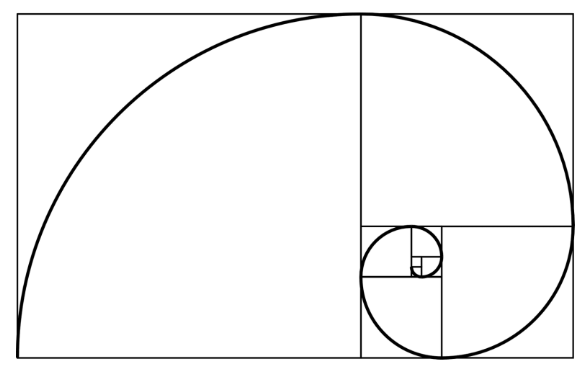
fig 1.3. Golden Ratio
- The Golden Ratio is a concept in design that is related to aesthetics, focusing on creating and appreciating a sense of beauty through harmony and proportion. When the Golden Ratio is applied to design, it is seen as a means to infuse a sense of artistry into the design. It is a useful guideline for determining dimensions and layout in design. One straightforward way to apply the Golden Ratio is to set dimensions in a ratio of 1:1.618, emphasizing the proportion of 1 to 1.618 in design elements.
Instructions
fig 1.0 DPI Module Information
Tutorial
Collage Elements Layering & Composition.
(Video Demo Below)
fig 1.0 YouTube Demo Collage
Practical
PROJECT 1A (10%):
COLLAGE (5%)
Design elements (5 Marks)
Composition (5 Marks)
Submission: WEEK 3
COLLAGE (5%)
Design elements (5 Marks)
Composition (5 Marks)
Submission: WEEK 3
We were told to start doing our first task which was to find some old magazine or newspaper and gather around the elements to create our very own collage. After Mr Fauzi explained some important details and even provided a video to watch so we could get some ideas and inspiration for our project. I immediately started planning my collage.

fig 1.0 First Draft Collage

fig 1.1 Second Draft Collage

fig 1.2 Last And Chosen Draft Collage
The chosen collage would be the third collage, as Mr Fauzi likes it the most.
Reflection
The second week of the Digital Photography and Imaging module brought me deeper into the world of photography and provided opportunities for growth and exploration. I learned about how important and crucial when it comes to the composition of a specific image. How the attention of a viewers as well its very important.
The concept of the "rule of thirds" was particularly illuminating. Placing the subject or key elements along the intersecting points of the grid created by dividing the image into thirds horizontally and vertically can lead to more balanced and aesthetically pleasing compositions. This simple guideline has already made a noticeable impact on the quality of my photographs.


Comments
Post a Comment