Typography | Task 1 Type Expression
Wong Jia Yi Carmen 0357198
Bachelor Of Design (Honours) In Creative Media
Task 1: Text Formatting and Type Expression
LECTURES
Week 1: Module Briefing and Exercise For Task 1
PHYSICAL CLASS
Today is the first day of class, Mr Vinod started by greeting us and briefly explained what we should expect in this module. He also explained some important notes that we should be aware of. We were introduced to a website called 'Blogger' and we had to create an e-portfolio as this is how Mr Vinod grade and give feedback to us. He then started explaining the first task for this module and gave exercise to us.
The outcome from the lecture:
I understood...
-the learning exercises of this module
-the definition of Typography
-how the grading situation works in Typography
ONLINE LECTURES
Typo_0_ Introduction
fig. 1.1. Typography In Visual Manner - JPEG Week 1(26/ 09/2023)
What Is Typography?
- Typography is the act of creating typefaces or type families. It's the art of arranging letters and text in a way that makes the copy legible, clear, and visually appealing to the reader. It involves font style, appearance, and structure, which aims to elicit certain emotions and convey specific messages.
- Typography has also evolved over 500 years from calligraphy (write) > lettering (draw out) > Typography. Later then computers were introduced and had become part of the teaching aids.
Early Evolution of Roman Letters 1
- Roman capital letters, both monumental and formal, were ideal for inscriptions on enduring monuments. However, everyday communication like business records, literature, and correspondence, evolved to better serve practical purposes over time.
Easier Writing Styles
- Stonecutters used metal tools for monumental inscriptions, while scribes, writing on papyrus and similar materials, developed more flexible handwriting styles. Over time, three distinct handwriting styles emerged: square capitals, rustic capitals, and Roman cursive, replacing formal capitals for everyday communication.
1. Square Capitals
- Square capitals were an attempt to replicate inscriptions and were used in formal documents. They conveyed precision and regularity but were written more quickly and with a flowing hand compared to stone inscriptions. As a result, they had some distinctions from monument lettering.
fig. 1.3. Example Of Square Capitals - JPEG Week 1 (26/ 09/2023)
2. Rustic Capitals
- Square capitals were wide and space-consuming. To save costs on less important documents, a narrower and simpler letterform called rustic (or "simple") capitals emerged, conserving both space and time.3. Roman Cursive
- Roman cursive, a swift and casual writing style, was ideal for business transactions and correspondence. It was commonly used until about AD 500. While often illegible, its speed and informality influenced the creation of many modern lowercase letters.
First Alphabets
- Throughout history, people have always found ways to record their lives. Early forms of writing started as simple tokens, like a flower symbolizing sentiment or rocks warning of danger. These evolved into marks, marking the birth of written communication. From the start, writing was an art.
Symbol Alphabets
- The first writings consisted of basic graphic images representing tangible concepts like "man," "woman," "fire," "food," and "tree." As language evolved, people realized the need for more symbols to convey additional words. This led to combining symbols, like multiple "tree" symbols forming "forest," and uniting "man," "woman," and "child" symbols into one "family" symbol.
- However, using symbols had limitations. Expressing complex thoughts requires too many symbols. As society advanced through agriculture, religion, and politics, the need for more sophisticated forms of expression emerged. The earlier symbol writing, suitable for specific things, couldn't effectively express abstract concepts or maintain records. To address these issues, new writing systems reduced form and expanded meaning.
fig. 1.6. Design Progression In Letterforms - JPEG Week 1 (26/ 09/2023)
1. Phonograms
- The Egyptians broke from simple symbol writing by introducing "sound pictures" to represent words and syllables with similar sounds. Over millennia, they transitioned to using "phonograms" for syllables, stringing them together to form words. This evolution led to the hieratic script known as hieroglyphics, with a popular variant, Demotic, used for various documents. These scripts laid the foundation for the development of alphabets in Mediterranean nation-states.
2. Phonetic Writing
- The Phoenicians, early traders and entrepreneurs marked the next evolutionary leap. Their practical business needs in Egypt, Crete, and Athens necessitated an alphabet, distinct from the ornate Egyptian style. Phoenician writing prioritized efficient record-keeping with a straightforward, phonetic alphabet, where one character equalled one sound. This marked the birth of the first phonetic alphabet.3. Our Alphabet Emerges
- Through their interactions with Greece, the Phoenicians shared their alphabet, sparking a transformation. The Greeks introduced vowels, new characters, and elegant curves, shaping the beauty of our current alphabet.
- The Latin alphabet, stemming from Greek letterforms through the Etruscans of Italy, was further adapted by the Romans. Their confident assimilation paralleled their adoption of Greek gods, leading to the development of a distinctive Latin alphabet with its own style and characters, building upon the Greek foundation.
4. Roman Capitals
- Roman capital letters, originating in signage, were used for monumental inscriptions and important manuscripts. Their enduring influence, characterized by curved typefaces with stroke variations, has set the standard for capital letter design and proportion for over 2,000 years.
Typo_1_Development
Early Letterform Development: Phoenician to Roman
- Initially, writing involved carving into clay or stone with basic tools. Uppercase letterforms, prevalent for about two millennia, evolved from these tools, characterized by simple combinations of straight lines and circular elements due to the materials and tools of the time.
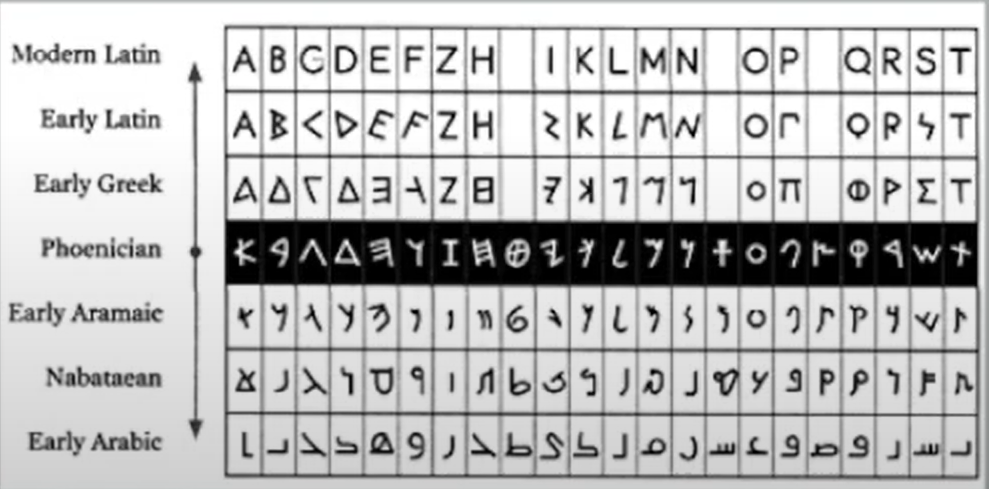
fig. 1.7.Evolution from Phoenician Letter - JPEG Week 1 (26/ 09/2023)
- The Greeks altered writing direction from right to left to a unique style called 'boustrophedon,' where lines alternated between right-to-left and left-to-right reading, leading to changes in letterform orientation.
fig. 1.9. Greek like the Phoenicians- JPEG Week 1 (26/09/2023)
fig. 1.9. Greek Fragment, Stone Engraving - JPEG Week 1 (26/09/2023)
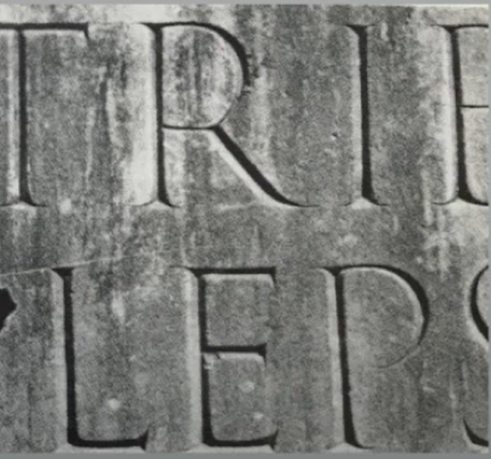
- Etruscan and Roman marble carvers painted letterforms before engraving, preserving stroke qualities like weight changes and stroke width variations in the carved letters.
fig. 1.10. Late 1st Century B.C.E., Augustan Inscription In The Roman Forum, Rome - JPEG Week 1 (25/09/2023)
fig. 2.0. Revolution Of Phoenician, Greek and Roman - JPEG Week1 (26/09/2023)
Hand Script From 3rd - 10th Century C.E.
- Square capitals, seen on Roman monuments, had letterforms with serifs at the ends of main strokes. Reed pens, angled at about 60 degrees, created variations in letter width.
fig. 2.1. 4th or 5th Century, Square Capitals - JPEG Week 1 (26/09/2023)
- Rustic capitals, a compact version of square capitals, allowed for faster writing with an angled pen, fitting more words on parchment. However, their compressed style made them a bit harder to read.
fig. 2.2. Late 3rd- mid $th Century. Rustic Capitals - JPEG Week 1 (26/09/2023)
- Square and rustic capitals were for formal documents, while cursive was used for everyday transactions, laying the foundation for lowercase letterforms.
- Uncials, drawing from Roman cursive, especially influenced certain letter shapes. While "uncia" suggests they are one-inch letters, it's more accurate to consider them as small letters. Their broader forms make them more readable at smaller sizes than rustic capitals.
fig. 2.4. 4th - 5th Century, Uncials JPEG Week 1 (26/09/2023)
- Half-uncials introduced formal lowercase letterforms with ascenders and descenders, emerging 2,000 years after the Phoenician alphabet's origin.
fig. 2.5. C. 500, Half - uncials JPEG Week 1 (26/09/2023)
fig. 2.6. C. 925: Caloline Miniscule JPEG Week 1 (26/09/2023)
Blackletter to Cuntenberg's Type
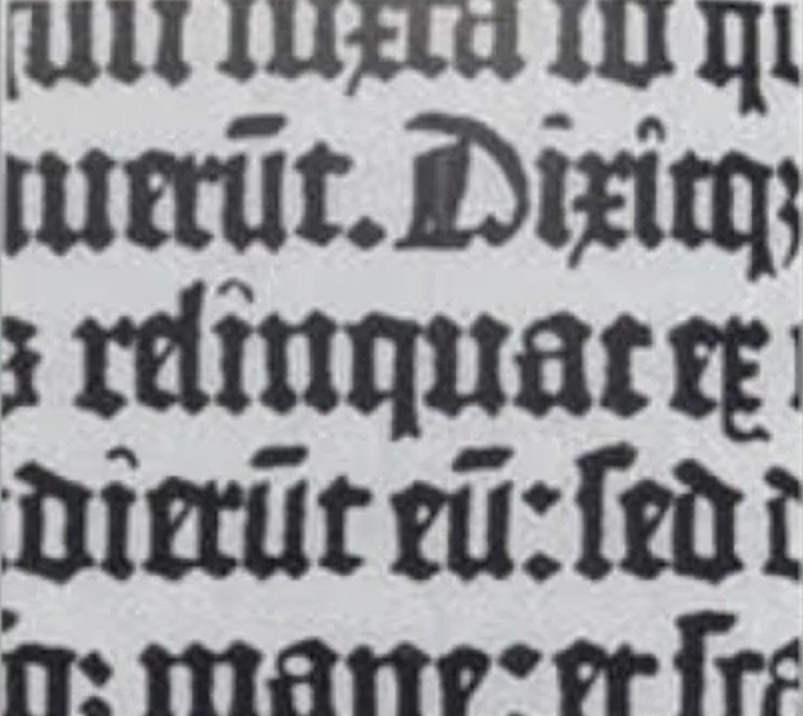
- As Charlemagne's empire dissolved, various regions developed distinct scripts. In the north, Blackletter (Textura) gained prominence, while the south favoured 'rotunda.' Italy adopted a humanistic script rooted in Alcuin's minuscule.
fig. 2.7. C. 1300: Blackletter (Textura) JPEG Week 1 (26/09/2023)
- Gutenberg's talents in engineering, metalsmithing, and chemistry allowed him to replicate the Blackletter script of northern Europe with precision, using a unique brass matrix for each letterform in his type mold.
fig. 2.8. C. 1455: 42 Line Bible, Johann Guternberg, Mainz JPEG Week 1 (26/09/2023)
Text Type Classification ( Dates Of Origin Approximated To The Nearest Quarter Century.)
1. 1450 Blackletter
- Examples: Cloister Black, Goudy Text
2. 1475 Oldstyle
- Examples: Bembo, Caslon, Dante, Garamond, Janson, Jenson, Palatino
fig. 2.10. 1475 Oldstyle JPEG Week 1 (26/09/2023)
3. 1500 Italic
fig. 3.0. 1475 Oldstyle JPEG Week 1 (26/09/2023)
4. 1500 Script
- Examples: Kuenstler Script, Mistral, Sneil Roundhandfig. 3.1. 1500 Script JPEG Week 1 (26/09/2023)
5. 1750 Transitional
- Examples: Baskerville, Bulmer, Century, Time Roman
fig. 3.2. 1750 Transitional JPEG Week 1 (26/09/2023)
6. 1775 Modern
- Examples: Bell, Bodoni, Caledonia, Didot, Walbaum
fig. 3.3. 1775 Modern JPEG Week 1 (26/09/2023)
7. 1825 Square Serif / Slab Serif
- Examples: Clarendon, Memphis, Rockwell, Serifa
fig. 3.4. 1825 Square Serif / Slab Serif JPEG Week 1 (26/09/2023)
8. 1900 Sans Serif
- Examples: Akzidenz Grotesk, Grotesk, Gill Sans, Franklin Gothic, Frutiger, Futura, Helvetica, Meta, News Gothic, Optima, Syntax, Trade Gothic, Universe
fig. 3.5. 1900 Sans Serif JPEG Week 1 (26/09/2023)
9. 1990 Serif / Sans Serif
- Examples: Rotis, Scala, Stone
fig. 3.6. 1990 Serif / Sans Serif JPEG Week 1 (26/09/2023)
Week 2: Type Expression With Adobe Illustrator
PHYSICAL CLASS
After checking our sketches for task 1, Mr Vinod then guided us to watch videos on how to digitalize our sketches in Adobe Illustrator. He also gave us our feedback.
The outcome from the lecture:
I understood:
- the importance of feedback in class
- the basic use of Adobe Illustrator
- rough idea on how to improve my sketches
ONLINE LECTURES
Typo_3_Text_P1
Text / Tracking: Kerning and Letterspacing
- 'Kerning' is an automatic letter spacing adjustment, often confused with 'letterspacing' which adds space. Modifying space within a word or sentence is called 'tracking.'
fig. 3.7. Usage Of Kerning JPEG Week 2 (02/10/2023)
- Normal tracking, loose tracking and tight tracking.
fig. 3.8. Normal, Loose and Tight Tracking JPEG Week 2 (02/10/2023)
- Uppercase letters can stand alone, while lowercase letters depend on the space between them for readability.
fig. 3.9. Comparison Between Normal and Loose Tracking JPEG Week 2 (02/10/2023)
Formatting Text
- Flush left: This format mimics the irregularity of handwriting, where each line starts at a common point and ends where the last word does. Uniform word spacing ensures a consistent appearance, creating an even text tone.
fig. 3.10. Flush Left, Ragged Right JPEG Week 2 (02/10/2023)
- Centered: This format creates symmetry in the text, turning it into shapes and adding a visual quality. Careful line breaks are necessary to avoid jagged text.
fig. 4.0. Centered, Ragged Right and Left JPEG Week 2 (02/10/2023)
- Flush right: This format highlights line endings over beginnings and is particularly useful for clarifying the relationship between text and images in situations like captions.
fig. 4.1. Flush Right, Ragged Left JPEG Week 2 (02/10/2023)
- Justified: Like centering, this format creates symmetry in the text by adjusting word and letter spacing. But be cautious, as this adjustment can lead to unwanted vertical gaps, or 'rivers' of white space. Careful attention to line breaks and hyphenation is necessary to mitigate this issue.
fig.4.2. Justified JPEG Week 2 (02/10/2023)
Texture
- Typefaces with larger x-height or heavier strokes appear darker on the page than those with smaller x-height or lighter strokes. Recognizing these variations in text density is essential for successful layout design.fig. 4.3. Anatomy Of A Typeface JPEG Week 2 (02/10/2023)
fig. 4.4. Comparison Between Adobe Caslon and Baskerville JPEG Week 2 (02/10/2023)
Leading and Line Length
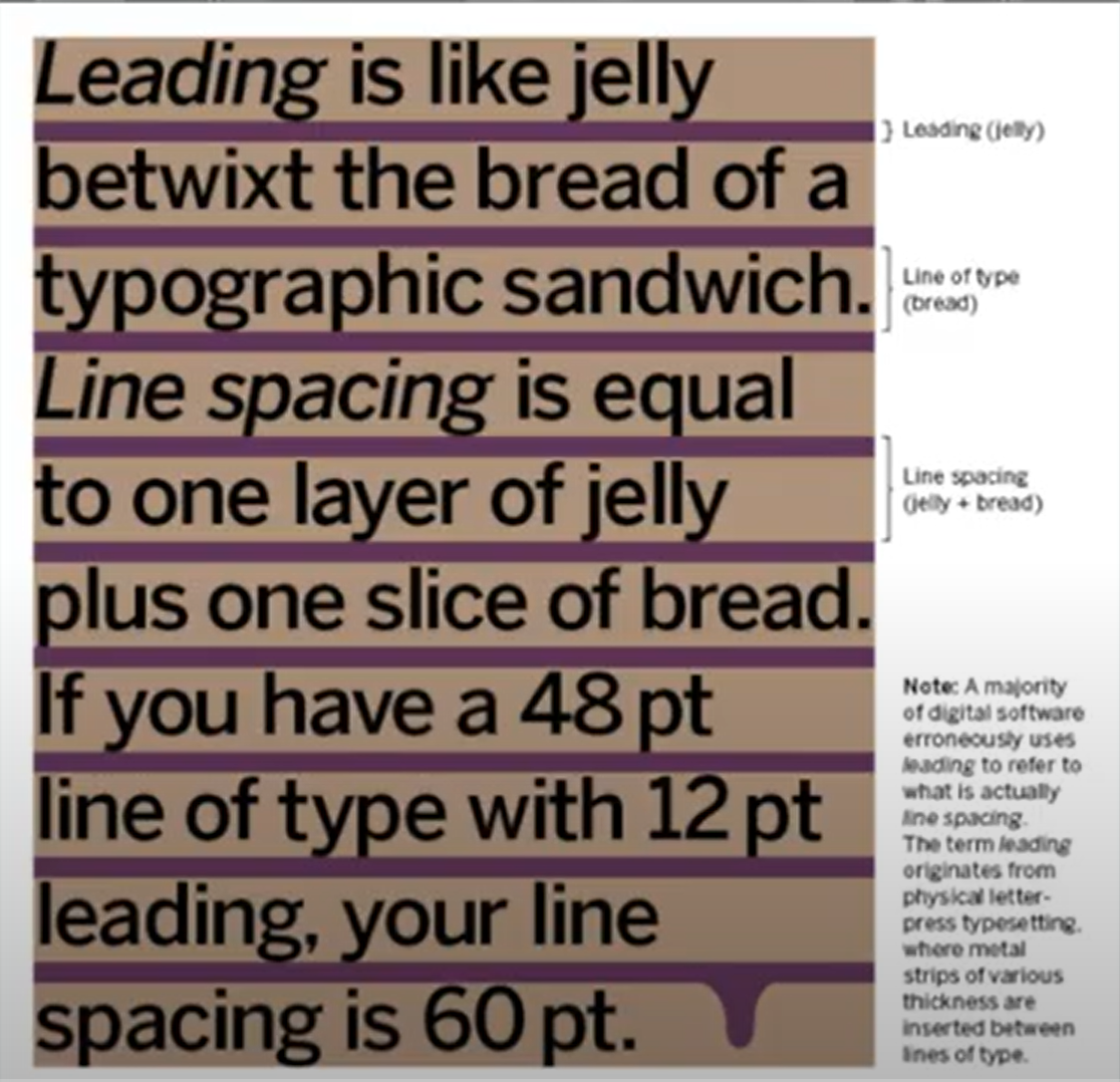
1. Type size: Text should be legible at arm's length as if you were reading a book in your lap.
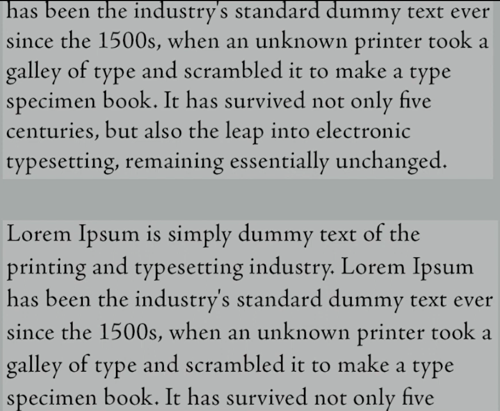
2. Leading: Text set too closely can cause the reader to lose their place, while text set too far apart creates distracting gaps.
3. Line Length: The ideal line spacing for text depends on both type size and line length. Short lines need less spacing, while long lines need more. Aim for 55-65 characters per line for optimal readability; extremely long or short lines can hinder it.
fig. 4.5. Left: Bad Leading Right: Good Leading JPEG Week 2 (02/10/2023)
Type Specimen Book
- A type specimen book displays typefaces in different sizes, aiding informed choices. Decisions for on-screen reading are best made on-screen. The book serves as a precise reference for type-related details.
fig. 4.6. Sample Type Specimen Sheet JPEG Week 2 (02/10/2023)
- Increasing the on-screen type size to 400% helps clarify the relationship between descenders and ascenders on adjacent lines.
fig. 4.7. 400% Zoomed In Of Different Lettering JPEG Week 2 (02/10/2023)
Week 3: Animated Fonts
PHYSICAL CLASS
Once I finished my digital fonts and got them checked for Mr Vinod's approval, I selected 'Gun' for the final fonts to be animated.
The outcome from the lecture:
I understood:
- how to animate fonts
- the importance of this blog
- further reading
ONLINE LECTURES
Typo_3_Text_Part 2
Indicating Paragraphs
-The example features a 'line space' (leading) between paragraphs. When it's set at 12pt, the paragraph space is also 12pt, ensuring uniform alignment in text columns.
fig. 5.8. Line space JPEG Week 3 (12/10/2023)
fig. 5.9. Comparison Between Line Space and Leading JPEG Week 3 (12/10/2023)
- The example showcases standard indentation, which is typically the same size as the line spacing or the point size of your text.
fig. 5.10. Usage Of Indentation JPEG Week 3 (12/10/2023)
- Extending paragraphs below can lead to exceptionally wide text columns, but there may be valid compositional or functional reasons for choosing this approach.
fig. 6.0. The Method Of Extended Paragraphs JPEG Week 3 (12/10/2023)
Widow and Orphans
1. Widow: A widow is a short, isolated line at the end of a text column.
2. Orphan: An orphan is a lone line at the start of a new column.
fig. 6.1. Examples Of Widow And Orphan JPEG Week 3 (12/10/2023)
- To address Widows, adjust line breaks within paragraphs, avoiding noticeably short final lines.
- Orphans need special attention, and meticulous typographers avoid starting text columns with the last line of the preceding paragraph.
- Here are basic examples of text highlighting within a text column, with different emphasis styles needing varying degrees of contrast.
fig. 6.2. Examples Of Text Highlighting Within A Text Column JPEG Week 3 (12/10/2023)
fig. 6.3. Examples Of Text Highlighting Within A Text Column JPEG Week 3 (12/10/2023)
- In this case, the sans serif font (Univers) was adjusted down by 0.5 to match the x-height of the serif typeface, resulting in a difference between 8 and 7.5.
fig. 6.4. Reduced The Sans Serif Font (Univers) JPEG Week 3 (12/10/2023)
- To emphasize text with a coloured background, maintaining the left reading axis, as seen in the right example, enhances readability.
fig. 6.5. Highlighted Text Through Coloured Background JPEG Week 3 (12/10/2023)
- At times, to maintain a strong reading axis, certain typographic elements should extend beyond the left margin of a text column rather than indenting.
fig. 6.6. Using Bullets as Highlight JPEG Week 3 (12/10/2023)
- Quotation marks and bullets can create an indentation, breaking the left reading axis. Compare the indented quote at the top with the extended quote at the bottom.
fig. 6.7. Using Quotation Marks as Highlight JPEG Week 3 (12/10/2023)
Headline Within Text
- Text within a chapter can be subdivided in various ways, and it's essential for typographers to discern the varying levels of significance. The image below identifies these levels as A, B, and C based on their importance.
- The A Head shows a clear separation between section topics. In the examples, 'A' section headings are in larger, bold small caps. The fourth example features an 'A' heading extending to the left of the text.
- The B Head in this context, B-level headings are subordinate to A-level headings. B-headings introduce supporting arguments or examples but should be less disruptive than A-headings. They are styled in small caps, italics, bold serif, and bold sans-serif.
- C headings, though rare, highlight specific aspects within B-level text without major disruption. They are styled in small caps, italics, bold serif, and bold sans-serif, followed by at least an em space for visual separation.
fig. 6.10. Example Of 'C' Heads In Text JPEG Week 3 (12/10/2023)
Cross Alignment
- Aligning headlines and captions with the text reinforces the page's structure and complements vertical rhythms. In this example, four lines of 9pt caption text align with three lines of 13.5pt text.fig. 7.0. Example Of 4 lines of Caption Type JPEG Week 3 (12/10/2023)
- Below, one headline aligns with two lines of text, and on the bottom left, four headlines align with five lines of text.
Week 4: Text Formatting
PHYSICAL CLASS
After letting Mr Vinod check my animated font, I needed to make some slight changes. After giving us a lecture, and teaching us today's task which was Text formatting, Mr Vinod let us do whatever we should do.
The outcome from the lecture:
I understood:
- the common sense of animation
- today's task
- roughly how to start doing it
ONLINE LECTURES
Typo_2_Basic
Describing Letterforms
- Typography, developed over five centuries, uses technical terms to describe letterform elements. Familiarity with this terminology eases typeface identification.
1. Baseline = The visual base of the letterforms is represented by an imaginary line.
2. Median = An imaginary line delineates the x-height of letterforms.
3. X-height = The x-height in a typeface refers to the height of the lowercase 'x'.
fig. 7.2. Example Of Baseline, Median, X-height JPEG Week 4 (17/10/2023)
4. Stroke = A line that outlines the fundamental letter shape.
fig. 7.3. Example Of Lines In Stroke JPEG Week 4 (17/10/2023)
5. Apex / Vertex = The point formed by connecting two diagonal stems.
fig. 7.4. Apex(above), Vertex(below) JPEG Week 4 (17/10/2023)
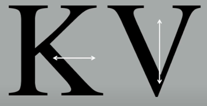
6. Arm = Short strokes extending from the stem of the letterform, which can be either horizontal (as in E, F, L) or slanting upwards (as in K, Y).
fig. 7.5. Example Of Arm In Letterform JPEG Week 4 (17/10/2023)
7. Ascender = The segment of a lowercase letterform's stem that extends beyond the median.
fig. 7.6. Example Of Ascender In Letterform JPEG Week 4 (17/10/2023)
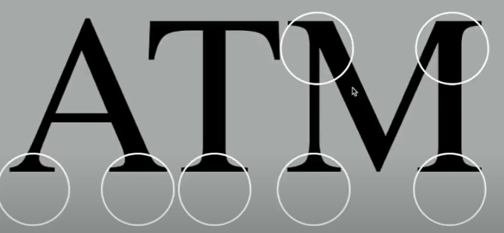
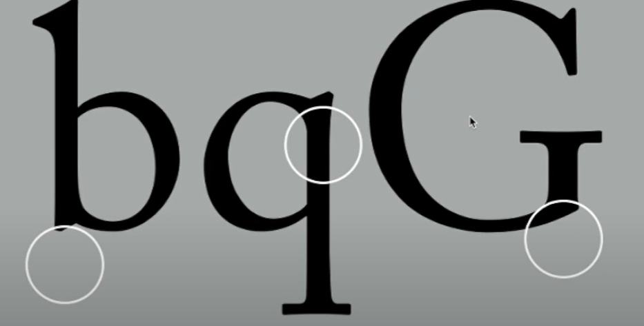
8. Barb = The semi-serif conclusion on certain curved strokes.
fig. 7.7. Example Of Barb In Letterform JPEG Week 4 (17/10/2023)
9. Beak = The partial serif ending on specific horizontal arms.
fig. 7.8. Example Of Beak In Letterform JPEG Week 4 (17/10/2023)
10. Bowl = The curved shape defining a counter. This bowl can be either open or closed.
fig. 7.9. Example Of Bowl In Letterform JPEG Week 4 (17/10/2023)
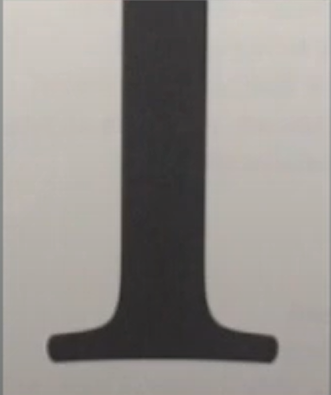
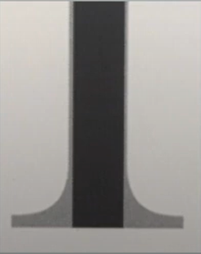
11. Bracket = The shift from the serif to the stem.
fig. 7.10. Example Of Bracket In Letterform JPEG Week 4 (17/10/2023)
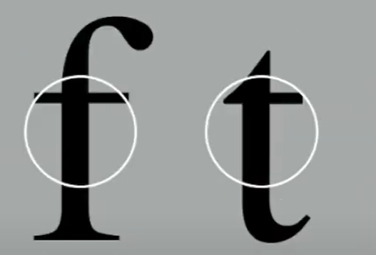
12. Cross Stroke = The horizontal line within a letterform that connects two stems.
fig. 8.0. Example Of Cross Stroke In Letterform JPEG Week 4 (17/10/2023)
13. Crotch = The inner area where two strokes come together.
fig. 8.1. Example Of Crotch In Letterform JPEG Week 4 (17/10/2023)
14. Descender = The segment of a lowercase letterform's stem that extends beneath the baseline.
15. Ear = The stroke that protrudes from the primary stem or body of the letterform.
fig. 8.3. Example Of Ear In Letterform JPEG Week 4 (17/10/2023)
17. Finial = The curved end of a stroke without a serif.
fig. 8.4. Example Of Finial In Letterform JPEG Week 4 (17/10/2023)
18. Ligature = A character created by merging two or more letterforms.
19. Link = The line linking the bowl and loop of a lowercase G.
fig. 8.6. Example Of Link In Letterform JPEG Week 4 (17/10/2023)
20. Loop = In certain typefaces, the bowl formed within the descender of the lowercase G.
fig. 8.7. Example Of Loop In Letterform JPEG Week 4 (17/10/2023)
21. Serif = The perpendicular or slanted base at the tip of the stroke.
fig. 8.8. Example Of Serif In Letterform JPEG Week 4 (17/10/2023)
22. Shoulder = The rounded line that doesn't belong to a bowl.
fig. 8.9. Example Of Shoulder In Letterform JPEG Week 4 (17/10/2023)
23. Spine = The curving stem of the letter S.
fig. 8.10. Example Of Spine In Letterform JPEG Week 4 (17/10/2023)
24. Spur = The extension that links the curved and straight strokes.
fig. 9.0. Example Of Spur In Letterform JPEG Week 4 (17/10/2023)
25. Stem = The prominent vertical or slanting line.
fig. 9.1. Example Of Stem In Letterform JPEG Week 4 (17/10/2023)
26. Stress = The positioning of the letterform, shown by the slender line in circular shapes.
27. Swash =The decorative extension that elongates the letterform's stroke.
28. Tail = The curved slanting stroke at the end of specific letterforms.
29. Terminal = The self-contained ending of a stroke without a serif, which can take various forms like flat, flared, acute, grave, concave, convex, or rounded like a ball or teardrop (as seen in finials).
fig. 9.5. Example Of Terminal In Letterform JPEG Week 4 (17/10/2023)
The Font
- A complete typeface encompasses more than just the 26 letters, including numerals and several punctuation marks.1. Uppercase = Uppercase letters, some accented vowels, special c and n characters, and a/e and o/e ligatures.
fig. 9.7. Lowercase JPEG Week 4 (17/10/2023)
3. Small Capitals = Uppercase letters align with the x-height. Small caps, usually in serif fonts' expert sets, can be generated from uppercase forms using style commands, but real small caps should not be confused with artificially generated ones.
fig. 9.8. Small Capitals JPEG Week 4 (17/10/2023)
4. Uppercase Numerals = Lining figures, also known as uppercase numbers, match the height and spacing of uppercase letters, making them suitable for tabular content and situations that involve uppercase letters.
5. Lowercase Numerals = Known as old-style or text figures, these numerals match the x-height, including ascenders and descenders. They work best alongside both uppercase and lowercase letters. Sans-serif fonts use lowercase numerals less often than serif fonts.
fig. 9.10. Lowercase Numerals JPEG Week 4 (17/10/2023)
6. Italic = Contemporary fonts often have italics, but small caps are usually limited to the Roman style. Italics are inspired by 15th-century Italian cursive writing, and oblique styles are based on the Roman typeface.
fig. 10.0. Italic Fonts JPEG Week 4 (17/10/2023)
fig. 10.1. Italic vc Roman JPEG Week 4 (17/10/2023)
7. Punctuation, Miscellaneous Character = Every font has standard punctuation, but other characters may differ. It's essential to know the full character set in a font before choosing it for a project.
fig. 10.2. Punctuation, Miscellaneous Character JPEG Week 4 (17/10/2023)
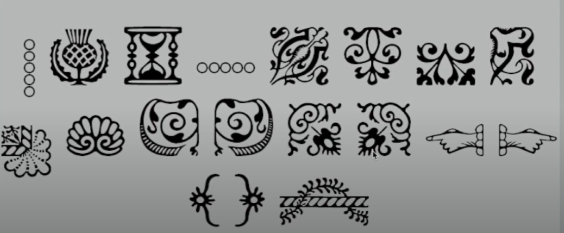
8. Ornaments = Flourishes are used in invitations and certificates, typically within larger font families. Some traditional typefaces, such as Adobe Caslon Pro, include ornament fonts in the complete collection.
fig. 10.3. Examples Of Ornaments JPEG Week 4 (17/10/2023)
Describing Typefaces
- Roman, letterforms come from Roman monument inscriptions, and a lighter Roman style is called 'Book'.
- Italic, are inspired by fifteenth-century Italian handwriting, while obliques are based on the Roman form of the typeface.
- Boldface, has a thicker stroke than the Roman form, and names can vary based on stroke width, including 'semibold' and 'extra bold.' In Bodoni, the boldest version is called 'Poster.'
- Light, lighter than the Roman form, with even lighter strokes referred to as 'thin'.
- Condense, is an extremely condensed style of the Roman form and is often referred to as 'compressed.'
- Extended, is an extended version of a Roman font.
fig. 10.4. Roman, Italic, Boldface, Light, Condense, Extended In Letterform JPEG Week 4 (17/10/2023)
Comparing Typefaces
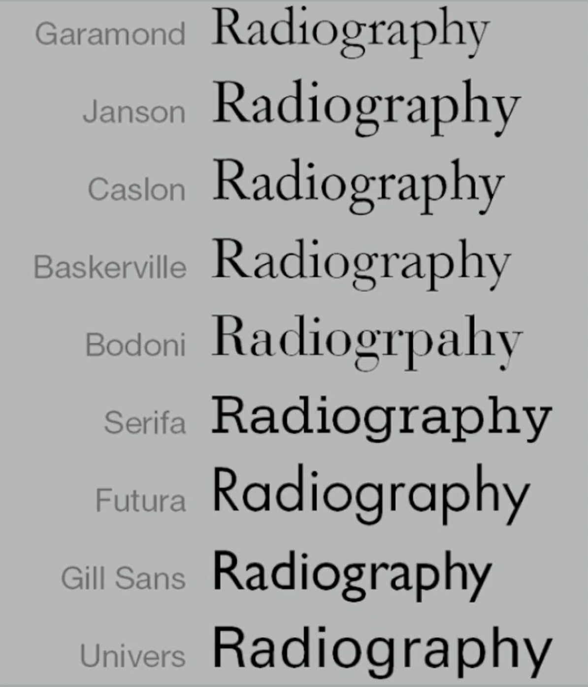
- The 10 typefaces listed in the following slide span 500 years of type design, aiming for both readability and a modern aesthetic expression.
- These fonts have both style and staying power, lasting for decades and even centuries, reflecting how we think, read, write, and print.
fig. 10.5. 10 Typefaces JPEG Week 4 (17/10/2023)
- What matters most are the differences, each arising from a unique accumulation of choices.
- Apart from x-height differences, the forms vary in line weight, stroke width, and character, carrying distinct connotations for typographers.
-The letter "R" below can convey different moods, from playful to formal, mechanical to artistic.
fig. 10.6. Examples Of 'a' and 'R' JPEG Week 4 (17/10/2023)
Week 5: Improving Our Text Formatting
PHYSICAL CLASS
Today, Mr Vinod finally checked our final formatting. Some are good, some needs some changes. For mine, I need to change my font type for the body section and the font size as well. After we were given time to redo our task 1. We then started our task 2 today.
The outcome from the lecture:
I understood:
- the placing of the layout
- the columns and the functions of it
- how to properly play around the kerning and tracking for each section
ONLINE LECTURES
Typo_5_Understanding
Letters: Undertstanding Letterforms
- The letterforms below look symmetric, but they aren't. Baskerville's strokes have different weights and unique curves in each bracket.
fig. 10.7. Example Of 'A' In Letterforms JPEG Week 5 (23/10/2023)
- Uppercase letterforms might seem symmetrical but have subtle width variations. Baskerville and Univers demonstrate meticulous design for both harmony and expression.
fig. 10.8. Uppercase Letterform JPEG Week 5 (23/10/2023)
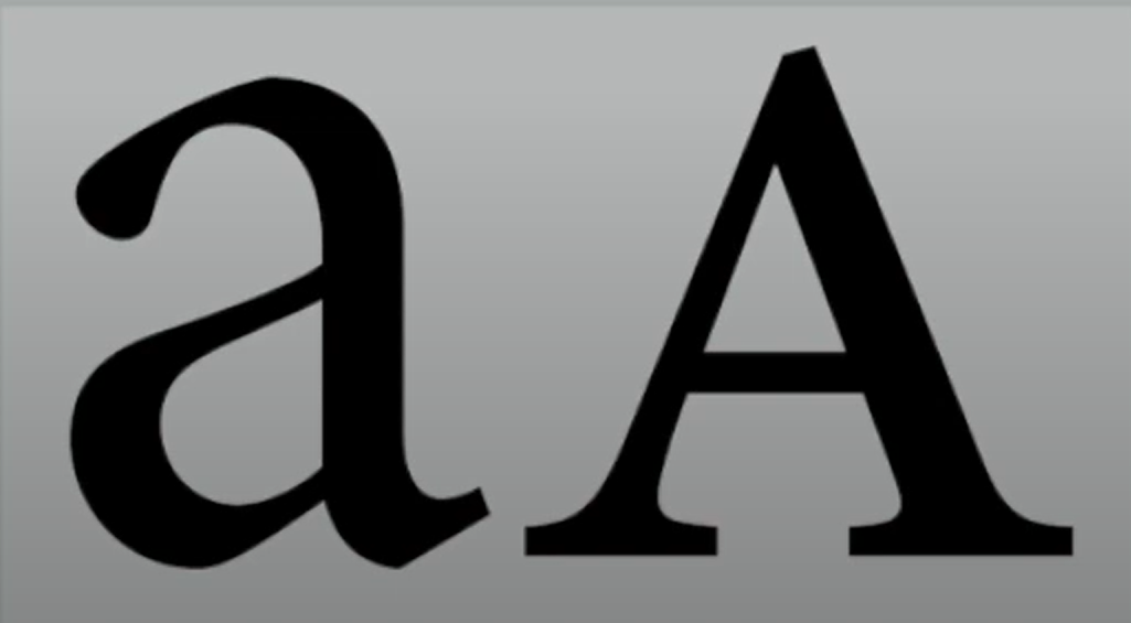
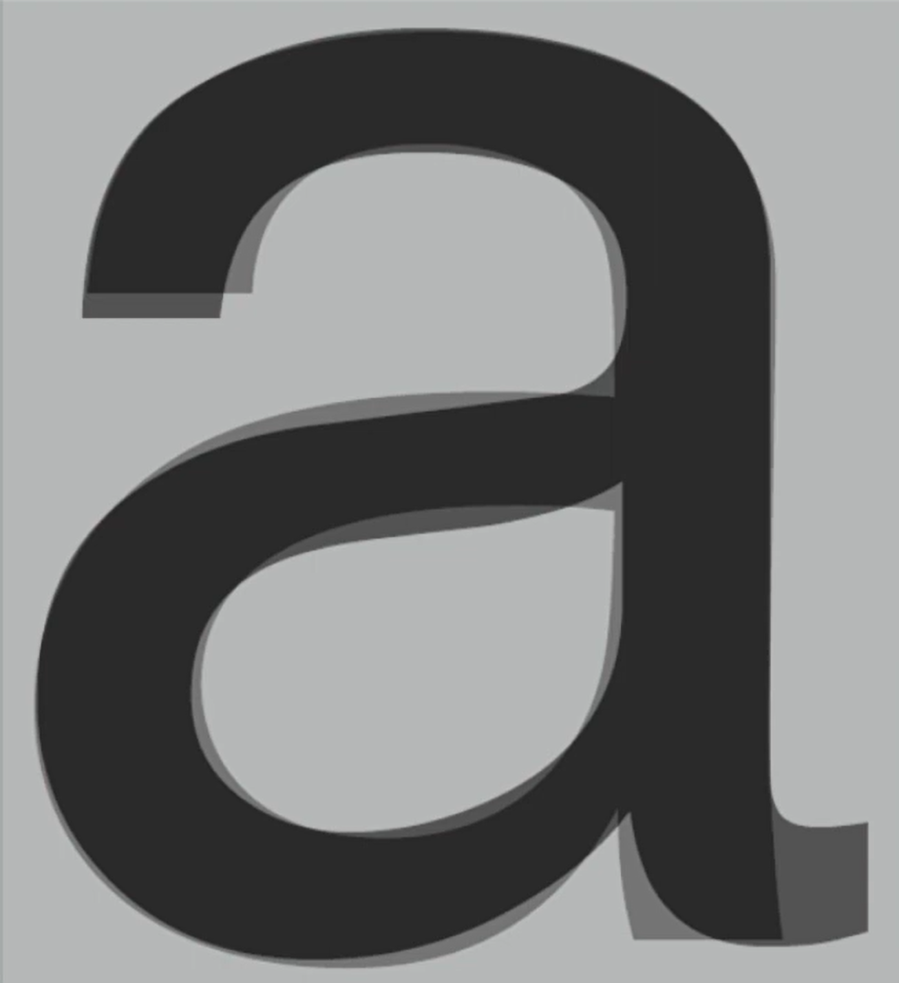
- Analyzing the lowercase 'a' in Helvetica and Univers, which appear similar at first, unveils the distinct intricacies in their character. Their differences become evident when examining how the stems conclude and how the bowls connect to the stems.
fig. 10.9. Comparison Of 'a' In Helvetica and Univers JPEG Week 5 (23/10/2023)
fig. 10.10. The Letter 'a' Overlayed JPEG Week 5 (23/10/2023)
Letters: Maintaning x-height
- X-height typically denotes the size of lowercase letterforms, but remember that curved strokes like 's' need to extend beyond the median (or dip below the baseline) to visually match the height of vertical and horizontal elements they connect to.
fig. 11.0. 'Razors' In Example In x-height JPEG Week 5 (23/10/2023)
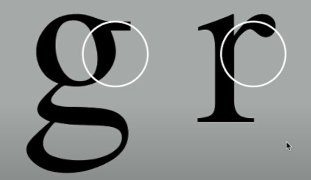
- Understanding letterforms is essential, but grasping counterforms, the spaces within and between letters, is equally vital for clear and cohesive typography, especially when working with letters like 'r' that lack enclosed counters. Counterforms impact the overall legibility and flow of text.
fig. 11.2. Example Of Counterform JPEG Week 5 (23/10/2023)
- Studying letterforms and their counters in close detail is a highly rewarding method to grasp the intricate balance between form and counter, and it offers insight into the unique traits of each letter. This examination also provides a glimpse into the letter-making process.
-It's important to note that as you enlarge the letters, 'S' maintains its identity, while 'g' tends to lose its distinct features when examined separately from the complete letterform.
INSTRUCTIONS
fig 1.0 Typography Module Information PDF Week 1 (28/ 09/2023)
Task 1: Excercise - Type Expression
Timeframe: Week 01 - Week 05
Deadline: Week 06
The exercises are as follows:
1) Type Expression
2) Text Formatting
We were given 7 words to compose and express which are dizzy, electric, fire, cry, gun, slide and freeze and I began by sketching out ideas.
1. Type Expression
fig. 1.1 Final Sketches - JPEG Week 1 (28/ 09/2023)
fig. 1.2 Final Sketches - JPEG Week 1 (28/ 09/2023)
After receiving feedback from Mr Vinod, I started to digitalise my sketches by using Adobe Illustrator, with the help of the tutorial video that Mr Vinod had sent and some tutorial videos from YouTube, I started to get familiar with the app.
fig. 1.3 Fonts - JPG Week 2 (04/10/2023)
This is initially my artwork for the 4 selected words, but after receiving some advice and feedback from Mr Vinod, he thinks I can do better and considering fixing some parts that he thinks I need to improve on.
And so I changed it and this is my final artwork with the words - dizzy, cry, gun and slide.
Final Work
fig. 1.4 Final Fonts - JPG Week 2 (09/10/2023)
fig. 1.5 Final Fonts - PDF Week 2 (09/10/2023)
fig. 1.6 Animated Font - GIF Week 2 (09/10/2023)
2. Text Formatting
After we've done the exercise for Type Expression, we immediately proceed to the next task which is text formatting.
According to the 10 fonts provided by Mr Vinod, we were asked to write our names based on the 10 fonts provided, and this is my work.
fig. 1.7 My Name Based On The 10 Fonts - JPEG Week 4 (18/10/2023)
For the next exercise, we were given a provided text and we were free to play around with the font type based on the 10 fonts, the letterspacing, the kerning, the tracking and more.
fig. 1.8 Text Formatting Layout (Without Grids) - JPEG Week 4 (18/10/2023)
fig. 1.9 Text Formatting Layout (Without Grids) - PDF Week 4 (18/10/2023)
fig. 2.0 Text Formatting Layout (With Grids) - PDF Week 4 (18/10/2023)
After letting Mr Vinod check my text formatting, he needed me to make some changes so I did.
Final Work
HEAD
Font/s: Bembo Std Extra Bold Italic, Futura Std Book Oblique
Type Size/s: 35 pt, 44 pt (headline), 12 pt (byline)
Leading: 42 pt, 52 pt (headline), 14.4 pt (byline)
Paragraph spacing: 0
Font/s: Bembo Std Extra Bold Italic, Futura Std Book Oblique
Type Size/s: 35 pt, 44 pt (headline), 12 pt (byline)
Leading: 42 pt, 52 pt (headline), 14.4 pt (byline)
Paragraph spacing: 0
BODY
Font/s: Bembo Std Bold
Type Size/s: 10 pt
Leading: 12 pt
Paragraph spacing: 12 pt
Characters per line: 58 characters
Alignment: Left Aligned
Font/s: Bembo Std Bold
Type Size/s: 10 pt
Leading: 12 pt
Paragraph spacing: 12 pt
Characters per line: 58 characters
Alignment: Left Aligned
Margins: 21 mm top, 3 mm left + 3.7 mm right + 9.2 mm bottom
Columns: 2
Gutter: 1.11 mm
Columns: 2
Gutter: 1.11 mm
fig. 2.1 Final Text Formatting Layout (Without Grids) - JPEG Week 5 (23/10/2023)
fig. 2.2 Final Text Formatting Layout (Without Grids) - PDF Week 5 (23/10/2023)
fig. 2.3 Final Text Formatting Layout (With Grids) - JPEG Week 5 (23/10/2023)
fig. 2.4 Final Text Formatting Layout (With Grids) - PDF Week 5 (23/10/2023)
FEEDBACK:
Week 1
General Feedback: Everyone must improvise their e-portfolio, watch the YouTube tutorial that Mr Vinod provided, and make sure it isn't messy.
Personal Feedback: E-portfolio is messy.
Week 2
General Feedback: Most of us did a great job, everyone was creative and had their own way of expressing each word based on the 10 fonts, however, there's room for improvement and we need to dive deeper and understand how each word can be expressed better.
Personal Feedback: #3 of dizzy is acceptable, the rest are a bit too expressive, and electric is okay. The rest of the word needed some minimal changes and I'll see how I can improve (maybe get some ideas online).
Week 3
General Feedback: We have to put our labeling under our blog as most of us didn't do that. Our blog is messy and we need to update often. Incomplete and unorganized.
Personal Feedback: I need to update my label, title and lectures section in my blog. Reflection and further reading are okay, poor blog. Update my labels under the pictures. For digital sketches, consider taking out the gradient for 'dizzy', adding a water droplet for 'cry', the letter 'L' for the slide is unnecessarily big, and changing the font as well.
Week 4
General Feedback: I understood the importance of the e-portfolio, and we are responsible to always update from time to time, we shouldn't stress about it.
Personal Feedback: For my animation fonts, I need to change the position of the bullets through the letters, the position of the fonts needs to make slight change.
Week 5
General Feedback: Watch out for the kerning & tracking of our text formatting, characters per line, and pictures can't be texted. Alignment needs to be aware as well. In the future, when we create something like headline, body...do not use 2 serif fonts together, because it makes no sense and it looks awkward. Use sans serif for the headline instead.
Personal Feedback: interesting layout however, change the font for the body, as it's too small. Utilize the space around
REFLECTION:
Experience
My experience with typography so far has been great, it was a mixture of excitement and trepidation. I always thought typography was easy and you could just play around but I was wrong. I had always admired beautifully designed posters, websites and logos, and I knew that typography played a pivotal role in creating those stunning visuals. I continued to explore different typefaces and fonts. It was fascinating to see how subtle changes in letter shapes and styles could convey various emotions and messages. I found myself drawn to certain typefaces. Typography isn't just about selecting fonts' it's also about creating a visual hierarchy in text. I practiced structuring content to guide the reader's eye through the page, making sure the headlines and the body of the text are a balanced composition. One of the valuable aspects of this week was receiving feedback on my work. It helped me to see my design choices from a different perspective and learn from both my mistakes and successes. Furthermore, understanding grid systems is also essential in typography. I dedicated time to studying and applying grid systems to my design projects, which helped me achieve a more balanced and structured composition.
Observation
One of my earliest realizations was that fonts are more than just styles, they are conveyors of mood and tones. One prominent theme from this week was the continual pursuit of knowledge and self-improvement. Each class brought new insights and opportunities to enhance my understanding of various subjects. It became apparent that growth is a continuous process, one that requires dedication and curiosity. I found myself delving deeper into subjects of interest. Whether through in-depth research or engaging in meaningful discussions, my ability to grasp complex concepts evolved. This deepening understanding illuminated the importance of investing time and effort in one's passions. In addition, I also came across obstacles that required problem-solving, resilience and adaptability. These moments reminded me that challenges are an integral part of growth and should be embraced rather than feared.
Findings
Fonts go beyond mere aesthetics, they are powerful tools for conveying emotion and tone. Creating a visual hierarchy with typography involves using different font sizes, weights and styles to guide the reader's attention and convey the importance of different elements. Not only that, kerning, tracking and leading are the key aspects of letter and line spacing. Proper spacing can greatly impact the readability and aesthetics of text.
FURTHER READING
Week 1
fig. 1.0. The Vegnelli Canon - JPEG Week 2 (02/10/2023)
After exploring some books that Mr.Vinod provided, I've decided to go with this book as it caught my attention because it highlights the essence of education and mentorship within the realm of graphic design and typography and the author's acknowledgement of the need for a better understanding of typography in graphic design, and their willingness to share their professional knowledge, resonates with the idea that creativity is enhanced by a solid foundation of knowledge which also suitable for me because I am learning as well.
fig. 1.1. The Intangibles: Semantic - JPEG Week 2 (02/10/2023)
fig. 1.2. The Intangibles: Syntactic - JPEG Week 2 (02/09/2023)
fig. 1.3. The Intangibles: Pragmatic - JPEG Week 2 (02/10/2023)
After some reading and understanding, I've learned that there are 3 aspects in design that are dominant to the author which are Semantic, Syntactic and Pragmatic.
The concept of semantics in design, emphasises its critical role in the creative process and the profound impact it has on the quality of design outcomes. Furthermore, it condemns design devoid of semantics, which is seen as shallow, arbitrary, and even vulgar in some cases. The author strongly criticizes those who intentionally create designs lacking meaning or purpose, viewing them as detrimental to the visual environment and a form of pollution. The distinction between honest vernacular communication and vulgar design is made, underlining the importance of preserving cultural and historical significance in contemporary design.
For syntactical, Syntax, in the context of design, refers to the proper use of design elements like grids, typefaces, and images to ensure consistency and harmony in a project. It emphasizes the significance of syntactical consistency, highlighting its relevance not only in graphic design but also in various human endeavours.
Lastly, pragmatics highlights the importance of clear communication and intent in design. It also highlights that even if a design is semantically correct and syntactically consistent, it must be understood by its audience; otherwise, it's wasted effort. The clarity of intent during the design phase ultimately determines the clarity of the final result. It stresses the value of simplicity, intellectual elegance, and timelessness in design, as opposed to complicated or trendy designs.
Week 2
fig. 1.4. Typography Basics - JPEG Week 2 (02/10/2023)
We should always understand the basics of everything before we dive deeper and this book will be this week's further reading. It focuses on a fascinating exploration of typography and its fundamental role in enhancing readability and information. It also underscores the historical importance of typography as the first goal In book production, dating back to the era of handcrafted manuscripts.
fig. 1.5. Font Categories: Serif - JPEG Week 2 (02/10/2023)
There are many varieties of fonts, this week I'll focus on Serif. Serif fonts are commonly used for body text and headlines due to their excellent readability. The team "serifs" refers to the small feet or arms that extend from the ends of letter strokes, giving the letters a characteristic thick/thin appearance. There are also 3 distinct sub-categories which are: Oldstyle, Modern, and Square Serif.
Oldstyle fonts are reminiscent of classical Roman inscriptions, characterized by open, wide, and round letters with pointed serifs. They exhibit a pleasing contrast between heavy and light strokes, contributing to their timeless appeal.
Modern fonts are rooted in design from over two centuries ago. They feature a higher degree of mechanical precision compared to Oldstyle fonts, with more pronounced distinctions between heavy and light strokes, as well as thin and squared-off serifs
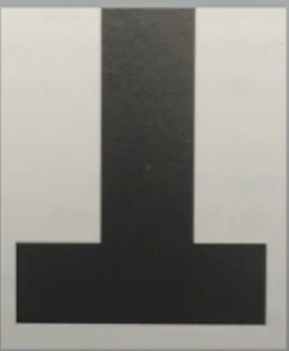
Square Serif fonts, also known as Slab Serifs, represent a contemporary style primarily used for short text portions such as advertising copy, subheads, and headlines. These fonts are characterized by square serifs and mostly uniform stroke widths, with minimal contrast, giving them a distinct and bold aesthetic.
Week 3
fig. 1.6. Typography Referenced - JPEG Week 3 (12/10/2023)
For this week's further reading, I've decided to choose this book called 'Typography Referenced'. It discusses the history and evolution of typography, highlighting how various eras and technological developments have shaped our understanding and appreciation of typography.
fig. 1.7. Introduction to 'Typography Referenced' Page 1 - JPEG Week 3 (12/10/2023)
fig. 1.9. Introduction to 'Typography Referenced' Page 3 - JPEG Week 3 (12/10/2023)
I found out there are many books on Typography such as 'The Elements of Typography Style' by Robert Bringhurst is widely regarded as foundational text on typography. In addition, 'Thinking with Type' by Ellen Lupton is an excellent resource for understanding typographic principles and design. Finally 'Stop Stealing Sheep & Find Out How Type Works' by Erik Spiekermann and E.M. Ginger offers practical insights into typography.
We can explore other comprehensive reference guides on typography, graphic design, and related subjects. These can provide in-depth knowledge and serve as valuable resources. Moreover, look out for books that cover both the history and practical aspects of typography. Other than that, we should also consider enrolling in typography courses or workshops, whether online or at a local educational institution. Hands-on learning can deepen your understanding of typography as well.
Week 4
fig. 1.10. Typography Basics - JPEG Week 4 (16/10/2023)
For this week's further reading, I've decided to continue where I left off from 'Typography Basics' of Week 2.
fig. 2.0. Font Categories: Sans Serif and Examples - JPEG Week 4 (16/10/2023)
Sans Serif fonts are "without serifs", meaning they lack the decorative strokes or "serifs" at the ends of letterforms that are common in Serif fonts. Sans Serif fonts typically have an overall even stroke weight, which means that the thickness of the line in the letters is fairly consistent, creating little contrast between thick and thin strokes. This lack of variation in stroke weight is one of the defining features of Sans Serif fonts.
They are known for their clean, minimalist appearance, and they often evoke a more modern and contemporary look. Due to their simplicity, they can be an excellent choice for various design projects, such as reports, websites, and advertisements. However, it's important to note that while Sans Serif fonts offer a sleek and modern aesthetic, they can be harder to read than Serif fonts in some contexts.
Week 5
fig. 2.1. The Vegnelli Canon - JPEG Week 5 (25/10/2023)
I will continue this book for this week's further reading from where I left off in Week 1, as I haven't finished it yet. And the content of this book is really interesting.
fig. 2.2. The Intangibles: Discipline - JPEG Week 5 (25/10/2023)
I found out that Discipline sets the tone for the importance of being thorough and diligent in one's creative work. Sloppiness, carelessness, and procrastination are seen as detractors of the disciplined approach to design. It emphasizes that every detail is crucial, as the end result of any creative process is the culmination of all the details involved. This highlights the idea that the quality of a design depends on the quality of its individual components.
Discipline is described as a set of self-imposed rules and parameters. These rulers are like tools that ensure a consistent and purposeful approach to design from start to finish. Discipline is also an attitude that maintains the continuity of intent in the creative work and prevents fragmentation.
Design without Discipline is chaotic and irresponsible. Anarchy and irresponsibility can lead to inconsistency and haphazard results in creative work, undermining the overall quality and impact.






























Comments
Post a Comment