Advanced Typography Final Compilation & Reflection
22/04/2024 - 22/07/2024 / Week 01 - Week 14
Wong Jia Yi Carmen 0357198
Bachelor Of Design (Honours) In Creative Media
Final Compilation & Reflection
Task Progression
Task 1: Exercise 1 (Typographic Systems) & Excercise 2 (Type and Play)
Task 2(A) & 2(B) : Key Artwork
Task 3: Type Exploration and Application
SUBMISSION
Task 1 | Exercise 1 (Typographic Systems) & Exercise 2 (Type and Play)
1. Typographic Systems
22/04/2024 - 06/05/2024 / Week 01 - Week 03

fig 1.0 Axial System JPEG Week 2 (01/05/2024)

fig 1.1 Radial System JPEG Week 2 (01/05/2024)

fig 1.2 Dilational System JPEG Week 2 (01/05/2024)

fig 1.3 Random System JPEG Week 2 (01/05/2024)

fig 1.4 Grid System JPEG Week 2 (01/05/2024)

fig 1.5 Transitional System JPEG Week 2 (01/05/2024)

fig 1.6 Modular System JPEG Week 2 (01/05/2024)

fig 1.7 Bilateral System JPEG Week 2 (01/05/2024)
fig 1.8 Final Outcome With Grids PDF Week 2 (01/05/2024)
fig 1.9 Final Outcome With Grids PDF Week 2 (01/05/2024)
2. Type & Play Part 1 & 2

fig 1.10 Final Letterforms JPEG Week 3 (06/05/2024)

fig 2.0 Final Poster JPEG Week 4 (06/05/2024)
Task 2(A) & 2(B) : Key Artwork
13/04/2024 - 06/06/2024 / Week 04 - Week 07
1. Task 2(A) - Key Artwork

fig 2.1 Black Wordmark on White Background JPEG Week 7 (06/06/2024)
fig 2.2 White Wordmark on Black Background JPEG Week 7 (06/06/2024)

fig 2.3 Colour Palette JPEG Week 7 (06/06/2024)
fig 2.4 Wordmark in actual colour on highest shade JPEG Week 7 (06/06/2024)

fig 2.5 Wordmark in the highest shade on darkest shade JPEG Week 7 (06/06/2024)
2. Task 2(B) - Key Artwork
fig 2.6 Colletral 1 JPEG Week 7 (06/06/2024)
fig 2.7 Colletral 2 JPEG Week 7 (06/06/2024)

fig 2.8 Colletral 3 JPEG Week 7 (06/06/2024)
fig 2.9 Instagram Link JPEG Week 7 (06/06/2024)

fig 2.10 Instgram Screengrab Week 7 (06/06/2024)
Task 3: Type Exploration and Application
10/06/2024 - 22/07/2024 | Week 08 - Week 14
Proposal
fig 3.0 Task 3 Proposal PDF Week 8 (12/06/2024)
Download Pixelaterif Here.

fig 3.1 Pixelaterif Uppercase Forms JPEG Week 13 (18/07/2024)

fig 3.2 Pixelaterif Lowercase Forms JPEG Week 13 (18/07/2024)

fig 3.3 Pixelaterif Numbers & Punctuation Forms JPEG Week 13 (18/07/2024)
fig 3.4 Pixelaterif PDF Week 13 (18/07/2024)
Font Presentation

fig 3.5 Font Presentation #1 JPEG Week 13 (18/07/2024)

fig 3.6 Font Presentation #2 JPEG Week 13 (18/07/2024)

fig 3.7 Font Presentation #3 JPEG Week 13 (18/07/2024)

fig 3.8 Font Presentation #4 JPEG Week 13 (18/07/2024)

fig 3.9 Font Presentation #5 JPEG Week 13 (18/07/2024)
Font Application
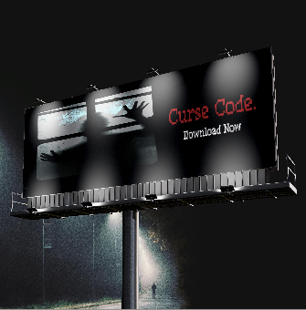
fig 3.10 Font Application #1 JPEG Week 13 (18/07/2024)

fig 4.0 Font Application #2 JPEG Week 13 (18/07/2024)

fig 4.1 Font Application #3 JPEG Week 13 (18/07/2024)
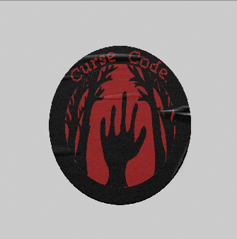
fig 4.2 Font Application #4 JPEG Week 13 (18/07/2024)

fig 4.3 Font Application #5 JPEG Week 13 (18/07/2024)
Reflection
Experience
Advanced Typography turned out to be a rather enriching and enlightening process for me which expanded my vision and perception of typography beyond the basic concepts I was introduced to in the previous semester. I enrolled for this advanced course with a perception that typography was all about designing the fonts, but now I realise that it is much more than that. It is a complex profession that deals with the appearance of products, their usability, and the messages they convey. In the previous semester, I learned the basics of typography: fonts, their application, and basic aspects of typography, such as figuring out how different fonts influence the appearance of the text and its readability. However, Advanced Typography further discussed topics on how type really works by looking at how impressions and meanings are affected by typography.
For example, this course challenged me to consider what happens between the letters, the shapes of the letters and the spaces between and around them where one letter is aligned to the left and the other to the right, and what that does to how a person reads and receives this message and different styles convey particular moods and feelings. Introducing the idea that an object of typography is not a creation of beautiful letters was one of the most influential moments in this course. There cannot be a single unnecessary type of decision that the text needs to be readable, set in the mood, and show the direction to the reader’s attention. Of all the principles of typography, this functional aspect was one that I could only know on the surface before, but now I comprehend it in its deeper context. Furthermore, the course always stressed the significance of context when it came to typography. Hence, there are differences between a font created for an interface as contrasted to one for printed material. We understood how to evolve type for different uses, while still remaining crisp and readable for the platform it was used on. This is specifically important now that typography is very much dispersed in multiple platforms, and hence, typography needs to be ready for anything.
Observations
One poignant was noted as one of the primary shifts that happened by being touched by typography is the space of communication and perception. I realized that if a writer changes the type of the font, its size, spacing, or alignment, then it significantly affects the content’s appearance and either makes it easier to read or influences its mood. Further, I realized that a successful implementation of typography also contains a strong element of context. Designing for the context, for instance, designing for the web and applications as opposed to designing for print is going to have different rules when it comes to readability and visibility. Another issue that was noted was the cyclical nature of the type designing process, referring to it as the type designer life cycle. Due to the nature of typography, it is not unusual to find that there may be two to three drafts for just one piece illustrating that patience and diligence are key in this career. I also found out that typography is not only about looks but is also a part of the toolbox for designing problem solving and user engagement. Observations made have enlightened me on the role of typography in communication as well as the hurdles involved.
Findings
I realized that typography is a lot more than merely designing typefaces. It is an art that comprises not only aesthetics and utilitarian aspects but also the process of conveying the message. This understanding I found to be vastly important in determining perception and meaning through typography. This is the general principle that there should be a reason behind the choice of all types of fonts, not only in the context of the given text, but in general: this might be the readability, the choice of the mood, or the leading of the reader’s vision along the composition. Furthermore, I realized that the environment plays a big role when typography is being used. Various formats of media used; whether it is online or a newspaper, require a somewhat different approach in type design in order for it to be effective and readable. This makes it easy for organizations to adapt to the modern world that is defined by multiple platforms. Moreover, the practical projects also explained the significance of the thinking process and the sharp focus most especially in type designing as it involves consecutive modelling. There is no medium that there is no need for constant improvement and reconsideration to attain the goal set to be reached. In general, all the above leads me to the conclusion that typography is a multifaceted and constantly evolving activity that means much more than the aesthetic appearance of letters. It is about problem-solving in design, international communications, and the approach to better user experience.


Comments
Post a Comment