30/09/2024 - 28/10/2024 | Week 02 - Week 05
Wong Jia Yi Carmen | 0357198 | Section 01
Brand Corporate Identity | Bachelor of Design (Hons) In Creative Media
Task 2: Logo
Table Of Contents
1. Lectures
2. Instructions
3. Research
4. Process
5. Feedback
6. Submission
7. Reflection
LECTURES
Week 2: Brand
- What is a brand?
- What is brand identity?
- What is branding?
- What are the benefits of branding?
- What is a designer's role in branding?
One of the problems when designing the term ‘brand’ is the lack of an unambiguous definition. Although most of the brand and marketing professionals, senior designers and other executives and managers involved in brand management should know what a brand stands for, sometimes many designers may not. We may now endeavour to put some of these ideas in a better light. It is important, however, to note that these opinions regarding these definitions may differ from one another and none of the things discussed here can be considered as universal. Anyway, it is always possible for mistakes, to give a better explanation, for other opinions and perceptions. In the end, it is your decision to make.
What is a Brand?
What does ‘brand’ or ‘branding’ actually mean? The word is derived from the Old Norse word 'brandr' translating to ‘to burn’ and is connected with the prehistoric process of marking cattle. This practice was started more than 4,000 years ago in the region now referred to as the Indus Valley or the Indus Valley Civilization.
fig 1.0 The Map Of Indus Valley JPEG Week 1 (26/09/2024)
For centuries branding has come a long way starting from farmers using the method to mark their property, artisans taking pride in putting their signature, from factories having their products identified, to companies selling their products and marketing them as superior to the rest. But what did branding look like when it arrived on the scene, and what does it look like now?
fig 1.1 Cattle Branding JPEG Week 1 (26/09/2024)
It is a process where cattle are burnt with a hot iron to affect their skin in a manner that makes it easy for the owners of the cattle to track or reclaim their animals should they be stolen. It’s especially useful in large open grazing areas where cattle from various owners may flock together. It is easier to recognize a branded animal and very difficult to steal because the brand acts as evidence of ownership. It is also a legal brand in some areas that can be used in court cases concerning animals. Even today there are better methods like ear tags or microchipping but branding is still in practice because it has been in use for centuries and is long-lasting.
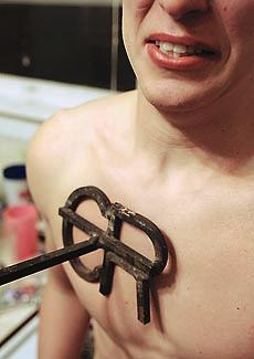
fig 1.2 Human Branding JPEG Week 1 (26/09/2024)
Human branding or scarification is a process of putting permanent marks on the skin using burns. They indulge in this process for different reasons. For example, in some cultures, it assumes the role of a ritual in many aspects of life, and in others, it is a symbol of status and membership in a group. Some people select branding for the purpose of self-identification since they can use branding elements to illustrate the principles they subscribe to or events in their lives. Of course, branding can also mean a partnership between two or more individuals or groups, or even between different subcultures. It may mean commitment to a spiritual or faith in a particular religion in some other religious beliefs. In the past, it was used as a way of punishing or of identification as in animal branding while today it is those professional body imprints.
We realise that what and how we brand, let alone why we brand has changed over the years. However, in the twenty-first century, branding continues to brand ownership in addition to product and property branding. It entails accepting each aspect of what your company represents, where it has gone wrong, and then earning the trust of its customers through the effort and rhetoric put forward by the company.
So what is a brand?
A brand therefore is an innate emotional impression of a particular product, service or company. While firms are not capable of totally managing this perception, they are able to influence this by articulating the characteristics that make up their products. However, once a large number of people have such ideas, then consultation can bring the firm to the condition of a brand. Ultimately, a brand is not what you say it is but is what other people think it is, at least from a scholarly perspective. It is a way that a product, a service, an organization, or even a person is pictured in the minds of the members of society.
fig 1.3 What is a Brand JPEG Week 1 (26/09/2024)
What is a Brand Identity?
When marketing professionals are speaking about brand identity they often think and talk about the “gut feeling” or brand perception and communication that is associated with any product, service, organization or person. This view holds considerable merit, for intuition is one essential aspect of a single brand image. Another important component of it is the ‘branding,’ which plays a role in defining as well as moderating the general message or image. Brand image is the set of all the communication meanings and symbols that a company creates and employs in its efforts to reach consumers. Closely related to brand image and branding though the two are different from each other.
fig 1.4 Brand Identity JPEG Week 1 (26/09/2024)
What is Branding?
Branding is the management of the meaning process by communicating the meaning and constructing it where the meaning is given to a particular organization, company, product or service. Laimae is a strategic approach formulated by organizations for those who are able to quickly notice their brand and get the key reasons to choose the organization’s products instead of those of the competitors.
fig 1.5 Branding JPEG Week 1 (26/09/2024)
The campaign “Be Stupid” collected by Diesel is the perfect example that breaks the company apart from other similar ones. It is a brand that does not conform to any regulation or standard, which thus fits perfectly with its rebellious logo.
fig 1.6 'Be Stupid' Campaign JPEG Week 1 (26/09/2024)
It can be said that ‘UNHATE’ promotion corresponds with Benetton’s position since the 1980s because it has value and social character. Over the years, the brand has concerned itself with the sending out of messages that are not playful, but rather provocative social statements.
fig 1.7 'UNHATE' Campaign JPEG Week 1 (26/09/2024)
With respect to the product values, communication and visual strategies, there is a clear dichotomy between the two brands outlined in the campaigns by Diesel and Benetton. However, they both fall under the same approach in terms of what the viewer is presented with when they glimpse at the images. In these two particular instances, branding means creating and fixing an image in the minds of consumers by providing a lasting and distinctive identity.
Branding can be accomplished through several key components:
- Brand Definition: Defining the role of the brand in the market,
- Brand Positioning Statement: A short statement that defines what your brand does, for whom, and why;
- Brand Identity: This encompasses the brand’s personality written communication strategies, which include the brand’s name, tone of voice, and even the VI design comprising the logo, colour and typeface selection.
- Advertising and Communications: Through different media tools such as TV, radio, magazines, billboards, websites and mobile apps.
- Product Design
- Sponsoring and Partnerships
- In-store experience
- Workspace experience and management style
- Customer Service
- Pricing Strategy
What are the benefits of branding?
- Branding allows you to stand out in a crowded market.
- It enhances your credibility.
- A well-defined brand enables you to charge a fair price for your offerings.
- Branding fosters customer loyalty.
- It encourages repeat business and referrals.
- Branding ensures consistency.
- It helps attract your ideal clients.
- Investing in branding can save you time and money.
- It instils confidence in your business.
- Established branding simplifies the introduction of new products and services.
- Branding provides a clear strategy for future growth.
What is a Designer's Role in Branding?
Designers are very important in the development of a brand, however, they are just but one part of a team responsible for endowing that brand with personality and form. The fact is that a brand simply cannot be created without such skills which designers bring. Brand image created by a designer is the face which represents the brand. Their work is to convey the content and strategy, as well as the communicating messages in the form of graphics. For designers, this means learning about the client and the client’s company and product, the target audience among other things, and the creation of trademarks.
For a “design program” needed to create a consistent message, the visual identity must also be consistent and valid to all structures and products or services of the organization or the individual. Brand enterprise is important in both large and medium enterprises, and this design program makes branding significant and works as expected. The task of the designer is to provide a brand image that can be easily recognized, easily remembered, uniform, and appropriate for the brand in terms of value and gross revenue. This identity should be reassuring, improve the market position, speak to the hearts of the buyers, and encourage their loyalty. This can only be realized if there is adequate research, appreciation and the right application of the visual identity program.
In the older centuries, the majority of the companies were trapped in a vicious cycle of low R&D investments, first-mover advantage, market pressures, and price competitiveness that ultimately pushed them into the depths of relegation. On the other hand, branding engulfs an organizational culture that gives birth to a virtuous cycle. If a part of intellect is mixed with the part of intuition, the string of events that may transpire from that basic activity of starting to differentiate, may then integrate, innovate, validate, and cultivate. The exclusion of all assumptions that Kareem has stated must be questioned, doing more than the best, and starting all over again. With each iteration, the company and its brand rise higher, drawing closer to the ultimate goal of marketing: which in turn was associated with reaching a sustainable competitive advantage.
Week 3 Types of Marks
- Logo
- Monogram
- Heraldry
- Trademark
Logo
Logos, logotypes, symbols, signatures, monograms and similar terms are not clearly distinguished and people usually get confused. Although designers and marketing professionals tend to have a vague idea of brand identity elements the practical application of these can lead to confusion. Perhaps, we should attempt to define the concepts behind certain of these terms. They need to understand that there can be other views and it is necessary to analyze and build up a good perspective in their opinion based on sufficient knowledge all the same.
fig 1.8 Logos JPEG Week 3 (08/10/2024)
The word 'logo' was derived from 'logotype' which is a trademark generated from a single word spelt in handwritten style ('logos' means 'word' in Greek). Loga was originally used because it sound pleasant to the ear but what is normally referred to is a trademark whether it is a logo, symbol, monogram, emblem or other graphic feature (Neumier, 2003). It is a usual misconception that a logo is just a text or/graphic symbol describing the business, service, product or person. In fact, the term logo refers to any marks that represent a brand. A logotype means a business name or its abbreviation in the form of a logo A logomark is an abstract image or symbol to signify a business or company.
Wait a minute, but what is a signature in the first place? A signature, also called a “combination mark,” is when a word and a symbol are used. However, at times a ‘logotype’ is known as a ‘wordmark’ both are in fact similar.
Monogram
A monogram is an art that develops a word by combining two or more letters or other figures so as to interconnect it with another figure or letter. They are usually made up of the first letters of names, for this reason, monograms act as symbols or logos. The word 'monogram' derives from Greek and means “a single line” as in written or drawn in profile (Mollerup, 2001).
fig 1.9 Monogram JPEG Week 3 (08/10/2024)
Established in 1602, the Dutch East India Company also known as VOC originally started out as a spice merchant. The same year it started the first recorded IPO in the world, thus was able to quickly and very effectively raise 6.5 million guilders. The VOC’s business and institutional developments helped to determine the future course of today’s transnational corporations and capital markets. Nevertheless, it was an invader, murderer and theft of people, kingdoms and states’ resources and knowledge, to aspire to corporate gains and pleasures en masse by subjugating numerous peoples, kingdoms, and states.
fig 1.10 Logo of Dutch East India Company JPEG Week 3 (08/10/2024)
Eustachius De Lannoy through the Dutch East India Company gave in to Maharaja Marthanda Varma of the Indian Kingdom of Travancore after the Battle of Colachel painted in Padmanabhapuram Palace. What is often overlooked in colonial narratives (whether English, French, or Dutch) are defeats like this: In 1741 the warriors of Travancore with Raja Marthanda Varma defeated the Dutch in the Colachel War. This fight is one of the examples of the first non-Asian states defeated by the European militarized technology and winning for the Asian powerful state which designed the Dutch influence in India.
fig 2.0 Eustachius De Lannoy JPEG Week 3 (08/10/2024)
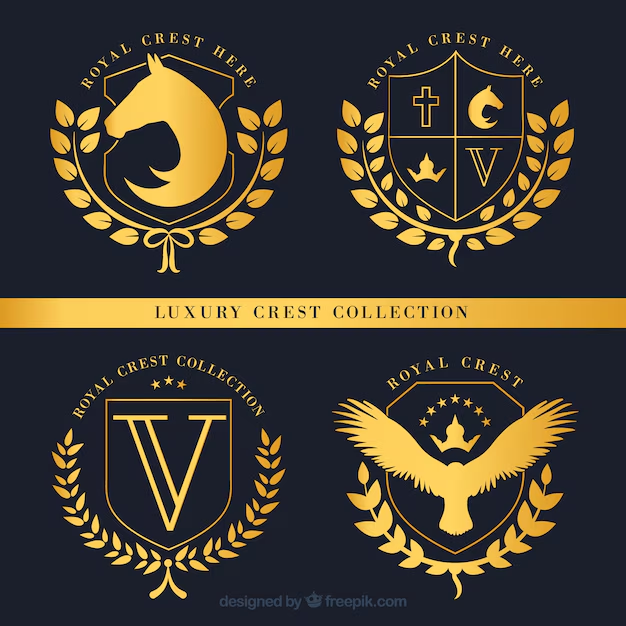
Heraldry
Heraldry is a venerable field that covers the creation, use and systematic investigation of armorial bearings commonly known as Armoury and the carrying out of ceremonies, rank and lineage investigation. Europe is the birthplace of the American breed primarily. Though it can be seen that in many places symbols, seals, and flags are being used to represent royalty, armies, empires, etc., this particular method of integrating multiple objects together in one symbol as has been seen in heraldic symbols is purely euro-centric. Therefore, there is a toleration of what can be called equivalent concepts such as Crest, Coat of Arms, as well as Insignia.
A crest is a unique symbol representing a family or corporate entity, traditionally displayed above the shield of a coat of arms (originally worn on a helmet) or reproduced separately, such as on stationery. A coat of arms refers to the distinctive heraldic shield or bearings associated with a person, family, corporation, or country. An insignia is a distinguishing badge or emblem denoting military rank, office, or membership in an organization, such as a khaki uniform with a colonel's insignia on the collar or the royal insignia of Scotland.
fig 2.1 Example of a Crest Logo JPEG Week 3 (08/10/2024)
fig 2.2 Example of a Coat Of Arms Logo JPEG Week 3 (08/10/2024)
fig 2.3 Example of a Insignia Logo JPEG Week 3 (08/10/2024)
Mark
When used separately, the term mark is defined as an imprint left on a surface such as paper, a wall or wood. Nevertheless, when added to other words like a trademark, watermark, earmark, farmmark, ceramics mark, stonemason’s, hallmark, printer’s or furniture mark these marks point to ownership or identification of a certain product. They contain a message of quality, of skill, of the maker, of the hand that made it and the empower the bearer with a certificate of credibility.
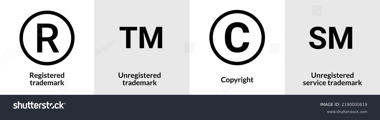
Today, the term we are most familiar with is "trademark," both in legal contexts and branding. While the more ambiguous term "logo" has gained popularity among the general public, "trademark" remains the dominant term in legal matters. Alongside trademarks, the term "service mark" also carries legal significance in the U.S. and several other countries.
A trademark is defined as a legal and acknowledged symbol, word, or a phrase that a company uses to market their products or services. Its major use involves identification. As mentioned by Mollerup (2001) this identification takes place within a so called ‘design programme’, which is among the management strategies of the corporate identity – a strategy working on the level of the organization with branding working on the level of the product.
fig 2.4 Trademark JPEG Week 3 (08/10/2024)
Trademark also act as a legal shield from proprietor’s exclusive right over the identified trademark for the purpose of protection against any act of piracy or theft. A service mark, employed in some countries including the United States, is employed to particularly distinguish a service from a product. Unregistered trademarks and services marks remain nominal until the well-known sign, design or expression providing for identity of products or services of a distinct source is formally registered. The ®symbol is a Kingman symbol that suggests that whenever there exists a word or movement symbol subsequent to the image, it is the sanctioned trademark or service mark of a certain jurisdiction, which a personality has registered with the national trademark office.
Week 4: Brand Ideals
A brand is a consumer’s first, unconscious impression of a product, service, or business. Of course, firms cannot directly manage this perception; however, they can influence it by emphasizing the distinctive characteristics of the offered product (Neumeier, 2003). The meaning of ‘ideal’ is associated with the realization of the dream or purpose, that in an ideal or most suitable way, and cannot directly control this perception, they can shape it by highlighting the qualities that set their product apart (Neumeier, 2003).
The concept of 'ideal' refers to the fulfilment of one's vision of what is perfect or most fitting. A brand idea goes deeper than the products or services which are offered—it is the noble cause that a brand represents. According to Stengel, the purpose of the brand is the brand’s driver, stating why the brand exists and the kind of difference it seeks to make in the world (Garbe, 2012).
Peter Drucker has long said that, the company which can boast of the best workforce is the company where people with potential work closely and in unison. Stengel (n.d.) has brought it to our attention that common cause is the most important factor that fosters cohesiveness in a leadership team. Values-based brand ideals offer meaning and purpose to everyone whom holds, appreciates, and is committed to, organizational aims and goals that are enshrined in those broad ideals.
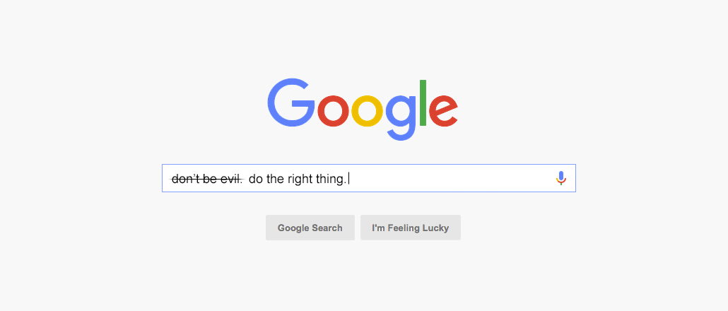
One of the unofficial mottos which were once in Google’s code of conduct was “Don’t be evil”. However, this phrase was quietly dropped in 2018. Although the motto was a value people have thought the company used to hold, many of them realized Google had left that behind years ago.
fig 2.5 Google Old Motto JPEG Week 4 (09/10/2024)
At the Brand level, storytelling has the role of creating actual interest and encouraging consumers to build long-term relationships with the brand. To many managers, these values act as a compass pointing the business towards the market and are not likely to change. In this case, it is the internal elements that define it – namely the purpose, personality and proposition that actually dictate the company’s interaction with customers. The best examples of what brand values look like connect to what the customer believes, but also reflect what the business is passionate about (Couchman, 2017).
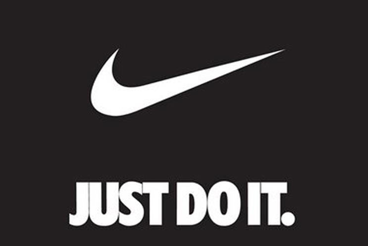
Nike’s advertising slogan “Just Do it” which began in 1988 is all about success, and encouragement to athletes and everyone who feels that they can achieve their goals.
fig 2.6 Nike 'Just Do It' JPEG Week 4 (09/10/2024)
Apple was struggling with market share problems in 1997 they came up with the idea of the 'Think Different' campaign to describe their brand and its values to the public, employees and shareholders. Apple’s strategic orientation revolves around the development of the best and most innovative device in the world, retaining the need for technology to be simple, and more quality than quantity.
fig 2.7 Apple 'Think Different' Campaign JPEG Week 4 (09/10/2024)
Ideals are an important element of the post-pandemic process of creating values regardless of the scale of the company and the type of its activity. These ideals include:
- Vision
- Meaning
- Authenticity
- Differentiation
- Sustainability
- Coherence
- Flexibility
- Commitment
- Value
Vision: According to Baber (2008), the strongest and most motivating brand concepts originate from a clear vision which is steered by an eloquent and enthusiastic leader. Vision demands courage. Big thoughts, ventures and things stem from people why have the capacity to picture all that other people cannot and the stamina to make the dream a reality. This vision needs to be communicated directly in order to shape a brand’s identity effectively. In turn, leaders who devote their efforts to the core conversation and attend not only to their greatest hopes and fears also value symbols and understand how vital storytelling continuously is to creating both the culture and the brand of the 11 Digits company (11 Digits, n.d.).
Meaning: The best are high in symbolism, conveying a big idea, a strategic position or a set of Inspirational values (Baber, 2008). Words as symbols do not have meanings that can be easily identified or come easily, they build over time. This meaning is realized in style by designers and expressed in the image of objects embodied in the models. This meaning must be clear to another to be understood and approved and that is why I need to make it explicitly clear. With this in mind, every piece of a brand identity system should have an underpinning that provides meaning and a level of obviousness or order (11 Digits, n.d.).
Authenticity: In the absence of an organization’s understanding of the market, its position, value, and competitive advantage in this market (Baber, 2008), authenticity cannot be possible. Integrity is being conscious of one’s self and then deliberately deciding and acting in accordance with that consciousness. Some organizations that grasp this start the identity process in a position of power and thus develop brands that are not only sustainable but authentic. The brand expression must come out with a clear picture of the mission statement of the organization, its history, culture, values and its personality. Consumers engage with firms that are meaningful, unique, and more importantly authentic (11 Digits, n.d.).
Differentiation: Brands are always in a battle within their respective niches and, to some degree, against all brands due to our time, energy, and buy-in (Baber, 2008). What seems to be missing is someone or something to communicate clearly and offer a clear positive vision of an ideal direction. That precisely leads to the question of the profound reasons consumers may have for taking an interest in one brand rather than another? Just to be different is not enough; brands must assert this about themselves and must have the ability to tell consumers how they are different. Can you imagine that suddenly your brand disappeared from the market: would your disappearance be notable? The true strength of the brand generates a massive gap. (11 Digits, n.d.)
Sustainability: Sustainability means the ability to sustain organisations into perpetuity in a globalised world characterised by constantly emerging environmental fluctuations such that anticipating and prepare for future changes becomes very difficult (Baber, 2008). Brand denotes reliability in the world characterized by high volatility of institutions, technologies, science, lifestyles, and language. People are familiar and safe with trade marks that familiar to them. It refers to theability of keeping a commitment to an idea for sometime and whether it can be able to withstand change (11 Digits, n.d.).
Coherence: Each touch point within a brand needs to look and feel like the last, and the result should be the desired one (Baber, 2008). They whether consume a product, interact with the customer service department or make a purchase on the iPhone, they should feel that they are dealing with a particular brand. Coherence helps all elements be in harmony to the extent that is preferred by the customer, sets out the framework in which trust can be developed, complimentary customer loyalty cultivated and customer satisfaction maximised. The organization strategy of a brand mark needs to be visually and structurally integrated and should contain internally harmonized brand hierarchies and coherently used color and font and format. There are obvious advantages to such a system, which include immediate gratification and the reinforcement of brand values in multiple media environments (11 Digits, n.d.).
Flexibility: A good brand also helps a company adapt for future growth and change in strategic position (Baber 2006). Innovation requires the management of brands to have flexible identity management and configuration so that a brand can quickly respond to a new market opportunity. The ideas created from the brand identity toolkit are creative, but are managed within certain parameters so as not compromise the easily recognizable brand appearance. Evidently, while keeping the balance between tight control and artistic freedom, it is possible to solve certain marketing objectives and, at the same time, keep the identity standards (11 Digits, n.d.).
Commitment: It therefore becomes crucial for organizations of the current era to make sure that everybody working close to the brand is committed and eager towards making it succeed (Baber, 2008). Brand equity is a brands’ worth and as such it has to be safeguarded, maintained as well as developed. This asset demands persistent attention, and top management support to strengthen brand awareness across the company while creating awareness down to the staff on the importance of the brand. It takes effort, self control, and dedication to establish, protect, and continue to foster a brand that stands for something and is valuable to its consumers. The management must continuously push on with the exercise, ensure strong adherence to the idea, constantly check the standards and the tools required to expand the brand (11 Digits, n.d.).
Value: This defination means that tangible measurable results have to be produced to sustain a brand (Baber 2008). In most organizations it is the creation of value which forms the ultimate aim. Sustainability has shifted the value proposition with consumers, from just the idea of profit to that of the social, environmental and economic value. Brand as an Intangible asset, obtains its value from Its identity, all physical manifestations, from the package to the Website that reminda consumers of that value (11 Digits, n.d.).
This is quite amusing, but organizations that aim to have an idealistic value drive the market to generate more money. The brands that operate with a calling, as a guiding principle, are successful for at least two reasons. First, they can endow the employees with incredible potential for unleashing primal instinctual and creative resources, which will help them adjust to the new types of consumers who look for something to belong to and participate in. The actual endeavor for brands in the future will be to actually build and maintain intangible markets for themselves as they attempt to bring people together through ideas (Simon, 2011).
Week 5: Positioning
Positioning
From a layman’s perspective, brand positioning entails determining the location of your brand in the minds of your buyers. This concept is also called positioning strategy, brand strategy or brand positioning statement (Bueno, 2019). Nonetheless, writing in 2017, Willis makes a distinction between strategy on the one hand, and positioning on the other, of the brand. “Brand planning is just like map making while brand positioning refers to where you are coming from and where you would want to be.”
Thus, positioning means the place a brand occupies in the minds of customers and how it sets itself apart from the rivals’ offerings.
However, it is also vital to stress that brand positioning is rather a one-time effort, as attempts to reposition it can be extremely difficult. For instance, the company such as Volvo had created the image of a strong and safer car that got all the families to shift to the company. However, the rating was made unfortunately low due to the undesirable consequence, namely that safety decreased its ‘seductive’ aspect.
fig 2.8 Volvo JPEG Week 5 (14/10/2024)
Often, organizations run into the problem of forming a niche, thereby not being unique from similar organizations in the market. To stand out, you require to know what your competitors are not doing. Realize the gap (Johnson, 2010) in your market that you can pickup while others are failing to capitalize on it. “Positioning is all about creating a distinct image in the mind of the consumer to enable him associate something distinctive and favorable with your brand, that you alone provide.” (Bueno, 2019).
Positioning will happen even where the clients concerned do not support it in a specific respect. I think the question that needs to be answered is; do they wish to be involved in shaping the perception of the same by the target market? Most clients do. Which positioning strategies are there? Willis (2017) amusingly suggests four different styles (or types) of positioning:
- Arm wrestling
- Big fish, smaller pond
- Reframe the market
- Change the game
1. Arm Wrestling – Here you decide to fight the market leader by doing what he does in a bid to garner the same market share. This is often effective when a company is in a stable market segment where there isn’t any strong market domination and this is realized after a mutual long run and deep pockets. There are many examples like coke and pepsi type of companies that are the main competitors.
2. Big Fish, Smaller Pond – This strategy aims at a segment in a bigger market the large firm is already in but a need that is not well served to the best of the big firm’s ability. The benefit is that the audience already has a mental reference point but the disadvantage is that you may easily be competed out of the market by the market leader.
3. Reframe the market - This positioning strategy involves defining an existing market in a different perspective. It makes the benefits once promoted to the market by dominant players in the market and now seem mundane or boring. This approach is good to use especially where your product or service provides novelty or where there has been change in need or expectation among the customers.
4. Change the Game – This strategy is useful if you are a category creator company. The corollary to always being the first is you get to define your own market, literally and figuratively. Market disruptors are things people now refer to by specific brand names, for example, using an Uber instead of a taxi or Xeroxing instead of photocopying. The advantages of such an approach are as follows: You automatically become the market reference. But conversely, with great concept with little or no barriers to entry (as seen with patents and copyrights), others may merely emulate you and leapfrog over you before you can even fully entrench yourself (for example, Grab, which used to be called MyTeksi).
When we define positioning, how do we achieve it? According to the notion of positioning strategy, it is necessary to first understand what exactly differentiates your brand and how you best position it in the market. But is not positioning the similar to differentiation? All of these concepts may seem rather intricate and one needs to accept that as a student this can be rather helpful.
Positioning VS Differentiation
Positioning also referred to as market positioning is a strategic technique that marketers use in order to identify where in this market, an offering should be placed. During positioning, marketers try to ensure that a particular product or service occupies a special somewhere in the minds of a specific target audience. Strategic positioning need not be overt and may often be tough to note” (Lumen, n.d.).
Positioning or market positioning is very much related to differentiation. This has to do with how firms position themselves to ensure that a product or service offering they provide has a unique edge over its rivals. Differentiation is important in making a decision, any time you are selecting between two products in the same class” (Lumen, n.d.).
Product or service positioning depends on some attributes or factors that distinguish the product or service from the competitors as it appears to the target segment.
Before being able to answer the questions of what makes your product, service, organization, or individual stand out most, proper procedures in the positioning of the brand need to be followed. However, to gain better insight in the strategy to use in the clarification of the market positioning, there are seven basic steps outlined by Bueno (2019).
- Determine how your brand is currently positioning itself
- Identify your direct competitors
- Understand how each competitor is positioning their brand
- Compare your positioning to your competitors to identify your uniqueness
- Develop a distinct and value-based positioning idea
- Craft a brand positioning statement
- Test the efficacy of your brand positioning statement
How to create a brand positioning statement (Bueno, 2019): For a positioning statement to be strong there are four components:
1. Target Customer: A brief but precise definition of identifying the target market based on select demographic and psychological attributes in relation to your brand of interest.
2. Market Definition: The type of marketplace your brand is in and when it is most appropriate to make it relevant for your customers.
3. Brand Promise: The core promises to target customer populations that are most motivating (emotional or intellectual) and superior to competitors.
4. Reason to Believe: The final proof of brand credibility and the evidence that proves your brand capable of fulfilling the brand promise.
When it is possible to create a brand positioning statement, one can create an easily memorable slogan that would remind consumers of the intended position. Marketing positioning claims are strategic communications targeted at employees of the business firm and are supposed to help it make the right choices in the marketing of its goods and services. On the other hand, tagline refers to an external statement employed when you are advertising. This is something learned from the positioning statement that if applied accurately can assist in creating the tagline but it is critical to note the differences between the two (Bueno, 2019).
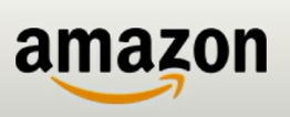
fig 2.9 Amazon's Logo JPEG Week 5 (14/10/2024)
Amazon's positioning statement: "For internet users who love books, Amazon.com is an online bookseller offering immediate access to over 1.1 million titles. Unlike conventional bookstores, Amazon.com delivers exceptional convenience, affordable prices, and a vast selection."
Amazon's Tagline: From A to Z.
INSTRUCTION
fig 1.0 Brand Corporate Identity's MIB Week 1 (26/09/2024)
RESEARCH
PROCESS
A)
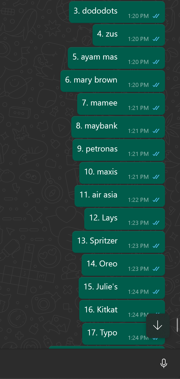
All the collected logos are sent to my WhatsApp so that I'll remember when I start to do the slides.
fig 1.1 Collected Logos Week 5 (25/09/2024)
After I got what I needed, I proceeded with the slides.
fig 1.2 Process of Making the Slides Week 5 (25/09/2024)
B)
Before we start our sketches, we were told to come up with 3 possible careers that we would like to design our logo during week 1. And these are my draft 3 careers.
fig 1.3 3 Draft Careers Week 2 (03/10/2024)
After showing it to Ms Lilian, she agrees to go with the first one as it's interesting. I went home and continued with the 2 mindmaps for the business side and the brand name side.
Here is the mindmap of the business side for "The Petals Atelier".
fig 1.4 Mind Map (Business) Week 2 (05/10/2024)
And here is the mindmap for the brand name itself for "The Petals Atelier".
fig 1.5 Mind Map (Brand name) Week 2 (05/10/2024)
After showing it to Ms Lilian, she said I have a good consideration aspect for both of the mindmaps. But a mood board was needed to help visualize it.
This is the overall vibe and theme I'm trying to go for. It's a vintage cozy place with windows to let the sunlight in.
fig 1.6 Moodboard Week 2 (05/10/2024)
I've tried to find some inspiration and references on Pinterest. These are just some of the main ideas of what I want in my logos.
fig 1.7 Logo References Week 2 (06/10/2024)
After getting everything in my head, I begin with the sketches.
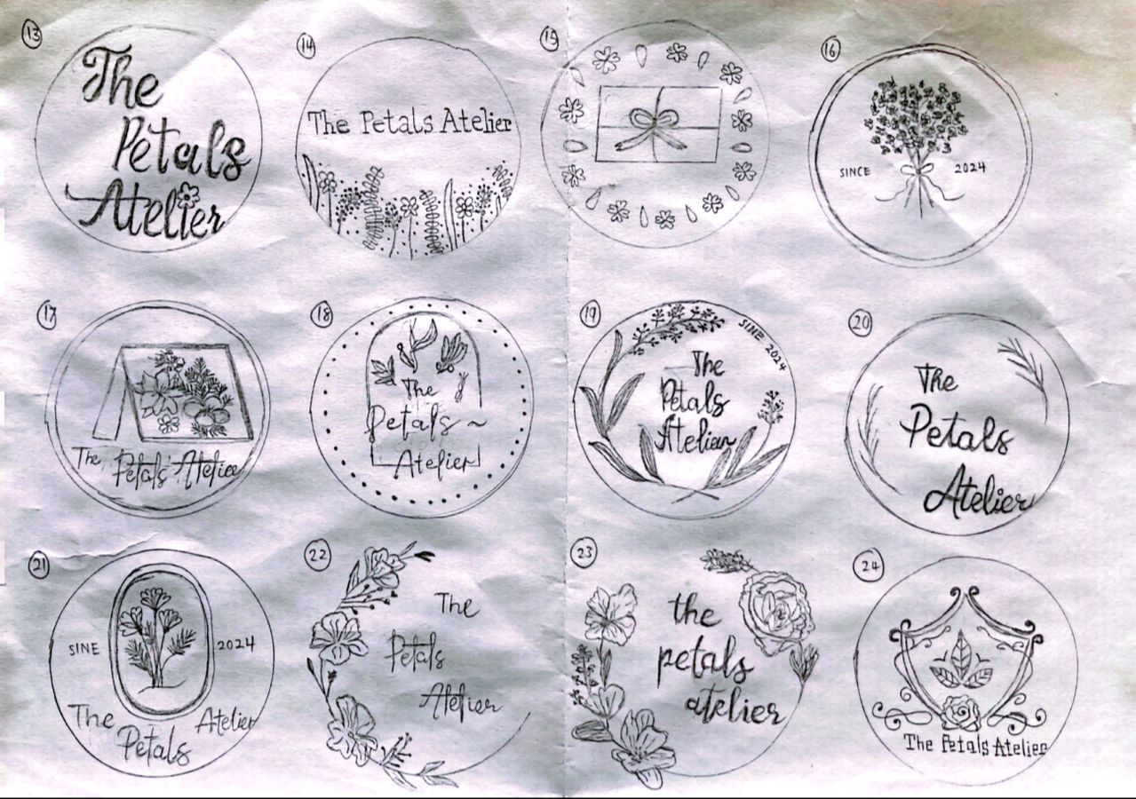
fig 1.8 Logo Sketches Week 3 (09/10/2024)
fig 1.9 Logo Sketches #2 Week 3 (09/10/2024)
After getting my feedback, I was told that my sketches were too complicated and I needed to simplify them. My classmates liked #5 the most and maybe to play around with the ribbons as well so I went home and tried again.
fig 1.10 Second Time Sketches Week 4 (07/10/2024)
Here I just played around with the flowers and tried different styles along with the ribbons. After feedback, I was told that I could improve better and not just focus on one style instead. The #3 sketch is what I like, I tried to draw out the ribbons in the shape of a flower and I pointed that out during feedback and Ms Lilian gave me the green light to continue exploring but I'll have to keep in mind with the little flowers at the side.
One of my classmates also pointed out that they liked the idea of the sparkles on my #11 sketch.
And so...back to stage number 1.
These are some of the ribbon references.
fig 2.0 Ribbon References Week 4 (12/10/2024)
Here I just play around with the ribbon in the shape of a flower idea and the sparkles.
fig 2.2 Sparkles and Flowers (Playing Around) Week 4 (12/10/2024)
Other one, I tried different styles and flowers, along with the ribbon, just to get some ideas.
fig 2.3 Trying Different Styles Week 4 (12/10/2024)
I like the idea of the fairy as I think it's really cute so I decided to digitize it and see how it goes. Along with some other sketches as well.
fig 2.4 Digitizing Sketches Week 5 (21/10/2024)
I decided to go for the idea of the fairy. Ms Lilian says it's nice if it's a graphic, again the leaves and the line might be an issue...
And so from there, staring from zero..again.
I redraw the fairy again, just to simplify it more and took off some shading just to simplified it even more.
fig 2.5 Redrawing the fairy Week 5 (21/10/2024)
Here I even tried a different style, but again it might not work and it looks a bit messy.
fig 2.6 Different style of the logo Week 5 (21/10/2024)
This is the final look of the logo, I took off the idea of the see-saw and just placed the whole fairy beside the wordmark and simplified it.
fig 2.7 Redrawing the fairy Week 5 (21/10/2024)
Here is the process of the submission.
fig 2.8 Process of the submission Week 5 (24/10/2024)
fig 2.9 Animation Week 5 (24/10/2024)
I did some refining of the submission slides after I got my feedback just to fix some things a bit.
fig 2.10 Refining of the Submission Slides Week 5 (28/10/2024)
And here is the final animation.
fig 3.0 Final Animation without background Week 5 (28/10/2024)
fig 3.1 Final Animation with background Week 5 (28/10/2024)
FEEDBACK
Week 2
FEEDBACK:
Great consideration of the aspect of the mind map, room for improvement. Do consider looking for visuals of how you want the shop to look like and the colour palettes as well. Some part of the brand name side should go to the business side. Do start looking for references for your logos later.
NEXT PLAN OF ACTION:
Improved both of my mind maps and made a mood board on how I wanted my shop to look like as long as the colour palette as well. Start looking for references on how I want my logo to look like.
Week 3
FEEDBACK:
Sketches are too complicated and can be simplified. Can see that you’re going for a cottage vintage vibes so keep that but play around with the bows and the flowers. Great fonts choice for the brand name also try to play around that as well. To include your brand name as well in your logo not just the visual or else people won’t know what business you’re doing.
NEXT PLAN OF ACTION:
Play around with the ribbons and the flowers, and explore the potential typeface for my brand name
Week 4
FEEDBACK:
Still have room to improve, don’t just only focus on the flowers, play around the structure, the typeface and elements that will go well with it. Consider what your tutorial mates said. Room to explore
NEXT PLAN OF ACTION:
Brainstorm ideas.
Week 5
FEEDBACK:
It will work well as a graphic. But the line from the seesaw the fairy is holding on is starting nowhere and it’ll be hard if you apply to other places. Maybe consider to only including the fairy and the leaves. Or try to connect the lines from the typeface. Maybe try a font instead of drawing out the typeface. It’ll be hard to if you reach the sizing area. The leaves and line are an issue. Rationalization to consider.
NEXT PLAN OF ACTION:
Play around the elements of the logo and the fairy. Try black and white and only include nessasary lines to highlight the fairy’s details.
SUBMISSION
Task 1: Logo
Timeframe: Week 03 - Week 05
Deadline: Week 06
Description:
A) Research & Analysis: To collect 28 logos, 2 every day for 2 weeks: Good &/Bad. All 28 logos are to be documented using Google Slide.
B) Produce 2 sheets of idea sketches.
Submission:
1. Logo in BW, reverse & colour
2. Logo space rationalization & Clearspace
3. Logo with strapline
4. Logo minimum size
5. Logo minimum size
6. Brand primary & secondary colours
7. Logo Typeface(s)
8. Patterns derived from logo
9. Logo Animation (GIF)
28 Good_ Bad Logos
fig 2.0 Task 2 28 Good_Bad Logos (28/10/2024)
The Petals Atelier Document Setup
fig 2.1 The Petals Atelier's Document Setup (28/10/2024)
The Petals Atelier Logo's Gif
fig 2.2 The Petals Atelier Logo's Gif (28/10/2024)
REFLECTION
Experience
Designing of our logo for the brand was one of the most difficult tasks I have undertaken. The first thing I did was coming up with a number of ideas, and it always involved too much time to sketch them, and no idea was optimal. I began to feel that each particular concept either appeared to be much too commonplace to be the subject or was too complex to be taken up and the result was a string of rejections. This constant feedback raised my stress levels and constantly questioned how I would come up with something that would work.
At some point, I have to admit that there were occasions when I didn’t know how I would proceed. For the life of me, it felt like the creative juices had ceased to flow. But instead of quitting, I decided to do more research on visuals and actually start focusing on my own brand. The more I realized what the brand is, what it stands for and for whom it stands, the more obvious it was.
With this clearer vision, I sat down and smoothed out my concepts once more. After lots of experimenting, I was able to submit a logo design, I personally was happy with the design since it was meaningful and simple in line with the brand logo. When I had showed to Ms Lilian, she gave it a nod and that feeling of having done it was just incredible. I learned about the value of perseverance, visual research, and making sure to get at the heart of the brand before proceeding to the design aspect.
Observations
My main observations from this experience were the importance of persistence and the need for a deep understanding of the brand before starting the design process. Initially, I struggled with creating a logo that worked, as my sketches were either too simple or too complex. This led to frustration and self-doubt, but I realized that the key was to step back and gain a better understanding of the brand's core values and target audience. Through more visual research and by focusing on the essence of the brand, I was able to refine my ideas and create a design that was both meaningful and visually appealing. This experience highlighted the need for patience, the value of feedback, and the process of iterating and evolving ideas until the right solution is found.
Findings
My findings from this experience are that creating a successful logo requires more than just sketching ideas, it demands a deep understanding of the brand and its core values. Initially, I struggled because I wasn’t fully in tune with what the brand represented, and my designs didn’t reflect that. Through further visual research and exploring the brand's essence, I was able to refine my approach and develop a more fitting design. I also found that feedback is crucial in the design process, as it helped me recognize areas for improvement. Ultimately, I learned that persistence, thorough research, and a clear connection to the brand are key to creating an effective logo.


Comments
Post a Comment